2007 Spring

I have talked about SUQQU several times, and I have praised its strong themes and stunning ad campaigns for its seasonal makeup collections.

Sometimes it only takes a single unique product in the collection to warrant all the building up to it:

Powder Eye Shadow in Daichi (EX-51)

Why? On the website and on the leaflet I got, it just looked like any ubiquitous deep brown eyeshadow. But when I tested it on the back of my hand, I realized that I had never tried anything else like this before.

The smooth (almost-creamy) texture, typical of SUQQU’s eyeshadows and blushers, is still there, but this brown eyeshadow has twinkly deep midnight blue sparkles. The finish is so absolutely gorgeous. It is still predominantly matte, while the sparse diamond-dust deep-blue particles really stand out and shine against the matte brown background.

It must be like a clear night in the desert.

If you happen to be near a SUQQU counter, you simply have to try it.

Again and again, SUQQU shows that their products epitomize Japanese sensitivity and sensuality. It’s all very subtle but it is enough to have you in awe.

{ 0 comments }

#2: Jill Stuart (“Brilliant Veil” Collection)

The Look: “Brilliant Veil” is quite an accurate description of the colors on offer here. Medium-pigmented colors add soft hues to the face with a great amount of glow and sheen. The emphasis is on the eyes, with the launch of Jill Stuart’s first collection of eye palettes.

Key Item: Brilliance Eyes palette in 04 Gem Amethyst (reviewed earlier here). A beautiful lilac palette with featherweight powder and intense shimmer and glitter. It gives a veil of color with dazzling and multi-dimensional sparkles. A palette that adds a bit of drama to the eyes.

Winner: Lavshuca

The Look: When I saw the ad campaign featuring the Japanese girl band PUFFY (the two girls you see as soon as you enter the Lavshuca website), I couldn’t believe their transformation. They used to be two funky girls with slightly mad hair jumping around the stage. Now they cannot look more polished and sophisticated while they still keep the coolness and edge. I guess this is the image that Lavshuca’s new collection is trying to convey: cute, fun, feminine, and with a bit of an attitude.

Key Item: Too many to mention, actually, but I will single out Eye Color Select in PK-1 (reviewed earlier here). Pink eyeshadow is hot for this spring, and this pink palette gives a couple of different looks. You can go for a soft pale pink or an intense cherry pink. The lightest shade is good as a base or a highlighter and the brown can be a natural eyeliner.

For me, it was very close between Jill Stuart and Lavshuca this season. They kept switching positions when I was finalizing my rankings. But Lavshuca wins at the end with its more complete range and updated packaging to keep the brand image fresh.

If you are interested in mineral makeup, my next post will be about von Natur’s mineral powder foundation.

{ 0 comments }

#4: T’Estimo

The Look: The whole collection (both the color and the packaging) is so pretty. The look is femine and elegant. The emphasis is on the eyes. Beautifully and delicately blended gradation from pale to soft to intense, from browbone to lashline, the single-color concept for eye makeup works seamlessly.

Key Items: Frame Impact Eyes palettes. Four eye palettes feature four gradations of colors (blue, green, lilac, and brown). Each palette comes with a cream eyeliner. Don’t be put off by the green and the blue. The colors are soft enough to look natural but pigmented enough to impart a gorgeous hue.

#3: Lunasol (“The Ultimate Skin” Collection)

The Look: The concept is to create flawless skin with the softest colors. Pale pastel colors for eyes and beige-pink for lips. The whole effect is fresh, polished, and very sophisticated.

Key Items: Skin Modelling Lips palettes (second from top on the webpage). It’s the ultimate lip kit. Each of the four palettes features a tinted lip primer, lip color, shimmer-free gloss, and shimmery gloss. The tool for sculpting the perfect pout.

(If you can get hold of the April issue of the Biteki magazine, it comes with a free DVD which is all about creating “The Ultimate Skin” using Lunasol’s latest makeup and foundation collections.)

I’ll reveal my top 2 in my next post (although you can probably guess what they are if you have read some of my previous posts). Still, don’t miss it!

After that, I will talk a bit about one growing trend — mineral makeup.

{ 0 comments }

(pictured: my Dior Addict Ultra-Nude
in #380 Undressed Mauve along with
Dior Detective Chic palette from Autumn 2006)

#6: Ayura (“Hawaiian Garden” Collection)

The Look: Sunny and breezy, with colors that brighten your eyes and your day. The combination of tropical colors in the eye palettes are unusual and fun — turquoise with lilac, orange with purple, and blue with minty green. Great when you want to be a bit more experimental.

Key Items: The three limited-edition Aqua Fix Lipglosses. Fresh and vibrant with three tiers of colors, they remind me of summer cocktails by the beach.

#5: Dior (“Dior Flight” Collection)

The Look: Chic, glamourous, and globe-trotting beauty. The Dior Flight palettes carry all the essentials (eyeshadow, blusher, and lip color), and the two 5-color eye palettes feature two very different looks (soft warm pastels and dramatic blue). The two single-color eyeshadows, white and pink, are spot-on with this season’s soft, femine, and almost-nude look. (Read a more detailed review of the collection here.)

Key Items: Dior Addict Ultra-Nude lipsticks. Definitely some of my favorite items for this season. All the five colors are sheer and wearable while giving a gloss-effect. The #380 (Undressed Mauve) that I have goes well with a variety of eyeshadows like cool pink, lilac, and pastel blue. The must-try for this season, in my opinion!

{ 0 comments }

#8: Anna Sui (“Blooms of Fascinations” Collection)

The Look: It is all about lips for Anna Sui this season, with a collection full of cute lipglosses and lipsticks in a variety of color palettes (pink, orange, red, and beige). The packaging is adorably girlie as always.

Key Items: Sui Lip Gloss. 19 sweet fruity colors of varying pigmentations. Mix and match them up!

#7: Aube by Sofina (“Splash Beauty” Collection)

The Look: Ultra-shiny and ultra-glossy, this collection brings a watery transparency and a burst of radiance. All five eye palettes feature a glittery eye gloss that can work as a base or a top coat, giving a wet-look effect. The lipsticks impart a gloss-like finish, and the shimmery powder is great for face as well as body.

Key Items: Jewelry Shower Eyes palettes. The name says it all. Apart from the eye gloss, there are gradations of pink, purple, blue, and brown in each palette. The shades are relatively muted, but reasonably so due to the high shine of the eye gloss.

Related posts:
PJ’s Top Ten: Spring 2007 Makeup Round-Up (#10, #9)

{ 0 comments }

In the coming posts, I reveal my top 10 of this season’s makeup collections. (Do let me know what tops your list!)

Here we go, in reverse order:

#10: The Body Shop (Vital Brights Collection)

The Look: It is a feast of colors. Cool-tone eyes, rosy cheeks, syrupy lips, and a bit of tan. It is a small collection, but it is one of the most colorful additions from The Body Shop for a few seasons.

Key Items: Eye Color Fusion in blue and green. (Wear them in moderation!)

#9: SUQQU (Daichimegami “Goddess of Earth”)

The Look: Strong,distinctive, and coherent, it is about shades of blue (sea/sky) and beige (earth/desert). Do check out the link above…it is an absolutely beautiful presentation of the collection from the official website. (Japanese brands are so good at this.)

Key Items: Powder Eye Shadow in shades of blue. A strong midnight blue or a bright powdery sky blue…the choice is yours.

Before revealing the rest of my top 10, my next two posts are going to be about Oscar fashion 2007. Stay tuned!

{ 4 comments }

Flowy, and feminine were the first words that came to mind…

Valentino has been one of my favorite designers since I started to be interested in fashion in the 80’s. He has been such an icon and I love his designs still.

This collection is almost the opposite to Dior’s that I equally love. While Galliano’s creations are bold and flamboyant, Valentino’s are softer and calmer. But surprisingly, to me, they almost have the same visual impact. The two collections are both extremely coherent with their respective themes (and therefore so memorable) and that explains my fondness for both.

When the color palette is mainly white and palest shades of beige and pink, the shape, texture and pattern are immediately under the spotlight. The harmonious combination of fur, silk, and chiffon adds depth and dimension. It is almost as if the simplicity of the color scheme is to showcase this seamless harmony.

The shapes of the dresses are simple and clean, and the details are so exquisite. (I really enjoyed looking at the detail photos and marveling at all the ruffles, folds, and embroidery.) The whole effect is a sheer sense of elegance, further enhanced by the piled-up hair and retro-style makeup.

To me, this collection is a master class in understated and sophisticated glamour.

{ 2 comments }


Lavshuca again today. They make some of the cutest stuff around. Their eye palette is just adorable, and this lipgloss pen is another example. In seven colors, the Gloss Stick looks just like any other lip gloss that comes in a pen, and the color I have (PK-3) is a nice basic everyday pink with a bit of shimmer.

But what makes it interesting and fun is the applicator:


The heart-shape dispenser is what seals the deal for me. What a nice little touch! It has a very similar advantage to that of the spatula applicator of Curvy Lip Silicone. It doesn’t smudge off the lipstick and is easy to clean. Cute and clever.

{ 0 comments }


Happy Valentine’s Day, everyone.

I didn’t consciously plan this, but I was going to talk about these gorgeous little eye palettes from Lavshuca featuring cute heart shapes. (Lavshuca is one of my favorite Japanese brands. Read more about it in my other post. I also reviewed its spring 2007 collection here.)

The Eye Color Select palette is out this spring and comes in five versions. I got the ones in pink and blue.


Pink is not the easiest color for me to wear but I wanted to try. Surprisingly, they came out nicely and I didn’t look like I had irritated eyelids. The deep pink (lower right on the palette) is very pigmented and is fun to experiment with.


The blue shades are all quite sheer, which I personally like. It is a subtle and elegant look.

All the colors have fine shimmering particles.

I am really loving these. They are great to use and look adorable on my dressing table. Definite keepers!!

{ 4 comments }

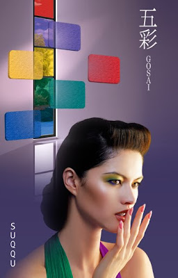
(stunning ad from SUQQU’s Fall 2006 collection)
(from www.suqqu.com)
.

Back in September 2003, when SUQQU‘s first counter opened in Isetan Department Store (a world-class cosmetics heaven, and an ultimate battlefield for all brands) in Shinjuku, Tokyo, people were waiting outside the store for the doors to open. The revenue of its first day of sale broke the record of this upmarket department store for a debut brand (Voce Magazine, March 2007).

Why did so many people rush to buy SUQQU’s products even before they sampled them and why has it been successful since its debut? Apart from the quality of the products itself, I think there are two very crucial reasons.

First of all, in a youth-obsessed society (in a globally youth-obsessed era), where packaging is getting cuter and the colors are getting funkier, SUQQU resorts to the reverse strategy. It targets mature grown-ups. It appeals to women who are successful, classy, intelligent, and sophisticated. I believe that, by doing so, it also appeals to young women who look up to their more mature peers. It altogether creates a surprisingly wide market.

Another reason is their beautifully constructed theme for each season and the visual brilliance of their ad campaigns that convey the theme. Usually printed cosmetics ads feature the face of the model freshly made up against a muted background. Pretty straightforward, but dull at the same time. Not SUQQU’s ads. They always have a sense of message and story, and it certainly helps when the colors of each seasonal makeup collection have such a strong identity.

Last spring, it was a collection which couldn’t be more pink, with pink eyeshadows, pink lipsticks, and pink blushers. The ad featured beautiful full-bloomed flowers as the backdrop:

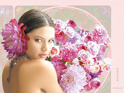
(ad for SUQQU’s spring 2006 collection)

(from www.suqqu.com)
.

Last fall, the collection featured primary colors used in ancient Japanese pottery. The ad (at top of the page) is stunning. But I think the upcoming spring 2007 collection is even more impressive. The theme is “goddess of the earth”. The eyeshadows are shades of blue and beige, paired with beige and brown lipsticks. It’s the sea versus the desert, bare earth versus deep ocean. The ad features a woman between the desert and the blue sky/ocean. She looks confident and in charge.

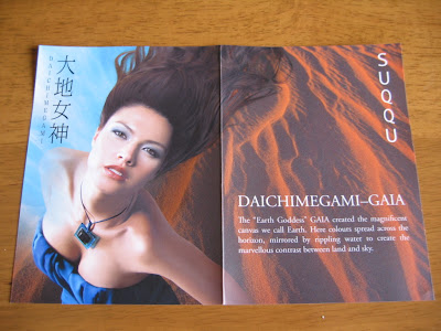
(SUQQU makeup leaflet for summer 2007)
.

Primary colors and shades of blue are not easy to pull off. But SUQQU’s message is “Wear them and be confident!” Packaged minimally with oriental sensitivity and sensuality, the colors inside are bursting with personality and attitude. All of these give SUQQU a very unique edge.

Later this month, I’ll come back to SUQQU again and review some of the makeup and skincare products. There are some fantastic products to be written about, including the smoothest eyeshadows I have ever tried.

Stay tuned!

Next: a lipgloss that has sold over one million copies in Japan.

{ 4 comments }