makeup

Every season, I count down my ten personal favorite makeup collections. This week, I present my top ten for spring 2008. In reverse order:

10: Clé de Peau

(Eye Color Quad in 116 (left) and 117 (right))
(image from www.shiseido.co.jp/cpb)

This is Clé de Peau‘s first time in my top ten in the last few years. I love the ad image and the gentle and feminine look with the blue eyeshadow. The Eye Color Quad in 117 is a delicious combination of purple, aqua blue, and mint green. Apart from capturing the trend, I think this versatile palette can take you right through the summer months.

9. Maquillage

(image from www.shiseido.co.jp/mq)

Maquillage is another line that hasn’t been featured in my seasonal top ten very much. But there is something very striking about their latest seasonal look, which is my favorite look for spring 2008. One of the key items of the collection is Clean Contrast Eyes 2 in SV844, which is used to create the soft lilac eyes we see above:

(Maquillage Clean Contrast Eyes 2 in SV844)
(image from www.shiseido.co.jp/mq)

This palette combines the very trendy grey from fall 2007 and the spring 2008 leading color lilac. It can also be seen as a monochrome palette with lilac as the accent color. It can create a variety of looks, from gentle and fresh to intensely smoky.

This shade combination is not the first for Maquillage. Contrast Eyes in SV862, released in spring 2006, is quite similar (but the lilac looks warmer). T’Estimo’s Grande Shine Eyes in 02, from summer 2007, also has a similar concept. But the release of this color combination in spring 2008 as a key item of the collection reflects Maquillage’s attempt to interpret the current trend. (Teaser: A full review of Clean Contrast Eyes 2 in SV844 is coming up next week!)

8: Ayura

(part of the Ayura spring 2008 collection)
(image from www.ayura.co.jp)

Ayura‘s spring 2008 collection is very visually appealing. I am sure some of the people familiar with Ayura were delighted to see the brand take on a new color scheme for the packing. The intricate patterns against the black cases look exquisitely classy.

The collection includes 4 blushers, 21 lipsticks, and 18 nail colors. There is no item for eyes, but it is almost certain that we are going to see some beautiful eye colors in the new black cases.


7. Anna Sui

(part of the Anna Sui spring 2008 collection)
(image from www.annasui-cosmetics.com)

Anna Sui is probably the princess of vibrant colors. The spring 2008 collection features bright hues for eyes and nails. The three limited-edition Sui Lip Glosses (above) appear to be very bright, but they all go on naturally sheer. (Have a look at my review of the blue-tinted Sui Lip Gloss in 100.)

This is one of the more memorable seasonal collections from Anna Sui in the last couple of years, and I hope there will be more lovely items to come!

See you in Part 2!

Related Posts:

Magie Deco Spring 2008 Collection
(A great collection that just missed the cut…)

Spring 2008 Makeup Trend Report
(before we move into summer…)

{ 2 comments }

(Paul & Joe
Light Cream Foundation in 03 Clair)

Most of the time, I wear a powder foundation, and my favorite by far is Shiseido ZA’s Two-Way Foundation (which I will be talking about in two weeks). In short, it has good coverage, controls shine fairly well, covers pores effectively, and is long-lasting.

But, occasionally, mostly in winter, I am tempted to play with liquid or cream foundations. At 26 pounds in the UK (around 51 USD), Paul & Joe‘s Light Cream Foundation (SPF 15 PA ++) would be a little too expensive as something to experiment with from time to time. But when I saw it at 13 pounds during the winter sale after Christmas last year, I decided to take it home.

I have used it for quite a few times, and here are my thoughts:

Texture & Consistency: The name “Light Cream” is not a very accurate description of the consistency, but almost in a good way. It is actually a lot more fluidy than many liquid foundations I have tried. I tend to go for a light and liquidy texture rather than a creamier texture, so I am very happy with the smooth double-cream consistency.

Slip & Blendability: There are some quite liquidy foundations that don’t have enough slip and dry too quickly to be blended evenly. Not this one. Out of all the liquid/cream foundations I have tried, this one probably has the best slip. It spreads and blends so easily that it feels like a smooth moisturizer.This is by far the best aspect of this foundation.

Finish: It imparts a luminous sheen, without any visible shimmer. Even though the finish is not overly shiny, I’d still set the foundation with a matte loose/pressed powder. (Also, please note that this foundation is not formulated to control shine.)

Coverage: I have come across a couple of reviews of this item where users praise the good coverage. But I suspect that this observation is based on the comparison with other Paul & Joe foundations, as the brand is known for sheer and ultra-natural foundations. I would still describe Light Cream Foundation’s coverage as light (not even light-to-medium).

Pore Coverage: I have very rarely come across a liquid/cream foundation that gives the pore coverage I want, and I always use a loose/pressed powder afterwards for that purpose. So I didn’t expect much. But because it has a superb texture and slip and it adheres to the skin well, the pore-diffusing ability is fair.

Lasting Power: Due to the sheer coverage, it is not easy to tell how good the lasting/staying power is. Considering the coverage does retain for a good number of hours, the lasting power appears to be relatively satisfactory.

Even though this foundation has an exceptionally pleasing texture and slip, it falls short on coverage. After using it for several times, I actually decided to use it more as a primer and then use a powder foundation to gently add coverage and matte out the shine. For me, this item works the best this way.

(Light Cream Foundation was replaced by Light Cream Foundation N, which is why this original version was being reduced. Currently it is not available at UK Paul & Joe counters anymore. But, several authorized on-line retailers still carry it. Please check the shop list on Paul & Joe’s global website for details. Some shops ship internationally.)

Related Posts on Foundations:

Foundation Face-Off – Lunasol vs. Coffret D’Or

Foundation Face-Off – Chanel vs. SUQQU

Related Posts on Paul & Joe:


Paul & Joe Face Powder

(another Paul & Joe acquisition during the sale)

Loving Japanese Brands – Paul & Joe
(my take on Paul & Joe)

Japanese Brands Available in the UK
(and where to get them from elsewhere)

{ 12 comments }

UK Follow-Ups in Brief

by PJ on Friday, March 7, 2008

in -Calvin Klein, -SUQQU, 2008 Spring, fashion, makeup

— Originally scheduled to launch on March 6th in the UK, Calvin Klein Beauty will launch on March 31st, according to the customer service at House of Fraser on Oxford Street, London.

Banana Republic’s UK/Europe launch has also been delayed. According to the sign (outside the construction site on Regent Street, London), the launch date is March 20th.

SUQQU’s spring 2008 collection has been launched in Selfridges Oxford Street. The texture of the eyeshadows is smooth as usual, and the Eye Lucent loose eyeshadow has intense but fine shimmer. Kyokkou (in silvery white) is particularly bright and shimmery. It is definitely one of the least matte seasonal collections from SUQQU.

{ 0 comments }

(Coffret D’Or Beauty Lasting Pack UV
& Lunasol Skin Fusing Powder Foundation)

After my first “foundation face-off” post (SUQQU vs. Chanel), some readers were wondering if I would do more. So here is another one, focusing on Lunasol’s current powder foundation, Skin Fusing Powder Foundation (referred to as “Lunasol” below), and Coffret D’Or’s debut powder foundation, Beauty Lasting Pack UV (referred to as “Coffret D’Or” below).

I have also tried the matching primers. I will review how the primers work with the foundations later on. The following comparison is based on the foundations worn without the primers (and right after my Olay daytime moisturizer/sunscreen).

Basics

– Lunasol: SPF 20 PA ++, 6 shades, released in spring 2007
– Coffret D’Or: SPF 24 PA ++, 7 shades, released in spring 2008 (March 1st)

Finish

Lunasol gives a luminous and almost glowy finish, while Coffret D’Or has a predominantly matte finish with subtle luminosity. Neither has visible shimmer.

Texture

Lunasol feels very pleasingly soft and velvety, while Coffret D’Or is slightly drier (but not chalky).

Coverage

Lunasol gives a very good above-medium coverage and successfully covers minor imperfections and redness. Coffret D’Or has a slightly below-medium coverage. In terms of how the coverage maintains throughout the day, both have a good staying power.

Pore Coverage

Lunasol has a relatively good pore-diffusing ability mainly due to the exceptionally velvety texture that adheres to the skin very well. Coffret D’Or’s pore-concealing ability is satisfactory but not outstanding.

Shine Control

All along, it seems Lunasol is winning. However, Coffret D’Or’s sebum-controlling ability is so impressive that I prefer it to Lunasol overall.

First of all, with Coffret D’Or on, it takes noticeably longer for my oily skin to appear visibly shiny than it does with some of my favorite foundations, like Sofina Raycious (earlier versions) and Shiseido ZA. Also, after gentling matting out the shine, the face looks nearly as matte as when foundation is first applied, which is not always the case with most foundations I’ve tried.

As for Lunasol, the soft powder (which has an almost-moist feel) does not seem to absorb sebum very well. The luminous and glowy finish makes the shine look more pronounced as the day goes on. Also, the face still looks somewhat shiny after I matte out the shine.

Between the two, I prefer Coffret D’Or for its exceptionally good shine-control ability. For me, the finish can look a little dry during the first hour of wear. But after that, the finish looks natural for the rest of the day with little maintenance. If you have combination or oily skin or if you live in a warm climate, Coffret D’Or is worth considering.

However, if you have dry skin with no issue of excessive sebum, then Lunasol’s soft and velvety powder will probably suit you better and give you a beautifully luminous finish.

With the primers:

(Coffret D’Or Beauty Lasting Veil UV
& Lunasol Smoothing Makeup Base)

Coffret D’Or’s Beauty Lasting Veil UV (SPF 20, PA ++, alcohol-free) has a very pleasing light milky texture and is easy to apply. Designed to add luminosity to the skin, it goes on almost completely sheer and it has visible shimmer. With this primer, Coffret D’Or’s finish turns considerably more velvety, almost like Lunasol (when worn without any primer) and the level of pore coverage is also increased slightly.

However, for me, the huge drawback is that the shine-control ability considerably lessens, which is very disappointing.

Lunasol’s Smoothing Makeup Base (no sunscreen factor, with some alcohol) is designed to diffuse the appearance of pores. It is slightly thicker than Beauty Lasting Veil UV but it is still easy to apply. It goes on almost completely sheer and does not have shimmer.

When worn with this primer, Lunasol’s smooth and velvety texture remains but the finish turns slightly more matte. Even though I don’t think the primer and the foundation worn together conceal pores better (then the foundation alone), the primer does seem to help control shine to a small extent.

While I would see Beauty Lasting Veil UV as a moisturizing primer for those who think Coffret D’Or is too dry, Smoothing Makeup Base seems to be for those concerned about Lunasol’s lack of shine-control ability.

Overall, in terms of the four options (two foundations with/without the primers), I would still prefer Coffret D’Or worn without primer. The winning attribute is definitely the outstanding shine-control efficacy.

Related Posts:
(spring/summer 2008 base makeup lineups)

Coffret D’Or
(loving the look of the loose powder)

SUQQU
(known for good-quality foundations)

Anna Sui
(very tempted to pick up the loose powder compact)

{ 32 comments }

(Chanel Quadra Eye Shadow in Stage Lights)

Lilac eyeshadows are some of the most on-trend items for spring 2008, and I have been a fan of them for a while. Today I bring you another lilac palette that can create this season’s hottest look.
.

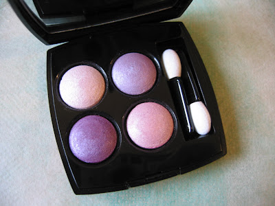
Chanel’s Quadra Eye Shadow in Stage Lights is perhaps the softest (in terms of color) and the sheerest lilac eye palette that I’ve had so far.

– Top left: white with substantial pearly shimmer
– Top right: pale lilac with soft shimmer
– Bottom left: medium lilac with soft shimmer
– Bottom right: a very pale pink with substantial pearly shimmer

Stage Lights is part of Chanel’s spring 2006 collection. While I distinctively remember liking the look of this, I had no intention of buying it at the time. My minty-green-and-turquoise phase was just about to start back then, and I picked up the Irréelle Duo in River-Light later that year.

My lilac phase started later that year and this palette was under the radar several months ago. After testing the shades many times recently and seeing the colors under different lighting conditions, I decided to have it.

The colors go on lighter than they appear in the container. Initially this was one of my reasons against buying it, but then I thought the soft and gentle finishes are great for a barely-there veil of lilac for the eyes. Also, I like the fact that the two lilacs and the pink are on the cool side and that they look more flattering on me than warmer ones.

Compared with many other eyeshadows from Japanese cosmetics brands, the texture of Chanel’s baked eyeshadows can be a little dry and the pigmentation level would disappoint many people. (The Irréelle range seems to fare better on these.) While a smoother texture would be more ideal, I don’t do a lot of layering for a daytime look so the sheerness is not a negative attribute. Obviously this palette can be worn wet for added intensity, but I simply reach for my other lilac palettes for that.

For spring 2008, Chanel released 4 Fleurs de Chanel, which is a very pretty item.
.
(4 Fleurs de Chanel,
from Chanel’s spring 2008 collection)
(image from www.chanel.com)
.
When I saw it for the first time last November (here), I thought I would definitely get it. But later on I got less and less excited, hearing that the colors are all very pale and very similar. (The collection was released a lot later in the UK than the US and Asia.) So I actually took a small risk and bought Stage Lights before 4 Fleurs de Chanel was released here. At least Stage Lights has two lilac shades, whereas 4 Fleurs de Chanel only has one.
.

When I finally got to try 4 Fleurs de Chanel, things I heard were confirmed. They are essentially white eyeshadows with various undertones (blue, lilac, and pink). While I do think the texture is very smooth and that the shimmer is quite intense but still sophisticated, I have no intention to buy it. I am still very happy with my Stage Lights.

Although, among all my lilac eye palettes, it does not rank as highly as my Coffret D’Or or Lunasol, the fact that the tones of the two lilacs are also spot-on for my skin-tone is enough for me to go back to it from time to time.

[A reader kindly reminded me that I didn’t actually describe my skin-tone in the last paragraph of my review. I have a medium-to-light skin-tone, with a pink undertone. The foundation I have been using in the past few years is ZA Two-Way Foundation in 22. It has a slight yellow undertone and I use it to neutralize my pink undertone. With foundation on, I would still describe my facial skin-tone as having a very slight touch of pink undertone.]

.

Related Posts:

Spring 2008 Makeup Trend Report
(not just about lilac…)

Jill Stuart Brilliance Eyes in Gem Amethyst
(diamond-dust shine)

Kanebo T’Estimo Frame Impact Eyes
(discontinued but not forgotten)

{ 16 comments }

(Prescriptives Lip Strips in Techno Cool
& Blush More or Less in Thai Orchid)

Prescriptives’ spring 2008 collection, The Technotropics, features vibrant-looking but very wearable colors. Here I review two items from this collection.


Lip Strips
in Techno Cool (limited-edition)

This compact includes five lip glosses with mostly cooler pinks. (Tropical Warm features five warmer shades.) The darkest shade (second from the top) is relatively pigmented as a lip gloss while the rest four are quite sheer. The top shade has no shimmer, and the middle three shades have subtle shimmer. The bottom white-ish shade has a lot of quite sparkling shimmer, and the finish is too intensely shimmery for my liking. But the product design does allow the user to easily mix two or more colors together, particularly any two adjoining shades.

My observation of most lip glosses in this semi-solid form is that they don’t usually give a watery or glassy shine. The finish tends to be more of a luminous sheen, which sometimes can look a little oily. While the finishes of these glosses are more balmy than greasy, personally I’d prefer a more watery shine.

Blush More or Less Creamy Cheek Color in Thai Orchid

I find that the Prescriptive website seems to have quite an accurate description of the texture of this product. This cream blusher is described to have “the smoothness of a cream and the lightness of a mousse”. Indeed, this is not like most cream blushers which can feel a little greasy, and the texture is light and almost mousse-like. (But it is not as mousse-y or spongy as, for example, Maybelline’s Dream Mousse Cheek Color.)

What impresses me about this formulation is that the mousse-like texture makes blending very easy, which is particularly vital for a blusher. It dries to a smooth semi-powdery finish with very subtle luminosity. It has a fairly satisfactory staying powder.

Thai Orchid appears to be a very intense rosy red. But it can easily be worn with varying intensity and it looks very natural worn sheer.

Between the two items, I much prefer the blusher. But the lip compact, which is the size of a typical round foundation case, can be a competent space-saver during traveling and go with various eye and cheek looks if you enjoy the balmy finishes.

Related Posts:

Blushers:

Albion Eprise Water Cheek Color
(another non-powder formulation that works well)

Ayura Aura Veil α in Sweet Pink

(perfect for spring)

Lip Glosses:

Lunasol Full Glamor Gloss in Bright Pink
(one of my favorites)

Rimmel Underground Light Beam Lip Gloss
(natural watery sheen)

{ 4 comments }

(Radiant Pastels
Shiseido The Makeup Spring 2008 Collection)
(image from www.shiseido.com/themakeup)

With Dick Page as the artistic director, Shiseido The Makeup‘s spring 2008 collection is looking fresh and colorful. (On the Shiseido website, the collection is billed as a (Dick Page) “inspired collaboration”.) While there are no new product designs, this is a visually very pleasing collection, from the shade selection to the ad image.

The collection includes:

— Hydro-Powder Eye Shadow: 4 new shades (seen below)
— Shimmering Lipstick: 4 new shades
— Multi-Shade Enhancer: 2 shades, Terra-Cotta Glow and Sunset Glow (Sunset Glow is a limited-edition item from summer 2007 and is now a regular product.)

(Hydro-Powder Eye Shadow)
(image from www.shiseido.com/themakeup)


I have tested Hydro-Powder Eye Shadow in H10 Languid Lagoon at the counter. The actual color is darker than what we see in the image above. It also looks greener and is less aqua-ish. I have to say, for me personally, it looks slightly better on the website and in magazine pages.

I might not pick up any item from this collection, but I will still look forward to more creations from the master.

Related Posts:

Shiseido Clé de Peau Spring 2008 Collection
(another gorgeous ad image)

Spring 2008 Makeup Trend Report
(featuring key items for this season)

Must-Try Look for Spring 2008
(trendy and wearable)

{ 8 comments }

(French graffiti artist Fafi at Henri Bendel)
(from www.nypost.com)

The Fari for MAC collection might have a bright and funky image with its fair share of vibrant colors. But, there are some very wearable shades and several bright-looking items that are not too difficult to work with. Even though the packaging is obviously targeted at a young audience, I feel that many shades have a more universal appeal.

Here are my favorites from the Fafi for MAC collection:

(Clock-wise from upper right:
Powder Blush in Hipness & Fashion Frenzy,
Lipstick in Fun ‘n’ Sexy & Strawbaby,
and Lipglass in Totally It)


My favorite items by far are the two blushers (Powder Blush in Fashion Frenzy & Hipness). Fashion Frenzy, my preferred one out of the two, has the kind of cool pink shade that I know would suit me. But because it is on the vibrant side and the blush is very pigmented, I do have to be very light-handed with it. (I also like the turquoise Fafi logo on the lid against the pink blusher.) Hipness initially appeared to be a peachy shade that might not suit me, but I was pleasantly surprised by its wearability as it turned more pink after a few hours’ wear. Both blushers have a fair lasting power.

Totally It is my favorite Lipglass from this collection. It is a bright pink with cherry pink and purple shimmer. Even though two of the other Lipglasses, Cult Fave and Sugar Trance, have more wearable shades, the shimmer is too frosty for my liking. On my lips, one sheer layer of Totally It actually looks relatively natural and this is how I’d wear it most of the time. With a second layer, the brightness of the pink really intensifies. Apart from the lovely pink and purple shimmer, I also enjoy the lasting shine.

The Lipstick in Strawbaby is a very wearable warm-rose with some delicate blue-green shimmer and should suit most skin-tones. On the other hand, Fun ‘n’ Sexy is a similar bright pink to the Totally It Lipglass with purple and bright pink shimmer.

I think the wearability of many items in the Fafi for MAC collection also appeals to some younger customers that have just started to experiment with makeup and want something easy to use. The Fafi Eyes palette in #1 is a very basic palette that would suit a beginner in makeup, and it actually reminds me of Chanel’s 4-color eyeshadow palette in Influences, which is one of the first eye palettes I bought. (The actual shades and finishes do vary, but the concepts are similar.)

(left: MAC Fafi Eyes #1;
right: Chanel Quadra Eye Shadow in Influences)


Despite MAC Paint Pots‘ rich colors and long-lasting quality, I am not really a fan of them. The colors are difficult to blend and none of the finishes featured in the Fafi for MAC collection (cream, satin, and frost) looks optimally flattering. This is a bit of a shame, because Rollickin’ and Girl Friendly could have potentially been shades I’d constantly reach for. (Rollickin’ is a turquoise with pale gold shimmer, which is better than the distracting yellow and green shimmer commonly seen in turquoise eyeshadows. Girl Friendly is a dusty rose-petal pink that is subtly elegant.)

Overall, the Fafi for MAC collection offers something for most people, from eye-catching lip shades to subdue neutrals for eyes. I still find it hard to like most of the packaging and the Fafinettes, but the two lovely blushers (which, for me personally, pleasantly don’t feature the Fafinettes) will potentially be very active members in my blusher family.

Related Posts:

MAC for A-Mei Collection
(perfectly in tune with her heritage)

Alexander McQueen for MAC Eyeshadow in Haunting
(loving this turquoise)

{ 12 comments }

New Side Bar Categories Added!

by PJ on Monday, February 25, 2008

in announcement, makeup, skincare, stash focus

I have added two new categories on my side bar so you can locate my past posts more easily:

My Current Makeup Favorites

My Skincare Essentials

The items in “My Current Makeup Favorites” include both some of my long-term staples and seasonal favorites. “The Skincare Essentials” feature items I am using on a daily basis now.

I will update these two categories constantly to reflect my current preferences (especially regarding my seasonal favorites), so do check back!

{ 0 comments }

(a tearful diva)
(image from www.kao.co.jp/est)

A reader once asked me why, regardless of the generally consistent quality, certain Japanese makeup lines (under the same company) are more expensive than others. To summarize my answer for her, apart from the fact that price-points and target consumer groups define each other, more prestigious makeup lines tend to have a fuller philosophy behind their creations.

One prime example is Sofina EST.

Sofina‘s EST is not new. It has been a skincare line under Kao’s Sofina for many years, and it is Sofina’s most expensive line. In fall 2007, EST launched a full color makeup line, following the earlier debut of the base makeup range. (While, obviously, the brand name reminds people of the superlative suffix “-est”, Sofina also advocates that it is an acronym for “Essence of Sofina Technology”.)

The over-arching concept of EST’s color makeup is Emotional Beauty. As our faces are always displaying various feelings and emotions, EST attempts to use colors and finishes to enhance our day-to-day expressions of emotions. So, our beaming smiles look even more dazzling, our focused determination is even more infectious, and our sorrow melts the hardest of hearts.

(image from www.kao.co.jp/est)


I love EST’s recent ad images. They are beautifully and subtly compelling, with colors that enhance the facial features rather than overtake them. To embody the essence of the line, the model (April) displays a much wider range of emotions than what we usually see in makeup advertisements. The image on the top of this post is by far my favorite. As for the two below, I call them “despair & hope”:

(image from www.kao.co.jp/est)

(image from www.kao.co.jp/est)

However, all this ethos will be hollow if it can’t translate to product designs. So how does EST carry out their promise?

One item that defines the line is Emotional Aura Pact. Essentially, this is a highlighter for the eye area. It includes four subtly different shades of various finishes and opaqueness, and each of them is used on a specific part of the eye area.

(Emotional Aura Pack)
(image from www.kao.co.jp/est)


Apart from the eye area, this multi-purpose item can also be used around the lips to sculpt your pout. So, when you feel surprised, happy, curious, excited, inspired, or moved, this item is designed to capture your million faces and help them make a lasting impression.

Also, so far, I have come across good comments on Emotional Aura Eyes, the eye palette range:

(Emotional Aura Eyes palettes)
(image from www.kao.co.jp/est)


After the huge success of Kanebo’s Lunasol in the last couple of years, Kosé’s Magie Deco and Sofina’s EST were two of the major makeup launches in late 2007 that posed as rivals. Similarly priced and packaged with a sophisticated flair, they appeal to similar demographics. With a strong and distinctive concept behind it, Sofina EST’s development and evolution will be immensely interesting to chart and will serve as an indication of the future of Japanese cosmetics.

[Even though Sofina is available in Japan and several other countries in Asia, the EST line is currently only available in Japan as far as I know. The EST website is for information only and does not offer on-line ordering.]

Related Posts:

Loving Japanese Brands – Lunasol
(my current favorite Japanese brand)

Brand Profile: SUQQU
(a reverse strategy that works)

Coffret D’Or 3D Lighting Eyes
(replacing the beloved T’Estimo)

{ 13 comments }