2008 Fall

A Splash of Color Lilting Lilac 3 1

.

It has been a very long time since I brought you the last A Splash of Color post (Sensuous Plum). Today I am finally back with more, and of course it has to be lilac.

My More Lilting Lilac was back in May 2008. In the last year or so, I have been in my warm-neutral phase and one of my only new purple purchases is the new 3D Glossy Eyes in 04 Pink Violet from Coffret d’Or (which I will review later). But I have got quite a few purple items in the last three years. Here are some of the new additions of lilac, mauve, and violet:

[Click to continue reading…]

{ 11 comments }

Maquillage‘s Forming Shiny Eyes was part of the line’s fall 2008 collection, which radiates an international flavor. (The collection was created in collaboration with fashion designer Christopher Kane and the ad campaign featured model Agyness Deyn.) Among the five variations, I liked the combination of purple and gold in #52 (which happened to combine two major makeup trends in fall 2008) and I received this as a birthday gift last year from a dear friend.

The product comes in a two-tier pot with a storage slot for the sponge applicator at the bottom.


The top tier has the cream base and the bottom tier has the gold and purple.


The cream base is very easy to apply with a finger. It leaves a nice veil of off-white shimmer that softly glistens (rather than glitters), and it actually looks quite pretty on its own. It can be applied from the lashline and taken all the way under the brow bone.

The gold imparts a beautiful shimmer, which doesn’t look too frosty or sparkly. (There are also some fine multi-colored particles to help the shimmer look more vibrant and dimensional.) The flattering yellow-toned gold doesn’t look too white-ish or bronzy.

The purple is a well-pigmented muted medium-to-dark shade that has less shimmer than the gold. Used as a lining shade (which is more or less what the application instructions on the packaging suggest), it frames the eyes very well.

Once, I thought I’d bring it further from my lashline, but it didn’t work well mainly because it didn’t seem to be blendable enough. Unlike the gold, which is very soft and easy to blend, the purple seems to be purposefully made to have less movement and to set more quickly. My suggestion is to only wear it close to the lashline or as a lining shade. (It does hold very well overtime.) Since the shade is less intense than most eyeliner colors, it adds a nice definition to the eyes without making the look too dramatic.

The image below shows the look that this item can create. Again, the purple is worn quite close to the lashline to define the eye contour.

(image from image from www.shiseido.co.jp/mq)


Overall, I like this trio very much. (I almost slightly prefer it to Maquillage’s Clean Contrast Eyes 2 in SV844.) It should be a very nice daytime item if you want something easy to wear and something effective in adding dimension to the eyes. The gold is light and fresh enough for daytime but vibrant enough to brighten the eyes, and the gold and purple make a well-coordinated pair.

For another item that has a similar color combination (though the colors are worn differently) plus a gorgeous medium lilac, please take a look at my review of Lunasol’s Sheer Contrast Eyes in Lavender Coral.

Related posts:

Maquillage Lasting Climax Rouge in RS310

Coffret D’Or 3D Lighting Eyes in Gold Variation

Maquillage Spring 2009 Point and Base Makeup Collection


A Splash of Color: More Lilting Lilac

{ 10 comments }

(continued from Part 1)

Today I am continuing the review of SUQQU’s fall collection and will be looking at the blusher and a lipstick from the collection.

.

.

Blend Cheeks in 05 Kasanebeni

This face color duo includes a pale warm pink blusher and an off-white highlighter. Both shades are predominantly matte and have very minimal shimmer.

The blusher shade is sheer and the finish is very subtle. If you like pigmented blushers or if you have a medium or dark complexion, I definitely wouldn’t recommend this item. Even among Japanese blushers, which are generally sheerer than most western blushers, this one is still on the sheer side and is sheerer than SUQQU’s blusher singles.

However, if you are heavy-handed and tend to over-apply blushers, then this can be a good choice (especially if you like to go dramatic on eyes and lips and want a very subtle blusher). Also, I remember that a reader asked me for suggestions on very pale and subtle blushers for her very fair complexion. If you are looking for the same type of blushers, I would suggest this one as well.

One thing also worth mentioning is that the brush in this compact is very soft and a pleasure to use. The hair is obviously not as dense as SUQQU’s Cheek Brush (which costs £80), but the luxurious softness is very similar.

.

.

Blend Lipstick in 14 Kaki

It seems to me that the products in the Blend series (Blend Cheeks and Blend Lipsticks) are sheerer than those in the original SUQQU lineup. I suppose the idea is that the colors would blend into and enhance the facial features. Kaki is quite a sheer warm pink with very minimal shimmer, and it is less pigmented than the SUQQU Creamy Lipstick that I have.

It is creamy and moisturizing (as moisturizing as the Creamy Lipstick), which, to me, is probably the most important thing about a lipstick. The finish is subtly glossy, which looks understated and elegant. The color and the gloss last relatively well.

In terms of color and level of pigmentation, this is among my favorite lipsticks, and, in terms of texture, it shows again that SUQQU makes some of the best lipsticks around.

Both items here create an understated look. They might not offer drama or intensity, but they will suit most people who want high quality for their wearable everyday makeup.

.

More wonderfully wearable items:

Lavshuca Cheek Color in PK-1

Lunasol Full Glamour Gloss in 04 Bright Pink

Chanel Irréelle Duo in Désert-Rose

{ 0 comments }

(image from www.suqqu.com/japan.html)

SUQQU‘s fall 2008 makeup collection, Kokoroiro – Himeaka (I very roughly translate it as “the mysterious red of the heart“), puts red on the center stage and shows what it can do for the eyes. For this season, many Japanese brands have come up with deep warm red eyeshadows, as we have seen in the lineups of Lunasol, Cosme Decorte AQ, and Magie Deco. Let’s now look at SUQQU’s red eyeshadow and some other items from the collection. (The second part of this review, which will focus on items for cheeks and lips, will be up next week.)


Dual Eyeshadow in 01 Koushi

I have mentioned before that the texture of SUQQU’s eyeshadows is among the smoothest and silkiest that I have ever come across. (The same description applies to SUQQU’s lipsticks.) The Dual Eyeshadow range is new to SUQQU, but the lovely texture remains the same.

01 Koushi is used for the print ad campaign (seen above). It includes a very pale warm beige (with mild shimmer) and a well-pigmented deep warm red (with subtle shimmer). The pale beige is quite sheer and can work as a base and a highlighter. The deep red actually doesn’t go on nearly as red as what you see in the ad. It is essentially a warm red-toned brown, with red as the main color of the subtle shimmer. It is also a lot more wearable than it looks. I find that it gives a very sensual look, which is not attention-seeking but still carries impact.

If you do want a deep-red shade for the eyes, this color might not be red enough for you. On the other hand, if you find most browns to be too greyish for your complexion, this neutral-with-a-twist is worth considering.

Dual Eyeshadow in 02 Chaki

This duo includes a very luminous and glowy off-white (which is more pigmented than the pale beige in 01 Koushi) and a well-pigmented medium-to-dark brown with subtle shimmer. I like the fact that the brown doesn’t turn ashy overtime and the richness of the color holds very well.

As shadowing shades, both the deep red-brown and the brown can be quite dark for those with light or light-to-medium complexions. (I tend to wear them quite close to the lashline.) But the shades can easily be blended into a smoky look if you want a more intensity.

For me, in terms of quality, SUQQU’s eyeshaows are some of the best I have come across. Regarding the dark shades, the well-pigmented powder works very efficiently, and a gentle dab of the brush into the powder picks up a lot of color. But when it comes to dispensing, the color is actually released very gently, evenly, and steadily. Also, the powder has what I call a fluffy adherence. During the application, the powder doesn’t stick too firmly on the lid, and layering and blending are wonderfully effortless. But once the application is completed, the finish lasts very well.


Eyelid Base

Currently available in one shade, this product works similarly to other eye-base products. However, because of its powder texture, it is applied after the (powder or liquid/cream) foundation. I also use it as a concealer elsewhere on my face after my powder foundation.

It has a matte finish with no hint of shimmer, but the light-reflective particles and the subtle coverage cancel out uneven skin tone and create a fresh canvas for the eyeshadow application. (It helps even out both redness and darkness, but I find it to be particularly useful in evening out redness). Even if you don’t wear eyeshadows, this product can help brighten up the eye area. (It can also be used in the under-eye area.)

However, I wouldn’t recommend this product if you have noticeable lines around the eyes, as this powder-type product can emphasize the look of them.

SUQQU’s makeup products used to be in white cases. When the brand brought out dark ones, I thought they were almost black at the very beginning. But they are actually in a deep violet shade, which I find beautiful, sophisticated and quite unique. I tried to capture the color of the case in the photo above. (The inner panels of the cases are black.)

On the other hand, some SUQQU’s cases are in dark red, such as those for the spring/summer 2008 base makeup collection.

I will return with the second part of the SUQQU fall 2008 review next week. Do come back!

Related Posts:

SUQQU Brand Profile

SUQQU Spring 2008 Collection

Foundation Face-Off: Chanel vs. SUQQU

{ 2 comments }

(image from www.rmkrmk.com)

The Kanebo-owned RMK is the creation of Japanese makeup artist Rumiko. Its main consumer group includes those in their thirties and late twenties who tend to go for trendy colors with a sophisticated edge. For fall 2008, RMK’s ’80s Color collection places emphasis on neutral shades for the eyes and injects vibrancy into them. Today I am reviewing items from this collection.

(Jelly x Powder Eyes in 01 Natural Coral Beige
and 04 Silver Gold Beige)

Jelly x Powder Eyes in 01 & 04

Jelly x Powder Eyes is a new creation from RMK for fall 2008. Those familiar with RMK might know that the brand has been carrying Jelly Eye Color (available in 6 (mainly pastel) shades) for some time. For this season, new eye duos are created with one shade of the same (jelly) texture and another complementing powdery shade. (The jelly shade is on top and the powdery shade is at the bottom.)

The two shades in the duo are designed to be layered. The jelly shade goes on first as a base color and the powder is layered on top. As you can see, the base shade is not necessarily lighter than the powder shade. As with 01, 02, 03, and 06, the jelly shade is the main shadowing color and the powder adds a veil of shimmer.

01 (Natural Coral Beige, left in photo) and 04 (Silver Gold Beige) are the lightest two duos of the six, and both have a nice light-neutral finish that will flatter those with fair and light complexions. The coral in 01 Natural Coral Beige can look too orange when worn alone, but, paired with the pale beige, the overall finish is a delicate shimmery warm gold.

Both shades in 04 Silver Gold Beige are quite sheer, but the shimmery particles in the gold powder shade are larger and much more sparkly than those in the pale beige in 01. I think this would be a good duo for evening makeup, as it creates a sparkly pale gold finish that looks nice alone or over darker neutrals.

I really like the texture and the staying power of the jelly shades. They are dense but are very easy to apply. (A great way to apply them is simply to use the sponge tip (marked J as seen in the photo), which dispenses and blends the powder effortlessly.) They basically feel like a gently wet powder that quickly dries up to a smooth finish with an impressive staying powder. I strongly recommend using a cleansing oil or a bi-phase eye/lip makeup remover to remove them.

(Jelly x Powder Cheeks in 02 Soft Rose
and 03 Soft Coral)

Jelly x Powder Cheeks in 02 & 03

Again, Jelly Powder Cheeks are existing items, and RMK has come up with three new colors and paired a sheer powdery shade with each of them to create Jelly x Powder Cheeks. The jelly shades are easily applied with fingertips and the powder sets the color. The powder can also be applied slightly above the cheek bone to create definition for the face. (Both shades in the duo have shimmer.)

02 (Soft Rose) can look very dark (and almost too shimmery) when swatched on the back of the hand, but the finish is surprisingly natural on the cheeks and the shimmer doesn’t look obvious. (This is again a typical example of blushers from Japanese brands.) I usually use matte blushers and I can happily live with the subtle shimmer. The soft rose tone should suit most skin tones, and there is a natural transparency to the finish (as if the flush came from within the skin). 01 (Soft Coral) is my less preferred one, as it is a little too warm for me and does not have enough pink undertone to look natural.

Because of the creamy texture, I recommend putting on the jelly shade before your powder foundation or after your liquid/cream foundation.

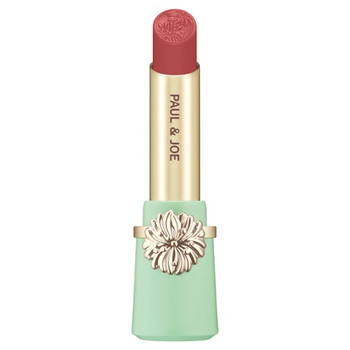
(Irresistible Lips C in 22 Natural Rose)

Irresistible Lips C in 22

RMK revamped its lipstick lineup a couple of years ago and launched three ranges. With Irresistible Lips B as the core range, Irresistible Lips M offers a satiny-matte finish while Irresistible Lips C creates a natural watery shine. (I bought 03 (a bright neon pink) from the Irresistible Lips C range when it was launched. I might review it a bit later. Before that, you can catch a glimpse of it here.)

22 Natural Rose is a muted rose-toned red that looks very elegant and is a great shade for fall and winter. It goes well with neutral eyeshadows as well as plums and warm purples, which are very on-trend for fall 2008.

What I like about Irresistible Lips C is its controllable color pay-off. One layer gives an ultra-natural tinted look that softly unifies the lip tone, an extra layer instantly imparts more color and shine, and a third layer creates extra volume for the lips with rich color. Typical of lipsticks from Japanese brands, all the different degrees of color pay-offs offer the beautiful sense of transparency (with no overly opaque finishes). The color wears well and doesn’t dry out the lips. The added scent is unusual among Japanese lipsticks (which are usually scent-free), but I like the very light cassis scent, which is never over-powering.

Overall, I think this is a very wearable collection and the shimmery neutral-toned colors are far from boring. It is particularly worth looking into if warm neutrals are your type of eyeshadow colors, and you will find shades for cheeks and lips that go very well with them.

(RMK is currently available in Japan, Korea, Taiwan, Singapore, Thailand, Maylasia, Hong Kong, and Macau. UK is the only country outside Asia where RMK is available. Please check here for all the RMK retail points.)

Related Posts:

Can’t Live Without – RMK Cleansing Oil N

Japanese Beauty Brands in the UK

Beauty City Guide – London

{ 6 comments }

(continued from Part 1 & Part 2)

3. Maquillage

(images from www.shiseido.co.jp/mq/)

2008 is the year when Maquillage started to grow on me. The fall collection includes shades of purple, plum, gold, and gentle neutrals, which happen to be the shades I have been wearing the most lately. Later on I will be trying out Forming Shiny Eyes in 52 (seen above), with an alluring combination of purple and gold (with a pale pink cream base). The collection also features twelve new shades of Lasting Climax Rouge, which debuted in spring and has been selling well in Asia.

2. Lavshuca

(images from www.kanebo-cosmetics.jp/lavshuca/)

When you don’t want to spend too much on makeup but still want quality and all the prettiness, you can almost always count on Lavshuca. A couple of items have been on my shopping list for a while (Dual Prism Eyes in PU-1 and Rouge Star Classics in (probably) PK-1). There are no limited-edition items in this collection so I will think about getting them after deciding which holiday 2008 items to have.

1. Coffret D’Or

For me, at this point, I think I can say that 2008 is the year of Coffret D’Or in terms of Japanese makeup. Launched just before the beginning of 2008 with a lot of expectation, Coffret D’Or has done well this year, both as T’Estimo’s successor, which continues to help shape the overall image of Kanebo, and for me as a makeup fan.

(images from www.kanebo-cosmetics.jp/coffretdor/)

Coffret D’Or’s solid fall 2008 collection does what the line is supposed to do, which is to create beautifully wearable shades with dependable quality for a wide range of consumers, from those wearing makeup on a regular basis to those new to makeup. With a price point lower than those of brands like Lunasol, it does have its own advantage.

Coffret D’Or is still expanding, and I think in 2009 we will see more new products. (The point makeup range hasn’t included basic items such as pencil eyeliners, and there will probably be more base makeup products. I am expecting to see an under-eye concealer pen that Revue used to have.) I certainly hope it will be worth the wait.

Related Posts:

Loving Japanese Brands – Lavshuca

Coffret D’Or Trance Deep Eyes in Rose Variation

Coffret D’Or Trance Deep Eyes in Grey Variation

{ 2 comments }

(continued from Part 1)

6. Anna Sui

(image from www.annasui-cosmetics.com)

Celebrating the 10th anniversary of its makeup line, Anna Sui has brought out Makeup Color Collection D as well as a new range of nail colors. (Please check this post for relevant information and a link to some actual photos of the makeup set.) Pricey as it is, it is one of those ultimate collectible items and I think it will only get more expensive as we come across it on auction sites.

5. Paul & Joe

(image from www.paul-joe-beaute.com)

Paul & Joe has been releasing the seasonal Sparkles collections in the past few years with original prints from designer Sophie Albou’s fashion collections. I don’t always love all the prints or the colors, but I like the overall look of this collection. I had a chance to test the items at the counter, and almost all the colors are pleasantly elegant and wearable. I was thinking about buying the eyeshadow and the lipstick in the cases with the pink bouquet print, but I personally think the print photographs slightly better than it looks in reality.

You can check out this blog post for more photos of some of the items.

4. Kesalan Patharan

(image from www.kesalanpatharan.co.jp)

Some of you might be surprised at Kesalan Patharan‘s 4th-place finish since I wasn’t overly impressed by the Eye Color Palatte in S007 that I bought and reviewed. But I think this reflects my view that there aren’t many outstanding makeup collections for fall 2008 and this well-constructed lineup is good enough to secure a spot in my top ten. (The collection also features three coordinating lipsticks and two blushers.) This is Kesalan Patharan’s rare appearance in my top ten.

Check out the final part of the countdown!

Related Posts:

Loving Japanese Brands – Anna Sui

Loving Japanese Brands – Paul & Joe

{ 0 comments }

It is time to count down my favorite fall 2008 makeup collections. In the next week or two, as usual, I will present them in reverse order (in three posts).

10. Awake

(image from www.awake.co.jp)

Purple shades will probably always get my attention, and Awake‘s fall 2008 collection certainly is very purple. Apart from the eye palettes, Awake’s Moon Illusion collection includes lip glosses and nail colors, both of which feature a purple shade. This is a small seasonal lineup with a very coherent look.

You can see a review of some of the items from this collection at Autumn Masquerade.

9. Jill Stuart

(image from www.jillstuart-beauty.com)

Packaging-wise, this is probably the prettiest makeup collection this season. The eyeshadow palette and blusher cases manage to look even more divine than the previous releases. But the color combinations are slightly predictable. Nevertheless, I will be looking forward to the spring 2009 collection.

Check out a review of some of the items (along with packaging comparison) at Musings of a Muse.

8. YSL

(images from www.ysl.com)

Even though I am disappointed with the Lilac Sky palette, which doesn’t suit me enough to worth a purchase, it doesn’t affect my view on this stunning-looking new range of 5-color eyeshadow palettes. The colors are rich and vibrant, with a mix of matte and shimmery shades. Whenever a magazine page features one of these, my eyes are usually immediately drawn to it.

7. Sonia Rykiel

(images from www.soniarykiel-cosmetics.com)

Sonia Rykiel‘s Actrice fall 2008 collection aims to capture the sophisticated glamour of silver-screen heroines. The colors seem lively but still easy to wear. The Quatre Eyeshadow Collection in 01 and 04 feature a soft lilac and violet respectively, while the limited-edition 06 has gold and silver in one palette. I haven’t tried anything from Sonia Rykiel after they changed the packaging from deep silver cases to striped ones, and I will definitely keep a mental note on the eye palette series.

The countdown continues in Part 2 and Part 3.

Related Posts:

Summer 2008 Makeup Top 10 –

Part 1
Part 2
Part 3

{ 6 comments }


Last month, I mentioned that, being a lilac fanatic, I was very interested in trying Kesalan Patharan‘s Eye Color Palette in S007 from the brand’s fall 2008 collection. I have now tried it for quite a few times and I am ready to share my thoughts with you. (A very brief brand profile of Kesalan Patharan is towards the end of this post.)


From left to right:
– medium lilac with sparkles and some very slight iridescence
– light blue with fine shimmer
– semi-matte aubergine with sparse shimmer

(All shimmer and sparkles are multi-colored.)


First of all, I have to say I am disappointed with the lilac. The powder seems to be on the dry side and lacks adherence to the skin, and it takes some layering to get the color on the eyelids. After that, as I try to gently blend the color, the sparkles start to come off a little. Throughout the day, the finish gradually turns dull and somewhat muddy. It certainly does not look like what you see in the pan.

On the other hand, the other two shades actually perform a lot better. I usually wear a light wash of the blue to go with the lilac, and the color shows up nicely and stays well (no turning dull). I don’t have any problem with the application and the staying power of the aubergine lining shade either.

It is a huge pity that the lilac doesn’t have an optimally flattering finish. Otherwise, this would be a beautiful and easy-to-wear palette and the coloration of the lilac should be very similar to the stunning one in Lunasol’s Sheer Contrast Eyes in Lavender Coral (which still reigns supreme as one of my favorite lilac palettes).

I thought I might talk a little more about the brand here. Kesalan Patharan is one of the few Japanese beauty brands that have an image of a professional beauty line. One of their best-selling products, I believe, is Sheer Micro Powder. It was chosen by Biteki readers as their favorite loose powder (in the February 2007 issue). It also happens to be the loose powder I have been asked about the most by my readers.

(Kesalan Patharan Sheer Micro Powder)
(image from www.kesalanpatharan.co.jp)

I have not used it, but I have been interested in it for a while. (One of my readers, Tammy, left a comment on this powder last year. You can have a look here if you are interested.)

(Kesalan Patharan is sold in Japan and some other Asian countries. Its official website is for information only and does not offer on-line ordering.)

Related Posts:

Coffret D’Or 3D Lighting Eyes in Purple Variation

Chanel Quadra Eye Shadow in Stage Lights

I Love Colors – Lilting Lilac

{ 2 comments }

(image from www.suqqu.com/japan.html)

SUQQU’s fall 2008 makeup collection has been released in the UK (in London’s Selfridges). From September 25th until 28th, there will be a fall 2008 makeup event at the counter. For a £30 booking fee (redeemable against any SUQQU purchase on the day), you will experience SUQQU’s unique gankin (facial) massage followed by a makeover using items from SUQQU’s fall 2008 collection.

(I got the information from the September 4th edition of Weekly Journey, which is a weekly paper mainly for Japanese people living in London. (Check here for its website.) Many thanks to my reader, Yasumi, for reminding me that Weekly Journey regularly features news of Japanese cosmetics in London!)

Related Posts:

Japanese Brand Profile – SUQQU

Japanese Cosmetics in the UK

Beauty City Guide – London

{ 2 comments }