makeup

(Coffret D’Or Beauty C Curve Eyes in 01 Gold Brown)
(images from www.kanebo-cosmetics.co.jp)

The Kanebo website now has the images of the five variations of the upcoming Beauty C Curve Eyes from Coffret D’Or’s late summer/ early fall 2010 collection.
(02 Rose Pink)

(03 Monotone Blue)

(04 Peach Beige)
(05 Khaki Green)

Even though there is no purple palette this time, I am still interested in trying one palette from the range. At the moment I am drawn to the (rather subtle) 04 Peach Beige.

(The Coffret D’Or website has also been updated to feature the late summer/ early fall 2010 collection.)

{ 4 comments }

Early last year, my friend Lynn (who reviewed items from Thierry Mugler) told me about Dutch makeup artist Ellis Faas, whom she read about on the February 2009 issue of W Magazine. (You can see the article here.)

Ellis Faas used to work on special effects as she recreated wounds and bruises for public service campaigns and music videos. Knowing that I loved purples, Lynn drew my attention to one of the things Faas said about purples:

During shoots, Faas, 46, noticed that the unsightly bumps and gashes she was trying to create were made up of hues that looked shockingly good against skin. “I started to use those colors in a beautifying way rather than a gory way,” she says. “Why not take the purple in a bruise and use it as an eye color? It’s a very natural thing to do.” (p. 74, W Magazine, February 2009)

I was fascinated by how Faas looked at colors. In the same article, she also mentioned pinks (from the palms of the hands) and browns (from pigmentations like freckles). Coincidentally, I mentioned in my report on makeup trends of spring 2009 that pinks, purples, and neutrals were the three main ways in which many beauty brands interpreted wearable colors. Faas’ philosophy on “human colours” provides her own perspective on why these colors are considered to be wearable and flattering and, on a more personal level, why I think pinks, purples, and neutrals look good on me.

Nearly all the items in Ellis Faas’ makeup line are in a fluid form and they are packaged in pen-shaped cases. Here are my thoughts on some of the items.


Creamy Eyes in E105 is a well-pigmented medium-to-dark brown. It has a mousse-cream consistency that feels light and fluffy. It spreads easily on the skin and has a velvety, suede-like, and semi-matte finish (with minimal shimmer). The staying power is very good.

It sets very quickly so blending has to be quick. I find that it is not very easy to fade the edges with fingers and that it works better in creating a dramatic block-color look (which you see in the link above). Personally I like it as an eyeliner. The brush makes it easy for the color to go on the lashlines smoothly and efficiently.


I tend to think I am far from the best person to review mascaras, because most mascaras don’t smudge or flake on me and they very rarely irritate my eyes. For me, Mascara in E401 Black is a standard mascara that performs relatively well. It lengthens and volumizes the lashes reasonably well, and the clumping is minimal.


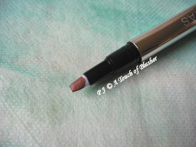
Creamy Lips in L101 Ellis Red is a well-pigmented and intense red that is slightly on the cool side. (It seems cooler than how it looks on the official website.) It has a lightweight gel-like liquid-to-cream consistency that does not feel heavy on the lips. It imparts a creamy sheen on the lips, and, applied light-handedly, it creates a stained look. The color is rich and dramatic.

Blush in S302 is my favorite item of the four. Before I tried it on my skin, I thought it might be too peachy for me. But it turns out to be a sheer peach that looks very natural. It is easy to apply as it has a lightweight creamy consistency that doesn’t drag on the skin. It can be layered for slightly more intensity.

I personally like blushers that are on the sheer side so this item appeals to me. If you like pigmented blushers, then it might be too sheer for you.

When I first got to know about the line, it wasn’t available in the UK. It was great to know later on that the line was launched in Liberty in London in February. It is also available at DollyLeo.com.

The French Vogue described Ellis Faas as “one of the most influential make-up artists of her time”. Her Human Colours makeup line carries a unique identity and is able to make a clear statement which reflects her views on beauty and colors. Whether you like your makeup to be natural or dramatic, you are likely to find items that work well for you.

(The items featured in this article are provided by Ellis Faas.)

Related posts:

New Japanese Beauty Brand: Addiction
(created by Japanese makeup artist Ayako)

SHISEIDO Luminizing Satin Eye Colors
(in collaboration with Dick Page)

SUQQU: Sensuality with an Attitude

{ 4 comments }

(continued from Part 1)

6. Paul & Joe

(image from www.paul-joe-beaute.com)


I think, for many people, the highlight of Paul & Joe’s spring 2010 collection is the Disney Character Collection, which features the Alice in Wonderland characters. For me, I also like the new eyeshadow singles (Select Eye Colors). A while ago, I was told by a Paul & Joe sales assistant that they might not be launched in the UK. But, fortunately, I recently saw them in Harrods. All the 25 shades are available here.

5. Maquillage

(image from www.shiseido.co.jp/mq)


There are five Eyes Creator (3D) palettes in Maquillage‘s spring 2010 collection. All of them feature light-to-medium colors, which look very wearable. I particularly like PK766 (with a hint of peach) and BR765 (with a hint of gold). The new shades of Eye Color N (Powder) include GD, BE, and BR shades as well.

4. Est

(image from www.kao.co.jp/est)


I still haven’t tried items from Est, but I nearly decided to go for a couple of items on several occasions. In the spring 2010 collection, I like the look of the Emotional Multiple Eyes palettes in 09 and 11. 09 reminds me of Magie Deco’s Shadow Brilliance II in Foxy Lady, while 11, with lilac, pink, and yellow gold, reminds me of Lunasol’s Sheer Contrast Eyes in Lavender Coral.

The countdown concludes in Part 3.

Related posts (on summer 2010 collections):

Paul & Joe

Aube Couture

Jill Stuart


{ 0 comments }

In my post on the makeup trend of spring 2010, I mentioned that quite a few orange-toned shades seemed to be appearing among Japanese cosmetics. Today, I am looking at a good example of this trend, Spring Modern Eyes in 03 Orangy Brown from RMK’s spring 2010 collection.

Top left: well-pigmented mildly metallic warm brown with a burgundy undertone
Bottom: moderately-pigmented shimmery light warm beige
Middle: lightly-pigmented mildly shimmery off-white
Right: sheer subtly shimmery soft peachy orange

The orange looks vibrant in the pan, but it is sheer and subtle when applied.

All the colors go on very smoothly, especially the light beige and the dark brown. The staying power of all the colors is good.

According to the application instruction enclosed with the palette, firstly, the light beige is applied on the eyelids. Then, the dark brown is used to line the eyes and the off-white is applied on the brow bones. Finally, the light orange is layered on top of the other three shades.

Based on this application, the effect is soft and warm. Even though the light beige and the orange are on the sheer side, they are not so sheer that they would just show up as shimmer.

I personally really like the light beige, which is a very good daytime color. It has the right (softly warm) tone for my slightly warm complexion and it adds subtle depth to the eyes. The multi-color shimmer also enhances the dimension of the eyes.

The orange imparts a touch of bounciness to the eye areas. It can be layered for slightly more intensity, but it doesn’t look gaudy or overly vibrant. It can also be used in the inner corners of the eyes or as a lower-eye liner for a very different look. I have not tried any shade similar to it before and I do find it to be quite wearable.

This palette is an interesting reinterpretation of warm neutrals. If the orange in this palette were a medium-to-dark beige, the palette would be relatively more ordinary. The orange certainly adds a bit of novelty and an element of surprise and discovery to the palette. It makes this palette worthy of a look even if you already have a few neutral palettes.

(The product featured in this review is provided by RMK.)

Related posts on RMK:

Summer 2010 Collection

Ingenious Powder Eyes

Powder Foundation EX

{ 6 comments }

Here we go, in reverse order:

10. Kate

(image from www.nikkei.co.jp)

(Diamond Cut Eyes in BR-3)
(image from www.kanebo-cosmetics.co.jp)

Kate is far from a regular on my seasonal top ten lists, but the line’s Gradical Eyes A series, with five tone-on-tone shades in each palette, has some soft-neutral options that appeal to me. (Also new for spring 2010 is Diamond Cut Eyes in BR-3, which is the kind of light-to-medium neutral palette that I would consider trying.)

9. SUQQU

(image fromwww.suqqu.com )

One of the things SUQQU is known for is its range of neutral-toned eye palettes. For spring 2010, the new additions are in the form of the limited-edition Noble Nuance Eyeshadow palettes. On the other hand, the star item of the collection is the multi-toned Noble Nuance Face Color.

8. YSL

(image from www.ysl.com)

(image from www.ysl.com)

Many major western brands, such as Chanel and Dior, have released relatively muted shades for spring 2010. This makes YSL‘s spring 2010 makeup collection stand out from the crowd. There are still wearable pinks and browns, but there are also more vibrant shades such as turquoise and deep violet. Lilac makes an appearance in the new Ombre 5 Lumières palette and the new La Laque nail color.

7. Elégance


(image from www.elegance-cosmetics.com)

The spring 2010 makeup collection from Elégance is also quite colorful. There are some interesting color combinations in the three new variations of the Phantom Eyes palettes (cool turquoise and warm pale pink, bright pink and mint green, and yellow and lilac). Eight shades of Eye Crayon also join the brand’s makeup lineup.

(The countdown continues in Part 2 and Part 3.)

Related posts:


Spring 2009 Makeup Top 10 Part 1, Part 2, and Part 3

{ 2 comments }

(Chanel’s spring 2010 makeup collection)
(image from www.iswii.net)

I nearly decided not to post a round-up of the makeup trends of spring 2010 because, unlike some of the previous seasons, there are not many clear makeup trends for spring 2010.

Nonetheless, one noticeable trend for this season is the continuation of medium-to-warm neutrals from previous seasons. They are relatively easy to wear and they suit many types of complexions. They also suit most occasions and you can wear them later on in summer and in the rest of the year. Chanel and Estée Lauder are two of the brands that have released these wearable neutrals for spring 2010.

(Estée Lauder Michael Kors
Eyeshadow Duo in Blonde Mink)
(image from www.esteelauder.co.uk)

Also, Kosé’s Visée released Glam Nude Eyes, in which all five variations are neutral-based, many of which are warm-toned.
(Visée Glam Nude Eyes)
(image from www.visee.jp)

One related trend that is worth mentioning is the appearance of orange-toned eyeshadow shades from Japanese lines. (All of the three lines mentioned below happen to be under Kanebo.)

Firs tly, apart from the usual neutral options such as BR-1, BR-2, and GD-1 in Kate‘s Gradical Eyes A, there is an OR-1, which is the kind of variation that is less often seen in Japanese cosmetics. I think it is an interesting reinterpretation of wearable warm neutrals.

(Kate Gradical Eyes A in OR-1)
(image from www.kanebo-cosmetics.co.jp)

(Kate Gradical Eyes A)
(image from www.iswii.net)

Coincidentally, the Spring Modern Eyes series from RMK (which is ultimately owned by Kanebo) includes the Orangy Brown variation.

(RMK Spring Modern Eyes in Orangy Brown)
(image from www.rmkrmk.com)

Coffret D’Or already released an orange-toned shade in Color Mixing Eyes’ Orange Brown Mix from summer 2009. The orange trend seems to continue into summer and fall, as it appears that the line’s late summer/ early fall 2010 collection will also feature an orange-toned shade in one of the new Beauty C Curve Eyes palettes.
(Coffret D’Or late summer/ early fall 2010 collection)
(image from www.nikkei.co.jp)

(I will be featuring Coffret D’Or’s Color Mixing Eyes in Orange Brown Mix and RMK’s Spring Modern Eyes in Orangy Brown later on.)

{ 2 comments }

(From left to right: Revlon Super Lustrous Lipglosses
in Lilac Pastelle, Pink Pop, and Coral Reef)

For Spring/Summer 2010, Revlon has released its first color makeup collection with Gucci Westman, the brand’s global artistic director. Today I am featuring three of the five new shades of Super Lustrous Lipgloss.

All these three shades are bright and well-pigmented, and they don’t contain any shimmer. They have a glossy vinyl finish that lasts well. A thin layer is enough to give the lips a gentle pop of color, and a second layer adds a considerable amount of shine and color and creates a liquid-lipstick look.

Coral Reef (right in photo), when applied light-handedly, is a relatively natural shade for my medium-to-warm complexion. But I personally slightly prefer Pink Pop (middle), which is quite versatile. One thin layer of it gives the lips an elegant rosy-pink look. With more layers, the color turns more vibrant and closer to a hot pink.

I thought I would like Lilac Pastelle (left) at least as much as I would like the other two, but it turns out to be a little too pale for my light-to-medium skin tone. (I might like it more if it were a lot sheerer.) I think it should suit those with a fair skin tone a lot better. It might also work for you if you like a relatively nude look for the lips.

The rest of the collection includes two other shades of Super Lustrous Lipgloss (in Peach Petal and Fire Cracker), two Nail Colours (in Minted and Lilac Pastelle), and one (limited-edition) ColorStay Eyeshadow Quad in Summer Suedes.

(The products featured in this review are provided by Revlon.)

Related posts:

Coffret D’Or Jewelcious Eyes in Purple Amethyst

Natural Makeup Recommendations (2 of 3): Cheeks & Lips

Dior Lady Dior in French Chic

{ 4 comments }

(images/info from www.cosme.net)

Sofina Aube Couture will release its early fall 2010 makeup collection in Japan on June 15th. The collection features:

– Designing Shine Eyes (above, 5 variations)

– Designing Stay Rouge (8 new shades)

– Designing Premium Rouge (8 new shades)

Related posts:

Aube Couture Summer 2010 Collection

Aube Couture Spring 2010 Collection

From My Treasure Chest (2) – Sofina Aube Rouge Dressious

{ 0 comments }

In the last few seasons, I have been picky about what makeup items to buy. However, I couldn’t resist Coffret D’Or‘s Jewelcious Eyes in 05 Purple Amethyst. Firstly, it is purple, and, secondly, it is Coffret D’Or.

The Jewelcious Eyes series is part of Kanebo Coffret D’Or’s spring 2010 collection, and there are five variations available. I was also interested in 04 Amber Beige, but, after seeing some photos of the palette, I thought that it might be too cool-toned for me.

The four shades in 04 Purple Amethyst are:

Left: sheer off-white with subtle shimmer
Right: moderately pigmented medium purple with pearly multi-colored shimmer
Bottom: well-pigmented dark charcoal-toned purple with sparse shimmer
Center: multi-colored sparkles (with little pigment)

All the colors have a good staying power.

I thought the medium purple might be a little too cool for me, but it actually goes on warmer than it looks in the pan and it turns out to be a shade that suits me quite well.

One of the selling points of this series is the “Jewel Shower” shade in the center of the palette. It is meant to be used over the eyelids as well as along the inner corners of the eyes to add some intense sparkles. I was worried that the sparkles would not stay put on my lids, but they do have a good adherence to the skin and there is very little fallout. The sparkling effect lasts throughout the day. (Personally, I think the shade is better suited for evening makeup.)

(I like the design of the case.)

In terms of the purple shades in the Coffret D’Or palettes that I have, the one in this palette is warmer than the one in Trance Deep Eyes in 04 Grey Variation and cooler than the one in Shine Accent Eyes in 02 Pink Variation. Overall, I prefer this palette to the other two, but I think 3D Lighting Eyes in 04 Purple Variation is still my favorite Coffret D’Or palette.

Related posts on Coffret D’Or:

Late Summer/ Early Fall 2010 Collection

Summer 2010 Collection

Color Mixing Eyes in Lavender Purple Mix

{ 18 comments }

(images/info from www.joseishi.net/voce)

Sonia Rykiel will release its summer 2010 makeup collection in Japan on May 1st. The collection includes:

– Ombre D’Été (above, 5 variations)

– Gloss D’Été (3 shades)

– Shiny Nail Color 2010 (3 shades)

– L’Atout Éclat Supreme 2010 (1 shade)

– Poudre Visage D’Été (1 shade)

All the items in this collection are limited editions.

Related posts on Sonia Rykiel:

Spring 2010 Collection

Fall 2009 Collection

Japanese Cosmetics Focus: Sonia Rykiel

{ 2 comments }