makeup

(Paul & Joe Face Powder in 03 Ambre)

I bought Paul & Joe‘s Face Powder in Harrods in London during the winter sale just a few weeks ago. At 50% off (13 pounds), it was a good bargain. (You can read about some of the huge savings people can make on cosmetics in the UK during the seasonal sales.)

The reason why it was reduced is that Face Powder was replaced by Face Powder N last year, so the Paul & Joe counters (both in Harrods and Fenwick) were clearing out this previous version. (The comparison between the two versions will be made towards the end of this post.) I hadn’t tried the loose powder by Paul & Joe before so I thought I’d try it at this reasonable price.

Like Anna Sui’s loose powder, the case is quite bulky, but I absolutely don’t mind. (I do like my makeup items to have a substantial look and feel.)

(the case and the puff)

Also, like Anna Sui’s loose powder, the cap simply rests on the loose powder container. This can also make transporting the case tricky. I have heard about many “accidents” where the whole case is tipped over and half of the powder ends up on the floor. (Basically, this loose powder is one of the best candidates for the centerpiece on your glamorous dressing table. It is probably not even suitable for trips around your home.)

(The cap simply goes on the silvery rim.)

The similarity to the Anna Sui powder continues. The refill is in a closed round paper container. The top is cut off to reveal the powder.

(I followed the dotted lines…)

Then, the powder container goes back into the loose powder case. The sift is simply placed on top of the powder.

(It is finally done…)

I know that many people really don’t like this design, all the way from the case to the refill and the sift. It all seems quite fiddly. I personally don’t have problems with them. I think it has that delicate “handle with care” quality that can really appeal to me sometimes.

What I do have a problem with is the powder puff. Imagine your puff for your loose body shimmer and this is basically it. First of all, it is too hairy and fluffy for an even application. All I can do is very lightly dust the powder on the face. There is no way I can press the powder onto the skin evenly and have the powder diffuse the look of the pores. Secondly, the core of the puff is solid, so I can’t rub the two sides of the puff against each other to make the puff drink in the powder evenly. The powder can only sit on top of all the fluffy hair, and this simply doesn’t help with an even application. So, I use one of my other loose powder puffs instead.

Onto the finish of the powder itself. I have often heard that Paul & Joe’s base makeup line (primers, foundations, concealers, and loose powder… particularly the foundations) is all about creating a sheer and ultra-natural look. This is certainly what this loose powder offers. Because 03 Ambre is quite a good match with my skin-tone, it goes on almost invisibly, as it imparts a very light air of luminosity. The powder does have shimmer, but it is quite fine and sparse. The finish is very gentle and subtle and is not visibly either matte or glowy.

If you like an ultra-natural barely-there look, then this loose powder is worth trying. But I usually like my loose powder to give me a matte finish and to have a good pore-diffusing and sebum-controlling ability.

While at the counter, I noticed that the new version of loose powder (Face Powder N) is almost completely shimmer-less. It will probably give me the matte finish I like. Also, the shade in #02, which is the closest to the #03 Ambre that I have, seems, in a good way, slightly less pinkish and more yellowish. This would be the shade I would go for if I decide to try the current version. Also, it seems that #03 (of the new version) is one of the darkest loose powder shades from a Japanese cosmetics brand. If you have darker skin-tones and find it difficult to find a loose powder from a Japanese brand, then this shade might be worth a look.

Over all, Paul & Joe Face Powder is all about subtlety. I will definitely continue to enjoy using it sometimes, but I will reach for some of my other loose powder options when I need a truly finished look.

(One note: I think the Paul & Joe Face Powder, which I am reviewing here, might have also been replaced by Face Powder N in some other countries. But, some of the authorized Paul & Joe on-line sellers in the UK, which are listed on the Shop Info page of the English Paul & Joe Beauty website, are still carrying the Face Powder. I believe some of them ship internationally.)

Related Posts:

Paul & Joe Foundation Primer N
(a very effective and well-rounded primer)

Paul & Joe Lip Gloss N in Black-Tie

(my favorite Holiday 2007 item)

Loving Japanese Brands: Paul & Joe
(my personal take on Paul & Joe)

Lavshuca Face Powder
(my current favorite loose powder)

{ 6 comments }

(Prescriptives Magic Liquid Powder in Red Neutralizer,
Creamy Eye Color in Moonstone,
Plush Blush for Cheeks and Lips
in Ibiza Sunset (left) and Balinese Peach (right))


Here is the report of my latest Prescriptives trials. Please enjoy!

Creamy Eye Color in Moonstone

(Prescriptives Creamy Eye Color)
(image from www.prescriptives.com)


This product has quite a thick cream texture. It dries up very quickly upon application, so swift blending is vital. Moonstone is a white with a pearly sheen and some shimmering particles.

What impresses me the most is how the color and shimmer stay put. Once it dries, the color really sets on the lids. It doesn’t smudge or move. Also, with Moonstone’s bright hue, I am surprised to see that the finish stays fresh for hours. Throughout the day, it always appears that I’ve just put it on and there is very little fading.

Plush Blush for Cheeks and Lips in Balinese Peach and Ibiza Sunset


(Plush Blush for Cheeks and Lips)
(image from www.prescriptives.com)


On the Prescriptives website, this product is accurately described as providing “a sheer wash of dewy color” for the cheeks. The finish is indeed very sheer. Even for someone like me, who likes medium-to-sheer blushers, I think they are a bit too sheer. (The color won’t show very well unless you have a very light skin-tone.) What the product adds is mostly a dewy sheen to the cheek area. Used for the lips, they offer a semi-matte finish with a soft metallic sheen. Again, there is only a very sheer veil of color.

Balinese Peach has a slight tinge of warm pink, while Ibiza Sunset is a very sheer warm gold with a little more shimmer.

Magic Liquid Powder in Red Neutralizer

(Magic Liquid Powder in Red Neutralizer)
(image from www.prescriptives.com)

This product claims to minimize lines, pores, and wrinkles and to mute redness. For me, it doesn’t minimize pores. (It certainly doesn’t minimize my pores nearly as well as some of my other loose powder.) Also, it doesn’t neutralize redness. It does provide a golden sheen, which is supposed to even out redness. But, at least on my face, it doesn’t do what it is supposed to do. The powder mainly gives a bit of soft luminosity to the skin. For me, I’d like my loose powder to do more.

Part of the powder does melt in contact with skin and provides a pleasantly cooling sensation. Usually I use a powder puff to apply loose powder, but, with this, the application is much more successful with a fluffy powder brush.

Other Prescriptives Reviews:

Flawless Skin and AnyWear Foundations

Magic Illuminating Potion in Red Neutralizer, Better Off Fast-Acting Makeup Remover, and Site Unseen Brightening Concealer

Related Posts:

Lavshuca Face Powder in Lucent

(It has everything I want from a loose powder!)

Makeup Essentials: White Eyeshadows
(Brighten your eyes with them!)

Anna Sui Face Color Accent

(Beautifully packaged and gives you rosy cheeks.)

{ 0 comments }

A Touch of Boots No. 7 Blusher

by PJ on Thursday, January 24, 2008

in -Boots, makeup, makeup - blusher

(My two Boots No. 7 Cheek Colour:
Soft Damson (left) and Petal (right))
.

Apart from my lovely Boots points, another thing I love about Boots is that they regularly give out £5 vouchers to be used on a variety of brands (with a transaction over 10 pounds), which usually include No. 7. So, I often use my vouchers to stock up my No. 7 favorites and to try new items.

I got both of these blushers with my vouchers. The retail price is 7.5 pounds so I only paid 2.5 pounds for each of them.

I like the blushers from Boots No. 7 mainly because they are matte and because they are medium-pigmented. The two I have got, Soft Damson and Petal, are both very wearable colors.

(Left: Soft Damson; right: Petal)


I got Soft Damson first. It is a dusty pink that shows very well on my cheeks. It is a very nice shade with a sophisticated edge. But after I used it for a couple of times, I was thinking about getting a slightly lighter shade. So I got Petal, which is indeed like the shade of petals of a pink rose. This is a really flattering shade for me and I think I slightly prefer this to Soft Damson.

Another thing I like about No. 7 blushers is that the powder is nicely pressed. It is not pressed so hard that it is difficult to pick up the powder with a brush, and it is not too softly pressed that the brush can pick up too much powder and that the powder flies around. Also, the shape of the compact makes it very easy for the blusher to rest in the palm while I concentrate on using my brush and applying the color.

Overall, I like these two blushers and these are two more reasons why No. 7 is a wonderfully affordable and dependable line from the trusted Boots.

Related Posts:

No. 7 Gentle Renewing No Grains Exfoliator
(another of my No. 7 favorites…see how it actually works)

Chanel Irréelle Blush in Tea Rose
(one of my all-time favorite blushers)

Ayura Aura Veil α in Sweet Pink
(a cutie in my blusher world)

{ 4 comments }

(my trusted beauty database)

A while ago, I wrote about Biteki, my favorite beauty magazine. Today, I am focusing on an element of Japanese cosmetics magazines such as Biteki and Voce that makes western equivalents pale in comparison.

With Biteki, four times a year, it has a grand seasonal makeup catalog (March for spring, June for summer, September for fall, and December for Holiday). The feature is about 30-page long for spring and fall and slight shorter for summer and Christmas.

Voce, another top cosmetics magazine in Japan, does things similarly. For example, in the seasonal makeup catalog from the February 2008 issue of Voce, you will find, under each brand:

(Givenchy spring 2008 collection
in spring 2008 makeup booklet,
Voce, February 2008, p. 28-29)


1. clear photos all the new items and shades
2. names of the products
3. all the shade names/numbers
4. retail prices in Japan
5. whether they are limited editions
6. promotional image
7. all the products featured in the promotional image
8. a short description and analysis of the collection

Obviously, you don’t really need to understand any Japanese to enjoy browsing the catalog.

Even though I do like the booklets that both Biteki and Voce do now, I slightly prefer Biteki’s old way of presenting the seasonal collections, as they used to have a lot of actual-size photos of the items. Packaging is as vital for me as the actual products, so knowing the actual sizes of products can be very helpful.

(Right: Ayura Lip Retouch Compact
Left: actual-size photo on Biteki March 2005, p.53)


The past catalogs might seem less useful, but, for me, they are just as important. I often refer back to past catalogs to confirm when a certain item was released, whether it was a limited edition, and whether a certain shade is a repeat in a new packaging. I also go back to previous catalogs just to reminisce past collections and to trace a brand’s evolution. I have been buying/subscribing to Biteki ever since its debut issue in May 2001, so what I have, right at my fingertip, is an archive of all the seasonal items from all the major Japanese and international brands in the last six and a half years. The size of the archive will only grow bigger.

(Chanel fall 2001 collection,
from Biteki September 2001, p. 50)


On a related note, twice a year, usually in May and October, Biteki does a seasonal base makeup feature/catalog, focusing on the new primer/concealer/foundation releases.

(part of the fall 2007 foundation feature,
Biteki October 2007 fall foundation booklet, p. 28)


Some time ago, a friend asked me why beauty magazines in the west simply don’t do this. Obviously I don’t really have an answer, but I have some speculations.

1. There is very little competition in the west. In the US, I think Allure is the only major beauty magazine. In the UK, we don’t really have any. In Japan, there are very major ones like Biteki, Voce, and Maquia. They are not obscure magazines. In Japan, they are the Vogue, Elle, and Harper’s Bazaar in the beauty world, and there are other less major ones. These magazines strive to be the best and offer the most comprehensive information, and the readers are the ultimate winners.

2. The relationship between cosmetics companies and print publications seems different in the west. It appears to me that it is either that the magazines only want to cover new releases selectively or that the cosmetics companies don’t want the readers to have full information of the lineup and the release dates from magazines.

3. I have sometimes come across articles implying that many aspects of the cosmetics industry in Japan are at least a decade ahead of the west. Perhaps this is one aspect of it, even though it is not all about the cosmetics industry itself. Maybe there will be more thorough seasonal makeup release coverage…in some years’ time. (But, at lease in the UK, we need to have that beauty magazine first!)

For me, in a way, it doesn’t really matter whether western beauty magazines will do anything similar. They will not be covering all the Japanese brands that are popular all over Asia, and, in my opinion, cosmetics magazines in Japan have been covering western cosmetics brands better than western magazines…

Other Beauty Phenomena:

Seasonal Beauty Sale in the UK

“Can I return this, please?”
(It depends on where you are.)

“Would you like some samples?”
(How can you get just a bit more?)

{ 14 comments }

(Ferro Ultimate Foundation)


Ferro Cosmetics is one of the many mineral makeup lines in the market today. I have been particularly interested to see if their Ultimate Foundation does create a matte finish and a medium-to-full coverage, which I personally look for in a foundation.


— Ultimate Foundation
(pictured above)


“Full coverage with matte finish” is what is stated on the packaging, so the stakes are high. Upon application, this foundation, out of all the mineral makeup foundations I have tried so far, is the only one that gives a truly matte finish. It is also the one that has the best coverage and the most convincing pore-diffusing property. (The medium-to-full coverage is more easily achieved with a dense flat-top brush, which, compared with a kabuki brush, also gets to the awkward areas around the nose and the eyes more thoroughly.)

However, while the matte finish does maintain for a couple of hours, one drawback is the finish later in the day. As my face gets oily, an unnatural metallic sheen starts to appear and it is hard to blot it completely off with my usual blotting paper.

This seems to be a general problem with mineral foundations. My observation is that the powder itself doesn’t really absorb facial sebum and that the sebum tends to float on top of the foundation. (But if you don’t have oily skin, then this might not be a concern.)

— Blushers

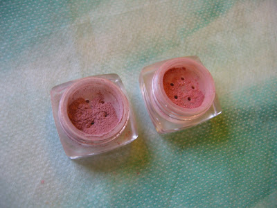
(Blusher in Bashful (left) and Pinkie Swear (right))


Bashful looks like a dusty pink in the container and it goes on as a nice cool pink. Pinkie Swear looks like a soft warm pink and it goes on with an orange undertone. While Bashful would be a good shade for me all-year-round, Pinkie Swear would probably be a wearable summer shade.

The powder is well-pigmented, so a tiny bit goes a long way. The finish is nicely luminous. The staying power is fair but I do wish it could be slightly better.

Eyeshaodws

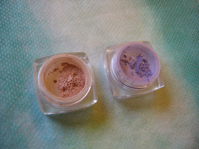
(Eye Candy Pearl in Secret (left),
and Eye Candy Shimmer in February (right))

Eye Candy Shimmer in February is a very pretty lilac shade with noticeable shimmer and fine sparkles. A very trendy shade for spring 2008.

Eye Candy Pearl in Secret has a champaign hue with a pale skin-beige undertone. I think it is a good multi-purpose item. It is a great shade to be worn alone to brighten up the eyes. It can also be used sparingly in the immediate under-eye area for the same purpose. I also think this is a nice and subtle highlighting shade for the brow bone and the T-zone.

Both shades are quite well-pigmented and long-lasting. (As with other loose powder eyeshadows (mineral or non-mineral), the eye areas should be properly primed with enough moisture so the color shows up better and stays on longer.


— Bronzer


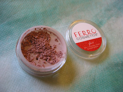
(Glow Bronzer in Glow Baby)

Glow Baby is a natural bronzing shade with a luminous finish for people with light and light-to-medium skin-tones. It can also be worn as a blusher for people who like beige-tone blushers. (A couple of other shades, like Spring Kiss and Autumn Kiss, are perhaps too orange for most skin-tones.)

Compared with the other mineral makeup lines that I have tried, I think the quality of Ferro is fairly good. I particularly like the two eyeshadows and the blusher in Bashful that I mentioned above. But, at the moment, I still can’t see myself switching to mineral foundations. They seem to share many traits that don’t go along with my oily skin. As a whole, they pale in comparison with many other non-mineral foundations that I have used. Only time will tell if there will be improvements in this particular aspect…


Other mineral makeup reviews:

Von Natur (Part One)

Von Natur (Part Two)

Erth Minerals

{ 10 comments }

(sales ad from Selfridges & Co.)

(image from www.selfridges.com)

I was surprised when I went to my first seasonal sale in London years ago (at the start of the winter sale on December 27th). In the most high-end department stores, a lot of limited-edition beauty items from a couple of seasons ago had a mark-down between 30 to 50 percent. I didn’t expect to see them, but then they were back and stacked up at the edge of the counter.

I soon realized that, during seasonal sales in the UK, cosmetics items are reduced just like clothes are.

There are mostly 4 types of beauty products that are marked down in UK seasonal sales:

1. Seasonal gift sets, especially fragrance sets. (Christmas fragrance sets usually have a 30% mark-down right after Christmas. Many people stock up their favorite fragrances at this time of year.)

2. Limited-edition makeup items. Dior, YSL and Guerlain do this the most, among many other (mostly French) brands.

3. Discontinued and soon-to-be discontinued products. If I see a couple of products from a brand’s current lineup being reduced massively (sometimes up to 50%), I know they are going to be discontinued very soon. (Or, if I know something is going to be discontinued or replaced, I’d expect it to be on sale.)

4. Surplus stock of makeup shades that are less popular.

So here are just some of the things I saw this time:

— Guerlain’s Pucci collection (limited-edition, summer 2007), 50% off
— Guerlain’s 4-color eyeshadow palettes, 50% off (the new range has replaced these).
— YSL Palette Esprit Couture (limited-edition, fall 2007), 30% off
— YSL limited-edition items for summer 2007 and holiday 2006, 50% off
— Dior Diorissime palettes (limited-edition, fall 2007), 30% off
— Various Dior eyeshadow palettes and lipsticks, 30% off
— Paul & Joe’s discontinued base makeup items (change of packaging and formulation in summer 2007) and the full nail color line (soon to be replaced by a new nail color range), 50% off.

For the first time, I saw fall limited-edition makeup items, such as Diorissime palettes, reduced right after Christmas in the same year. But, with spring collections out earlier and earlier, maybe it is not all that surprising.

I have always been in two minds about all the clearing out. Of course it is nice to buy things at reduced prices. I have bought some lovely Paul & Joe items during the sale for very affordable prices.

However, even though high-end brands have a certain image and cache that they try hard to maintain, some of them still haphazardly stack up discounted palettes at the counter. Lip glosses are bundled up in rubber bands and put in plastic boxes. I can’t help but feel that this is rather unsightly and that the only thing they aim for during the sale is to get some stock space back. It doesn’t really reflect elegance and sophistication.

(True to its Japanese roots, Paul & Joe’s attention to detail during the sale stands out. In Fenwick on Bond Street, Paul & Joe’s reduced items are usually lined up neatly on a small and simple round table next to the counter. No plastic boxes or rubber bands…)

As I understand, there are clear-outs like this in the US for brands that are going to be discontinued. But it appears to me that seasonal limited-edition makeup items from high-end brands are not usually marked down regularly like they are here in the UK.

In some other countries (as well as in the US), I am aware that there are similar seasonal beauty clear-outs, but they are done in companies’ warehouses or headquarters. These events can be slightly more exclusive in terms of how they publicize the event information.

Are cosmetics items reduced regularly like this in your country? Let us know!

Voice more of your opinion on:

Can I return this, please?
(Can you?)

You Mean It’s Not Real?
(Are there problems with mascara ads?)

Japanese vs. Western
(Which side are you on?)

{ 14 comments }

(Kanebo Coffret D’Or 3D Lighting Eyes)
(image from http://www.kanebo-cosmetics.jp/coffretdor)

Kanebo’s new makeup line, Coffret D’Or, was launched on December 16, 2007 in Japan. (The line is also available in Hong Kong and Taiwan as far as I know.) It is replacing the color makeup line T’Estimo and the base makeup line Revue.Upon seeing the first few images from the line a couple of months ago, I was not very enthusiastic. I thought the packaging was not particularly outstanding and the range of shades was not immensely imaginative.

However, as I saw more and more sneak-peek photos of the collection, Coffret D’Or’s debut lineup started to grow on me. I decided that I would try something from the line.

In many Japanese brands, I think the eyeshadow palettes play an important part in defining the image of the brand, in terms of both packaging and shade combinations. Their 3D Lighting Eyes in 04 Purple Variation really caught my eye. So there was no question which item I would want to try first.

I like the packaging of the palette. It is like a small gift box wrapped in jeweled ribbons. (Many Japanese brands are able to do cute and elegant at the same time without ever appearing tacky.)

04 Purple Variation faces severe competition with my other lilac-based palettes.


The individual shades deserve a detailed mention. First of all, the upper white strip consists of two finishes. (In the photo, you can see that the left half is slightly whiter than the right half.) The right half is a medium pigmented white with very fine multi-color sparkles. The left half is sheerer and has slightly larger multi-color sparkles. The two parts are meant to be used together
as a base (swept across with a brush or a wide sponge-tip) but they can still be used individually. I think the reason the two halves are packaged like this is to showcase the variation of sizes of sparkles and the multi-dimensional effect that they can create together (the namesake 3D effect, I suppose).

On the second row, from left to right:
— a dusty pink with very smooth shimmer and very fine sparkles (medium pigmented)
— a sheer and very pale blue with mild shimmer and slightly larger multi-color sparkles (not glitters)
— a well-pigmented muted violet with sparse multi-color sparkles

The dusty pink has a very mild warm mauve undertone and the pale blue has a hint of cool pale lilac undertone.

The palette is a joy to use. The texture of the powder is very smooth, the shades go on very easily, and blending is effortless.

What some people like about eyeshadow palettes of some Japanese makeup lines is that there are step-by-step instructions on how to use a palette to create the look that it is designed to create and to achieve the look in the promotional image.

(instructions on the back of the outer packaging)
(Please click on the image to see a larger version)


These instructions are very useful for people who may be wary of using 4 or 5 colors on the eyes at the same time and for people who might not feel comfortable asking sales assistants for application tips.
Before I explored other possibilities, I decided to follow the instructions to see what this palette can do for me. I was very pleased. The main idea of this range of palettes is to use the B shade (please refer to the photo above), which is slightly darker and less sparkling, in the outer 2/3 above the eyes to create subtle shadowing and the C shade (paler and more sparkling) in the inner 1/2 above (which overlaps the B shade) and below the eyes to make them pop.

I put the two photos together so you don’t need to refer back and forth:


The finish look is very soft, natural, and sensual, as the B and C shades are both relatively light. But the palette manages to very effectively enhance the dimension of the eyes. I think the delicate variation in shades, pigmentation, shimmer, and sparkles in this palette is a success. Every single element in this palette is doing something that you can see.
 

Out of the five promotional looks (modeled by five Japanese actresses as brand ambassadors for the line), I think the look presented by Tokiwa Takako best demonstrates the eye-sculpting effect of this range of eyeshadow palettes:


(Tokiwa Takako for Coffret D’Or)
(image from http://www.kanebo-cosmetics.jp/coffretdor)


(Please note that Tokiwa Takako is using the 3D Lighting Eyes in 05 Gold Variation.)

The instructions seem to aim for a fresh and elegant daytime look. For a more intense evening look, smudging the violet shade further (instead of using the shade to simply line the eyes) will add more drama. (I tried that and it worked very well too.)

Overall, I adore this palette and the soft and understated look that it creates. The shimmer is smooth and velvety, and the multi-color sparkles are delicate but vibrant.

If you prefer a lot of impact for the eye makeup, then this range of palettes might not appeal to you as much. But perhaps Coffret D’Or will bring out more intense color combinations later this year. Judging by the quality of this palette, I think it is worth the wait…

Updated on January 28, 2008:

If you are interested, there are reviews of 02 Blue-Green Variation on My Women Stuff and Mostly Make Up.

My other lilac-based palettes, along with a very short comparison (please click on the links for full reviews):

Jill Stuart Brilliance Eyes in 04 Gem Amethyst
(The shades are sheerer and there are larger sparkles.)

T’Estimo Frame Impact Eyes in 03

(The lilac shades are cooler and there is a wider range of lighter and darker shades for a more intense look.)

Lavshuca Eye Color Select in PU-2
(This palette from Lavshuca’s fall 2007 collection is overall a slightly darker and warmer version of the Coffret D’Or one.)

Please feel free to leave your comment if you’d like to ask me for more comparisons among these palettes and shades!

{ 22 comments }

(image from www.sephora.com)

The CK Calvin Klein Beauty line is now up on the Sephora websites in the US and Canada (thanks to a friend who alerted me to this).

This is the first time I was able to have a slightly better look at the range of the collection. It appears that the initial lineup provides a palette of wearable colors, which is obviously typical of a debut lineup (or re-debut in this case). Not particularly edgy or trend-sensitive at this point, but we will see how things evolve.

Just a few things that are on my list of potentials:

Tempting Duo Intense Duo Eyeshadow

#213 Silky Sunset
seems to be a nice combination of pink and lilac. It would be interesting to compare the texture and finish of the lilac eyeshadow in this duo with other lilac eyeshadows I have.

Flush with Desire Velvet Blush

#101 Shiver and #104 Desire both appear to be wearable for me. I am suspecting the finish of this blusher range to be semi-matte.

Subliminal Purity Mineral Based Loose Powder

I am still in my loose powder phase and I would be interested in trying this out.

If you have tried any item from the new line, please do let me know. I’d love to hear from you! The line should be launched over here in the UK soon, and it would be great to hear what you like and don’t like about the new beauty line.

Related Posts:

Calvin Klein Launched in Hong Kong
(Check out the photos of the counter. It seems that there are more color choices for some of the items, such as the two types of lipsticks.)

Bring It Back! Calvin Klein Cosmetics

(Compare the packagings of the two lineups.)

{ 6 comments }

MAC A-Mei Color Collection Out Now: Further Update!

by PJ on Friday, January 11, 2008

in -MAC, makeup

My post on MAC A-Mei Collection has been updated with a link to photos of the MAC storefront display featuring the collection, counter display, and color swatches.

(Please scroll to the end of the post, and enjoy!)

{ 2 comments }

(L.U.C.I.: Lancôme’s spring 2008 collection)
(image from www.lancome-usa.com)

(promotional image in the UK)
(Notice the differences!)


You have probably read from great beauty sites like Makeup Bag about Lancôme’s spring 2008 collection.

I saw the collection in the shops a while ago. Then, as I was reading about the US release, I noticed some differences in what the collections consist of. While the L.U.C.I Eyes palette (in the seashell shape) sold in the US has the bronze shade, the two sold in the UK feature turquoise and blue. (The bronze option doesn’t seem to be available here.)

On the UK promotional image, both models are wearing the turquoise palette, which the model on the right (Daria Werbowy) is holding in her hand.

Moreover, all three palettes are available in Japan:

(image from www.lancome.jp)

The collection, L.U.C.I. (which stands for “Luminescent Ultra Colour Intelligence”), is Gucci Westman’s last collection for Lancôme. The identity of this collection is marked by the iridescent reflectiveness in various items.

I was paying particular attention to the shades of the shimmer and iridescence. For the L.U.C.I Eyes palettes, the white shade in A Ray of Green Light (the one with the turquoise) has yellowish green iridescence, while the one in A Ray of Blue Light has lilac iridescence.

Other iridescent/shimmer hues can be seen in:

The pale Color Fever Shine lipstick: pinkish lilac iridescence
The pale Color Fever Gloss: blue shimmer (not iridescence)
Ombre Glacée (in A Ray of Pink Light): pink iridescence
Traceur Design Eyeliner: lilac iridescence
The pink nail color: subtle blue iridescence

Some of the iridescent hues are quite intense, especially those from the white shades in the L.U.C.I. Eyes palettes.

This collection is certainly very unique and has a coherent concept and a distinctive look. For this, this collection deserves accolade, and I think makeup fans will constantly refer back to some of these items.

For me personally, even though I love blue-tinted lip glosses and lilac eyeshadows, I surprised myself by not being overly excited about this collection. I think I prefer the iridescence to be slightly more subtle. (I’d have to be very careful and use these shades very sparingly.)

But, if you like iridescent shimmer, you can surely add an eye-catching accent color to your eyes, lips or nails with this collection. Or, if you like a bit of an edge, then some of these items are definitely worth checking out.

Related Posts:

Dior Holiday 2007 Collection
(Again, notice the more extensive Dior Holiday 2007 range in the UK and Japan)

My Shopping List for Japan
(more things that can’t be found in the US or Europe)


{ 12 comments }