(pictured: Sony CP Makemania
Curvy Lip Silicone)

First of all, yes it’s Sony. They do cosmetics in Japan! (Or rather, they own a company in Japan that carries many budget and premium cosmetics lines. Makemania, which carries this Curvy Lip Silicone I have, is one of them.)

This lip gloss is claimed to have sold over 1 million copies in Japan and has been a huge sensation in some other Asian countries. It is nicknamed “Lip Attack” or “Lip Siege” (you get the idea).


It looks pretty ordinary, but it is one of the most lip-plumping lip glosses I have ever used. It is so good that I can’t even put too much on or I’ll end up having very fat lips, and it actually doesn’t feel too thick or sticky.

Also, one great design is the spatula applicator (see below). I always hate the sponge tip because it smudges off the lipstick and it is a hassle to clean. Now with the soft plastic spatula applicator, I can just wipe it with a tissue and it looks as clean as it can be. It also makes a smooth and even application! (Western brands please learn this!)

(pictured: the spatula applicator,
against the (very rare) bright summer sky in England)

Now that I have tried it, I can understand the hype about it all around Asia, especially when it only costs about $10 USD in Japan!

Edited on June 3, 2007: I’d like to point out that this is not the kind of lip-plumping lip gloss that gives you the tingling feeling and dilates the blood vessels in your lips. I personally don’t like that. For me the tingling feeling is a discomfort. The plumping effect of the Curvy lip Silicone lies in the spot-on texture, consistency, and the glassy and light-reflective effect.

Edited on July 18, 2007: Photos updated.

{ 24 comments }

(stunning ad from SUQQU’s Fall 2006 collection)
(from www.suqqu.com)
.

Back in September 2003, when SUQQU‘s first counter opened in Isetan Department Store (a world-class cosmetics heaven, and an ultimate battlefield for all brands) in Shinjuku, Tokyo, people were waiting outside the store for the doors to open. The revenue of its first day of sale broke the record of this upmarket department store for a debut brand (Voce Magazine, March 2007).

Why did so many people rush to buy SUQQU’s products even before they sampled them and why has it been successful since its debut? Apart from the quality of the products itself, I think there are two very crucial reasons.

First of all, in a youth-obsessed society (in a globally youth-obsessed era), where packaging is getting cuter and the colors are getting funkier, SUQQU resorts to the reverse strategy. It targets mature grown-ups. It appeals to women who are successful, classy, intelligent, and sophisticated. I believe that, by doing so, it also appeals to young women who look up to their more mature peers. It altogether creates a surprisingly wide market.

Another reason is their beautifully constructed theme for each season and the visual brilliance of their ad campaigns that convey the theme. Usually printed cosmetics ads feature the face of the model freshly made up against a muted background. Pretty straightforward, but dull at the same time. Not SUQQU’s ads. They always have a sense of message and story, and it certainly helps when the colors of each seasonal makeup collection have such a strong identity.

Last spring, it was a collection which couldn’t be more pink, with pink eyeshadows, pink lipsticks, and pink blushers. The ad featured beautiful full-bloomed flowers as the backdrop:

(ad for SUQQU’s spring 2006 collection)

(from www.suqqu.com)
.

Last fall, the collection featured primary colors used in ancient Japanese pottery. The ad (at top of the page) is stunning. But I think the upcoming spring 2007 collection is even more impressive. The theme is “goddess of the earth”. The eyeshadows are shades of blue and beige, paired with beige and brown lipsticks. It’s the sea versus the desert, bare earth versus deep ocean. The ad features a woman between the desert and the blue sky/ocean. She looks confident and in charge.

(SUQQU makeup leaflet for summer 2007)
.

Primary colors and shades of blue are not easy to pull off. But SUQQU’s message is “Wear them and be confident!” Packaged minimally with oriental sensitivity and sensuality, the colors inside are bursting with personality and attitude. All of these give SUQQU a very unique edge.

Later this month, I’ll come back to SUQQU again and review some of the makeup and skincare products. There are some fantastic products to be written about, including the smoothest eyeshadows I have ever tried.

Stay tuned!

Next: a lipgloss that has sold over one million copies in Japan.

{ 4 comments }

Announcement: Tag Function Added to My Blog

by PJ on Tuesday, February 6, 2007

in announcement

Hello everyone,

I’ve switched to Blogger Beta and I have sorted all my posts under labels (tags). I welcome you to visit my blog and read about your favorite topics!

Enjoy!!

PJ

{ 2 comments }

.

.

(Jill Stuart Brilliance Eyes in 04 Gem Amethyst)

.

This palette is from Jill Stuart’s spring 2007 makeup collection. When I saw this on the magazine, I just thought I had to get it. First of all, the packaging is ultra-pretty. Secondly, soft lilac and pink are colors that suit me quite well.

It proves to be what I wanted it to be and more. The featherweight powder feels soft on the skin. The colors are not heavily pigmented (which I like), and all of them are infused with shimmer and multi-colored sparkly particles. The effect is stunning. I can go for a barely-there look or I can layer the colors for a little bit more drama, For both looks, the shimmer adds subtle dimension to my eyes.

Overall, for this season, this is one of the best new items for me. Beautifully wearable colors and princessy packaging at their best!

.

Related post:

Loving Japanese Brands: Jill Stuart
(my personal take on Jill Stuart)

{ 2 comments }

There are many products that are always heavily featured in magazines and I am sure you sometimes think “They are not that good.” You might have used them and thought they were shockingly average, or you simply don’t fall for the hype.

For me personally, these products are over-hyped in different ways:

1. Creme de la Mer (hype despite of the price)

I admit I have never used it, so I can’t say whether it is a good moisturizer in itself for me. However, I don’t think any moisturizer (even if it is well-formulated) should cost this much, especially when algae (included in this product) is one of the cheapest and easily accessible ingredient.

Some people say they just want to have a bit of luxury in life. We all do sometimes, but it is a luxury *only if* it is better than anything else!

Unfortunately, there are loads more other products that fall into this ultra-premium category. Ignorant customers can easily be lured into them.

2. Lancome Juicy Tube (hype despite of the quality)

Its price is fine. It is affordable. But many magazines claim this is the best lip gloss. I also read that, on Ebay UK, it is one of the most searched items under the Health and Beauty category.

I have used it and I do think it is good. The slanted applicator is convenient and the gloss stays put and lasts for hours. But most of my other lip glosses give the same performances and I don’t understand the hype of it.

3. Kose Sekkisei Lotion (hype despite of the irritating ingredient)

Readers from many Asian countries will know what I am talking about here. It has been sold for more than 20 years and it is still one of the most popular toners in Japan. It is claimed to give skin brightness and luminosity. A popular way to use this toner is to soak a tissue mask in it and wear the mask for a good 20 minutes.

I bought this almost ten years ago and it proved again that alcohol and I really couldn’t get along, especially when there is so much of it (imagine Clinique Clarifying Lotion 3). I’ve said this before and I’ll say it again…alcohol is a major skin irritant and should not be added to any skincare product.

4. Benefit (hype despite of the packaging)

Right, this is only about the look, and feel free to disagree, because packaging is totally subjective and all views are valid. It seems like many people love the quirky and fun packaging of Benefit. I do like some of the imaginative names of the products, but that’s as far as it goes. The packaging is indeed very catchy so I understand why it stands out, but I personally really don’t like it at all. I don’t like cartoon drawings on my cosmetics. They just seem too child-like.

I tend to like packaging that is glamorous and relatively understated, like Chanel and Dior. I do girlie too, like Paul & Joe and Anna Sui. But Benefit is just too much for me. (So is Stila.)

(The only Benefit product I am interested in is the fragrance Maybe Baby. I like the smell and the bottle is simple but glamorous and elegant. But this look is not typical of most Benefit products……)

I’ll stop here and let you guys think about what products you think are over-hyped.

{ 4 comments }

When I was very young, our local news sometimes showed clips of fashion shows when it was rolling the end credits. Some featured bizarre and impractical garments and my father always frowned and asked “Who would wear that?”

A bit later, I became aware that there seemed to be two types of fashion shows. One featured pieces we could see in shops, while one showcased luxurious fabrics and elaborate craftsmanship and consolidated the image of a fashion house. The latter one is, of course, haute couture.

Strictly speaking, the term haute couture is protected by law in France and has a legal definition. (See more here, for a legal definition for a couture house and for a list of official couture houses, regulated by Chambre de commerce et d’industrie de Paris.)

I love my technicalities, but I will stop here.

When I saw photos of John Galliano’s work for the latest Christian Dior’s haute couture collection, I was really amazed. The oriental theme continued throughout the collection. There is a vibrant mix of colors, from soft blue, pink, lilac to bold yellow, fuchsia, and turquoise, to deep plum and black, with orange and green in between.

Some of the garments have many kimono elements in them, but it is the other touches that complete the concept: the fans, the bonsai branches, the lanterns, and all the origami details (I saw the exact same origami flowers that I used to make).

The wide tie-up belts and the big volume of the dresses make the models very doll-like. It reminds me of the doll dresses I used to make with some of my own stuff.

I have seen couture collections based on an oriental theme, but this one really stands out for the visual impact. It is undoubtedly flamboyant, but I also think the flamboyance is actually very controlled here, so it is not just about being big and over-the-top. It is at the same time very well-contained so we are also drawn to the wonderful detail and the sheer beauty of shape and balance.

This is by far one of the best couture collections I have seen in quite a long time, and I believe it will remain unbeatable for a while.

Later I’d like to talk about the sheer elegance of Valentino’s couture collection.

Next post: over-hyped cosmetics items.

{ 0 comments }


(Pictured: my Paul & Joe stash)

Paul & Joe is changing the packaging of its makeup line this season. But it is really hard to notice a difference (without seeing the real items, that is). It seems like it is a different shade of pink, a more reflective finish, and slightly more pronounced floral patterns. But these changes seem so subtle that I wonder if it was worth the hassle.

There are whole new collections for lipsticks and eyeshadows. I am sure the new packaging will expand to other products later. The slightly more interesting items are the two-color facecolors. Some of the colors can be used as blushers, and some highlighters.

Packaging-wise, the limited edition items (almost always three lipsticks and three eyeshadows, featuring original Paul & Joe prints) are not as good as the hummingbird collection from Christmas last year. (Sort of there but not quite…it will take a lot to beat that collection.)

I am going to Fenwick on Bond Street next week. I will still definitely have a look.

Newsflash: I have got the new Jill Stuart eyeshadow palette! It’s so pretty!! I will review it later.

Next post: I will talk about Haute Couture for the first time here. The breathtaking Christian Dior Haute Couture for Spring/Summer 2007 will be my topic.

{ 0 comments }

Avene Thermal Water

by PJ on Sunday, January 28, 2007

in skincare, skincare - cleansing/toning, stash focus


(Pictured: my Avene Thermal Water)


My Shu Uemura Refreshing Lotion ran out and I knew it had been discontinued. So I asked a sample of another Shu Uemura toner beforehand (about a year ago). I tried it and liked it, thinking I would switch to this one.

I bought it last month and started using it a couple of weeks ago, and I actually didn’t like it. It felt a little bit thick on my face, and, more importantly, it made my skin flush just a little bit. As I decided not to use it anymore, I started to panic a little. I always use a toner but a really suitable one is very hard to come by. I can’t do alcohol, which rules out A LOT of toners. I also don’t like that sticky and filmy feel. It has to be something very fresh and calming. (I also tried not using a toner at all. That didn’t work. I know a toner is generally optional, but I actually need it.)

Then I started to think of all the toners I tired and kind of liked. Lancome’s Tonique Douceur is good, but it is still slightly filmy. Ayura’s AF1 toner is good too, but it is pricey and it is not available in the UK. (I would have to have my friend buy it for me, but that is too much of a hassle.) I needed something good and easily available locally.

Then I thought of Avene Thermal Water. I used it about 6 years ago. I used it to set my makeup and I didn’t like the effect. (Setting makeup with a face spray was never a good idea anyway, I later learned. It NEVER worked.) But it did feel light on my skin and certainly didn’t irritate it. Plus, my local Boots started to stock Avene products again. (It stopped stocking them about three years ago.) It was cheap anyway so I decided to give it a try.

I first bought the travel-size one (50ml). I used it for a couple of days and I liked it. It is of course really just spring water and it does feel light and refreshing. It calms my skin as well. I also notice that it seems to evaporate slightly more slowly (than if I splash tap water on my face). I think it might be because of the minute traces of silica that naturally exist in the spring water. But it does not feel filmy at all.

So far I am happy. I also bought the normal size a couple of days later.

I still have some samples of Ayura’s AF (Alcohol-Free) 1 toner and I will use them when I need to during this time of year (as they are more moisturising). But Avene Thermal Water will now be an official member of my skincare team.

{ 4 comments }


(pictured: my Lavshuca stash)

(Read my previous Lavshuca post here.)

First of all, the new Lavshuca site was launched a couple of days ago to include the new collection.

After reading a lot of information about the various new collections, I think Lavshuca wins it for me this season. The slight modification of the packaging (from pale pink to plum) is working for me. Still exquisite and princessy. The vast array of new colors is exciting as well.

I have also decided on what to have:

Jewelry Lips: Amethystia Groom PK-1

I was choosing between this one and Viva Garnetica RS-1, but I was confident that PK-1 wouldn’t be too pink for me.

Gloss Stick: PK-3

I think I can go more pink on the gloss, hence the choice.

Eye Color Select: BU-1 (and maybe PK-1 as well)

I mentioned that I wanted to go for PK-1. But then it was actually off my shopping list for a while. Later I saw some photos of the palettes (not studio shots), and I fell in love with them again and thought BU-1 was also a great choice as well. Now I am not sure whether I will have both. I think I probably will. They are only about 8 pounds each.

Ummm…later I noticed that the BU-1 eye palette and the PK-1 lipstick were exactly what were used on Puffy on the ad shots…was I being subliminally influenced??

I might do *another* post after I get these items!

Next post: Avene Thermal Water.

{ 0 comments }

Dior Spring 2007 Collection

by PJ on Wednesday, January 24, 2007

in -Dior, 2007 Spring, makeup, makeup - lip color


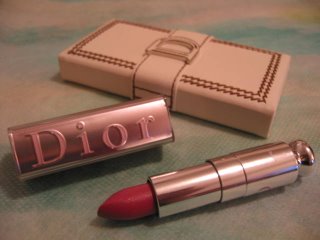
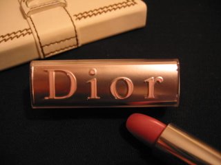
(pictured: my new Dior Addict Ultra-Nude
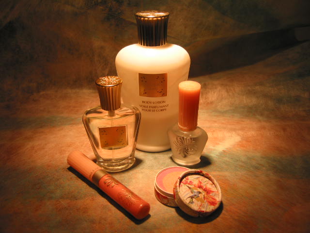
and Detective Chic from last fall)


With nearly all the spring collections revealed in my lovely Japanese cosmetics magazines, I have been quite disappointed with most major European brands. Usually I’d like the Dior limited edition product or some new things from Chanel. But for this season, I am not liking the Dior Flight palette or Chanel’s Lumiere d’Artifices (sequin eye palette), and my interest in YSL’s new eye palettes had dwindled even before they were available nationwide.

In the next post, I will review Lavshuca’s new collection, possibly my favourite collection of the season. Today it is about Dior.

First of all, as I said, I am not very excited about the Dior Flight palette. It is inspired by the same-name bag and accessory collection of the house of Dior. But, as you might have already guessed, I am not a huge fan of the Dior Flight bags. I don’t really like the “Remove Before Flight” tag, even though orange is one of my favorite colors for clothing.

I much prefer the Dior Detective collection, and the Dior Detective Chic palette (pictured above) is great.

To be fair, the colors in both of the Dior Flight palettes are good. I do prefer the one with the pink blusher (which is the one with the black eyeshadow). (The other blusher is slightly too peachy for my complexion.) But for something this pricey, I have to like everything about it to want to have it. (It costs the equivalent of 69 USD in the UK, while it costs 55 USD in the US.)

The two 5-color eye palettes are a bit of a hit and miss. While Pink Attitude features soft colors and is very wearable, Myriad is just a bit too blue. Even the Dior SA I was chatting with admitted that the palette would only suit a few people.

The two single-color eyeshadows released in the UK are obviously a teaser for a full newly-packaged collection (which is currently available in the US) Both Pink Candy and Icy White can be tricky colors to wear, especially Pink Candy. (If you don’t wear glittery pink eyeshadows right, you will look like you have irritated eyelids. A sheer, soft and gentle finish is the key!)

But I like the change of the packaging. I think it will be a matter of time before it carries over to the blushers. THEN I will consider buying a Dior blusher.

I think the best aspect of the new collection is the limited edition line of lipsticks “Dior Addict Ultra-Nude“. First of all, love the silvery case with the Dior logo in pale pink. I always like the shape of the Dior Addict lipsticks, but I never like the blue case and the white case of the Dior Addict Pearl Shine collection looks a bit too plasticky. So when I saw the soft slivery cases, I was intrigued.

Also, all the colors are soft and sheer (but not too sheer). There are not full of pearly glitter. Instead, they have an understated gleam. “Exactly what I like,” I thought. I could easily wear Body Pink, Skin Beige, and Undressed Mauve (because of their semi-transparent finish), and I decided to take Undressed Mauve because the soft-purple pink is something I want to try a bit more.

I like the way the color merges into my original lip color. It is indeed a nude look, and in a flattering way. I do have to say that the lipstick is slightly drying, but, with better prepping and maybe a bit of a clear gloss on top, it should be fine.

(I need to mention that the actual color of the lipstick is lighter and more purple. It seems very red due to my yellowish lighting.)

Overall, this collection is not as fascinating as some of Dior’s previous ones. But it is still one of the best among the European brands for this season.

Next Post: Lavshuca’s Spring 2007 Collection

{ 0 comments }