Kanebo Coffret d’Or has been releasing quite colorful eyeshadows in the last few seasons. However, just before that, the line went with the dusty-color trend in Japan (which I briefly talked about in my review of Kate’s Vintage Mode Eyes in BU-1) and released the Mysterious Force Eyes range. Today I will be sharing my thoughts on 01 Golden Modern.
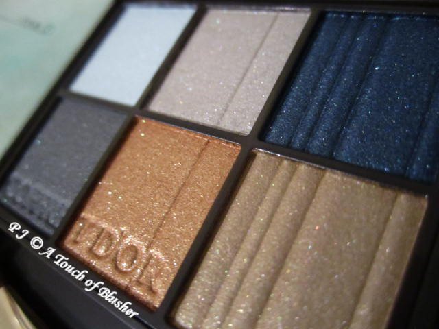
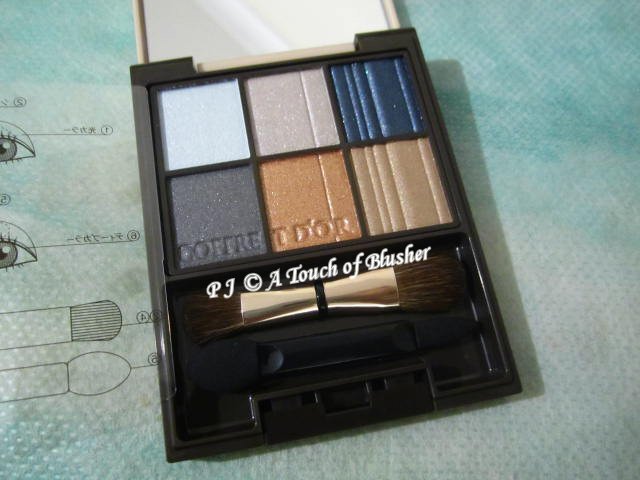
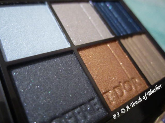
Kanebo Coffret d’Or Mysterious Force Eyes in 01 Golden Modern (カネボウ コフレドール ミステリアスフォースアイズ 01 ゴールデンモダン/ 佳麗寶 金炫光燦 光透秘彩眼影 01 Golden Modern, limited edition, ¥2800) was released in Japan for the holiday 2018 season (when the Mysterious Force Eyes range was launched with two variations (in 01 Golden Modern and 02 Mauve Lady)). The six shades in this palette are (clockwise from top left):
- pale-to-light blue, lightly-to-moderately (towards lightly) pigmented, softly shimmery
- light gray, lightly-to-moderately (towards moderately) pigmented, with soft pearly shimmer
- dark warm blue, well-pigmented, with a soft pearly glow and a hint of shimmer
- medium-toned brownish beige, moderately pigmented, with a satiny glow and a soft veil of fine shimmer
- bronze orange, moderately pigmented, shimmery with soft sparkles
- dark gray with a blue undertone, well-pigmented, velvety with a hint of shimmer
All the shades have multi-hued light-reflective particles. They are all very easy to apply and blend, and they all have a very good staying power.
The line recommends two basic looks (shown on the back of the outer box of the product). The three shades on the upper row are used for one of the basic looks, and the three shades on the lower row are used for the other.
Basic Look 1:
- pale-to-light blue on the entire eyelids
- light gray on the middle and the outer parts of the eyelids and along the outer 1/3 of the lower lash lines
- dark warm blue along the upper lash lines
Basic Look 2:
- brownish beige on the entire eyelids and along the outer 1/3 of the lower lash lines
- dark gray along the upper lash lines
- bronze orange on the middle parts of the eyelids
The pale-to-light blue is fairly lightly pigmented, but it can be layered for more intensity. (The color becomes more saturated, and the shimmery finish also becomes more intense and more light-reflective.) It is not an off-white blue and it is too blue-toned to work as a base shade. It is more of a lightening shade, and I like its freshness, translucency and shimmery finish.
The light gray, the brownish beige and the bronze orange are the shadowing shades in this palette. The light gray is the lightest among the three. It creates a subtle shadow, and my warm-toned complexion can handle this type of gray. (Grays (as shadowing shades) often don’t look good on me, but light-reflective light-to-medium grays with a silver-like quality tend to look better on me.) I also like to wear it along my lower lash lines to create a subtle depth. While all the shades in this palette are very blendable, I find this shade particularly creamy and easy to work with.
The brownish beige has a medium color depth and is a fairly natural shadowing shade for my light-to-medium complexion. While the depth of the shade appeals to me, I would prefer the shade to be warmer (more gold-toned or more bronze-toned).
The bronze orange is the warmest and the most shimmery shade in this palette. It has a similar color depth to that of the brownish beige. When layered on the brownish beige (to create Basic Look 2), it imparts warmth and shimmer on the middle parts of the eyelids without altering the color depth created by the brownish beige. Used as a shadowing shade on its own, it looks slightly too orange-toned on me. However, I do like its shimmery and subtly sparkly finish.
The dark warm blue and the dark gray are the two eyelining shades in this palette. The dark warm blue is slightly lighter and fairly noticeably more light-reflective than the dark gray. It is a very competent eyelining shade. It goes on smoothly and doesn’t require a lot of layering.
The dark gray has a blue undertone, and I like how it adds a subtle nuance to the shade. Like the dark warm blue, it goes on smoothly and works efficiently as an eyelining shade.
I have tried both of the basic looks recommended by the line, slight variations of them (with the eyelining shade from the other basic look) and looks with all six shades. Between the two basic looks, I thought I would prefer Basic Look 2. However, as neither the brownish beige nor the bronze orange has the right color tone for my own personal preferences (as mentioned above), I actually prefer Basic Look 1 (with the pale-to-light blue and light gray). Even though Basic Look 1 is on the whole slightly too cool-toned for me, I like its soft and ethereal feel. The two looks I have tried with all the six shades are both based on Basic Look 1. Here are the details of one of them:
- pale-to-light blue on the entire eyelids (as in Basic Look 1)
- light gray on the outer halves of the eyelids (similar to Basic Look 1)
- bronze orange on the lower halves of the eyelids
- dark warm blue along the upper lash lines (thicker and more diffused lines)
- dark gray along the upper lash lines (thinner and more defined lines very close to the lashes)
- brownish beige along the lower lash lines
The bronze orange really stands out in this look mostly due to its warmth and partly due to its sparkles. I also find the contrast between the very cool-toned pale-to-light blue and the very warm-toned bronze orange quite eye-catching. The difference between the dark warm blue and the dark gray (layered on the dark warm blue) is not very obvious, but the dark gray does add additional depth along the roots of the lashes. The look is slightly more elaborate than my usual looks and involves color combinations I don’t usually go for, but it is certainly fun to experiment with different looks from time to time.
I like the design of the case. It has the same shape and bow detail as those of the cases of Nudy Impression Eyes and 6 Selection Eyes palettes, but its lid is entirely in a gold shade. Finally we have a case design from Coffret d’Or that reflects the name of the line!
Even though there are aspects of this palette I really like (such as the good blendability of the powder and each shade with a subtly different finish), the palette doesn’t work particularly well for me. The main reason is that the brownish beige (the main shadowing shade in this palette for me) is not warm-toned enough for me. If it were more gold-toned or more bronze-toned (not more orange-toned), it would be easier to create looks that are more flattering on me. This palette and Kate’s Vintage Mode Eyes in BU-1 reflect the dusty-color trend and have similar color combinations. I personally prefer the latter, but I do think they can complement each other and create coherent and interesting looks.
Related posts:
Coffret d’Or Summer 2020 Makeup Collection
Stash Focus: Coffret d’Or 3D Gradation Eyes in 06 Beige Navy
Stash Focus: Coffret d’Or Shiny Color Collection Eye & Cheek in 02 Shiny Cool


{ 0 comments… add one now }