all about Japanese cosmetics

(pictured: Sony CP Makemania
Curvy Lip Silicone)

First of all, yes it’s Sony. They do cosmetics in Japan! (Or rather, they own a company in Japan that carries many budget and premium cosmetics lines. Makemania, which carries this Curvy Lip Silicone I have, is one of them.)

This lip gloss is claimed to have sold over 1 million copies in Japan and has been a huge sensation in some other Asian countries. It is nicknamed “Lip Attack” or “Lip Siege” (you get the idea).


It looks pretty ordinary, but it is one of the most lip-plumping lip glosses I have ever used. It is so good that I can’t even put too much on or I’ll end up having very fat lips, and it actually doesn’t feel too thick or sticky.

Also, one great design is the spatula applicator (see below). I always hate the sponge tip because it smudges off the lipstick and it is a hassle to clean. Now with the soft plastic spatula applicator, I can just wipe it with a tissue and it looks as clean as it can be. It also makes a smooth and even application! (Western brands please learn this!)

(pictured: the spatula applicator,
against the (very rare) bright summer sky in England)

Now that I have tried it, I can understand the hype about it all around Asia, especially when it only costs about $10 USD in Japan!

Edited on June 3, 2007: I’d like to point out that this is not the kind of lip-plumping lip gloss that gives you the tingling feeling and dilates the blood vessels in your lips. I personally don’t like that. For me the tingling feeling is a discomfort. The plumping effect of the Curvy lip Silicone lies in the spot-on texture, consistency, and the glassy and light-reflective effect.

Edited on July 18, 2007: Photos updated.

{ 24 comments }

(stunning ad from SUQQU’s Fall 2006 collection)
(from www.suqqu.com)
.

Back in September 2003, when SUQQU‘s first counter opened in Isetan Department Store (a world-class cosmetics heaven, and an ultimate battlefield for all brands) in Shinjuku, Tokyo, people were waiting outside the store for the doors to open. The revenue of its first day of sale broke the record of this upmarket department store for a debut brand (Voce Magazine, March 2007).

Why did so many people rush to buy SUQQU’s products even before they sampled them and why has it been successful since its debut? Apart from the quality of the products itself, I think there are two very crucial reasons.

First of all, in a youth-obsessed society (in a globally youth-obsessed era), where packaging is getting cuter and the colors are getting funkier, SUQQU resorts to the reverse strategy. It targets mature grown-ups. It appeals to women who are successful, classy, intelligent, and sophisticated. I believe that, by doing so, it also appeals to young women who look up to their more mature peers. It altogether creates a surprisingly wide market.

Another reason is their beautifully constructed theme for each season and the visual brilliance of their ad campaigns that convey the theme. Usually printed cosmetics ads feature the face of the model freshly made up against a muted background. Pretty straightforward, but dull at the same time. Not SUQQU’s ads. They always have a sense of message and story, and it certainly helps when the colors of each seasonal makeup collection have such a strong identity.

Last spring, it was a collection which couldn’t be more pink, with pink eyeshadows, pink lipsticks, and pink blushers. The ad featured beautiful full-bloomed flowers as the backdrop:

(ad for SUQQU’s spring 2006 collection)

(from www.suqqu.com)
.

Last fall, the collection featured primary colors used in ancient Japanese pottery. The ad (at top of the page) is stunning. But I think the upcoming spring 2007 collection is even more impressive. The theme is “goddess of the earth”. The eyeshadows are shades of blue and beige, paired with beige and brown lipsticks. It’s the sea versus the desert, bare earth versus deep ocean. The ad features a woman between the desert and the blue sky/ocean. She looks confident and in charge.

(SUQQU makeup leaflet for summer 2007)
.

Primary colors and shades of blue are not easy to pull off. But SUQQU’s message is “Wear them and be confident!” Packaged minimally with oriental sensitivity and sensuality, the colors inside are bursting with personality and attitude. All of these give SUQQU a very unique edge.

Later this month, I’ll come back to SUQQU again and review some of the makeup and skincare products. There are some fantastic products to be written about, including the smoothest eyeshadows I have ever tried.

Stay tuned!

Next: a lipgloss that has sold over one million copies in Japan.

{ 4 comments }

.

.

(Jill Stuart Brilliance Eyes in 04 Gem Amethyst)

.

This palette is from Jill Stuart’s spring 2007 makeup collection. When I saw this on the magazine, I just thought I had to get it. First of all, the packaging is ultra-pretty. Secondly, soft lilac and pink are colors that suit me quite well.

It proves to be what I wanted it to be and more. The featherweight powder feels soft on the skin. The colors are not heavily pigmented (which I like), and all of them are infused with shimmer and multi-colored sparkly particles. The effect is stunning. I can go for a barely-there look or I can layer the colors for a little bit more drama, For both looks, the shimmer adds subtle dimension to my eyes.

Overall, for this season, this is one of the best new items for me. Beautifully wearable colors and princessy packaging at their best!

.

Related post:

Loving Japanese Brands: Jill Stuart
(my personal take on Jill Stuart)

{ 2 comments }

There are many products that are always heavily featured in magazines and I am sure you sometimes think “They are not that good.” You might have used them and thought they were shockingly average, or you simply don’t fall for the hype.

For me personally, these products are over-hyped in different ways:

1. Creme de la Mer (hype despite of the price)

I admit I have never used it, so I can’t say whether it is a good moisturizer in itself for me. However, I don’t think any moisturizer (even if it is well-formulated) should cost this much, especially when algae (included in this product) is one of the cheapest and easily accessible ingredient.

Some people say they just want to have a bit of luxury in life. We all do sometimes, but it is a luxury *only if* it is better than anything else!

Unfortunately, there are loads more other products that fall into this ultra-premium category. Ignorant customers can easily be lured into them.

2. Lancome Juicy Tube (hype despite of the quality)

Its price is fine. It is affordable. But many magazines claim this is the best lip gloss. I also read that, on Ebay UK, it is one of the most searched items under the Health and Beauty category.

I have used it and I do think it is good. The slanted applicator is convenient and the gloss stays put and lasts for hours. But most of my other lip glosses give the same performances and I don’t understand the hype of it.

3. Kose Sekkisei Lotion (hype despite of the irritating ingredient)

Readers from many Asian countries will know what I am talking about here. It has been sold for more than 20 years and it is still one of the most popular toners in Japan. It is claimed to give skin brightness and luminosity. A popular way to use this toner is to soak a tissue mask in it and wear the mask for a good 20 minutes.

I bought this almost ten years ago and it proved again that alcohol and I really couldn’t get along, especially when there is so much of it (imagine Clinique Clarifying Lotion 3). I’ve said this before and I’ll say it again…alcohol is a major skin irritant and should not be added to any skincare product.

4. Benefit (hype despite of the packaging)

Right, this is only about the look, and feel free to disagree, because packaging is totally subjective and all views are valid. It seems like many people love the quirky and fun packaging of Benefit. I do like some of the imaginative names of the products, but that’s as far as it goes. The packaging is indeed very catchy so I understand why it stands out, but I personally really don’t like it at all. I don’t like cartoon drawings on my cosmetics. They just seem too child-like.

I tend to like packaging that is glamorous and relatively understated, like Chanel and Dior. I do girlie too, like Paul & Joe and Anna Sui. But Benefit is just too much for me. (So is Stila.)

(The only Benefit product I am interested in is the fragrance Maybe Baby. I like the smell and the bottle is simple but glamorous and elegant. But this look is not typical of most Benefit products……)

I’ll stop here and let you guys think about what products you think are over-hyped.

{ 4 comments }


(Pictured: my Paul & Joe stash)

Paul & Joe is changing the packaging of its makeup line this season. But it is really hard to notice a difference (without seeing the real items, that is). It seems like it is a different shade of pink, a more reflective finish, and slightly more pronounced floral patterns. But these changes seem so subtle that I wonder if it was worth the hassle.

There are whole new collections for lipsticks and eyeshadows. I am sure the new packaging will expand to other products later. The slightly more interesting items are the two-color facecolors. Some of the colors can be used as blushers, and some highlighters.

Packaging-wise, the limited edition items (almost always three lipsticks and three eyeshadows, featuring original Paul & Joe prints) are not as good as the hummingbird collection from Christmas last year. (Sort of there but not quite…it will take a lot to beat that collection.)

I am going to Fenwick on Bond Street next week. I will still definitely have a look.

Newsflash: I have got the new Jill Stuart eyeshadow palette! It’s so pretty!! I will review it later.

Next post: I will talk about Haute Couture for the first time here. The breathtaking Christian Dior Haute Couture for Spring/Summer 2007 will be my topic.

{ 0 comments }


(pictured: my Lavshuca stash)

(Read my previous Lavshuca post here.)

First of all, the new Lavshuca site was launched a couple of days ago to include the new collection.

After reading a lot of information about the various new collections, I think Lavshuca wins it for me this season. The slight modification of the packaging (from pale pink to plum) is working for me. Still exquisite and princessy. The vast array of new colors is exciting as well.

I have also decided on what to have:

Jewelry Lips: Amethystia Groom PK-1

I was choosing between this one and Viva Garnetica RS-1, but I was confident that PK-1 wouldn’t be too pink for me.

Gloss Stick: PK-3

I think I can go more pink on the gloss, hence the choice.

Eye Color Select: BU-1 (and maybe PK-1 as well)

I mentioned that I wanted to go for PK-1. But then it was actually off my shopping list for a while. Later I saw some photos of the palettes (not studio shots), and I fell in love with them again and thought BU-1 was also a great choice as well. Now I am not sure whether I will have both. I think I probably will. They are only about 8 pounds each.

Ummm…later I noticed that the BU-1 eye palette and the PK-1 lipstick were exactly what were used on Puffy on the ad shots…was I being subliminally influenced??

I might do *another* post after I get these items!

Next post: Avene Thermal Water.

{ 0 comments }

(Pictured: my Raycious stash)

Raycious updated its website today to feature the latest additions, due out in February.

I love Raycious. It is more or less the only reason why Sofina is one of my favorite brands. (See my post about Sofina here, which is mostly about Raycious.)

This spring, there are three new products. The Glamorous Skin Powder will be the 8th-generation Raycious powder foundation. (The 7th-generation is the one with the three-way mirror. The link just above has a photo of it.) Again, the case looks so lovely and will definitely be added to my collection.

Along with the foundation, there are a primer and a double-tipped highlighting/shading pen.

The Crystal Skin Base is a primer that will impart a sheer luminosity. But it might look greasy on my skin after a couple of hours.

The Face Trick Duo is an interesting product. It has a highlighting cream on one end and a beige/brown contour shading cream on the other. It is for creating defined facial features and contour. Because of its creamy texture (but lighter than the usual creamy concealer), it is used before a powder foundation or after a liquid/cream foundation.

This and the Glamorous Face Powder are what I look forward to trying!

After months of anticipation, Raycious seems to have delivered products that are worth the wait. But I will pass my final judgment when I get my hands on these new products.

{ 2 comments }

(Pictured: my Ayura stash)

The new Ayura collection includes lipglosses, eye palettes, nail colors, and aromatic face absorbent paper. It is out on January 26th.

I quite like the lipglosses. The ones with three layers seem intriguing, especially the BL one. But the layers will probably merge after several uses.

The whole collection is soft and breezy. There are no garish colors. It might lack the drama that some people look for, but for me these are lovely items that can enhance our natural beauty.

I consistently like Ayura’s seasonal makeup collections. It always has something interesting, like the stunning creamy eyeshadows last autumn.

Ayura doesn’t have the ultra ornate packaging of Anna Sui or the glamorous look of Dior. But it is the epitome of elegance. The packaging is soft and feminine and so are most of the colors in the makeup line. Moderately pigmented and without too much glitter, the understated makeup is for everyday use and for most occasions.

To me, it is a brand I can always count on, and the new makeup collection proves it again.

{ 0 comments }

(Paul & Joe, Suqqu, Visee, and YSL…
so which side is winning?)


Several days ago, someone in the asian_beauty community over at LiveJournal asked me whether I preferred Japanese over western cosmetics. I gave an answer but was inspired to write a longer post here.

In terms of makeup, I do actually prefer Japanese products. I have ten favorite makeup brands and seven of them are Japanese. There are three main reasons:

1. I tend to go for sheer pigmentation for eyeshadows, blushers and lipsticks.

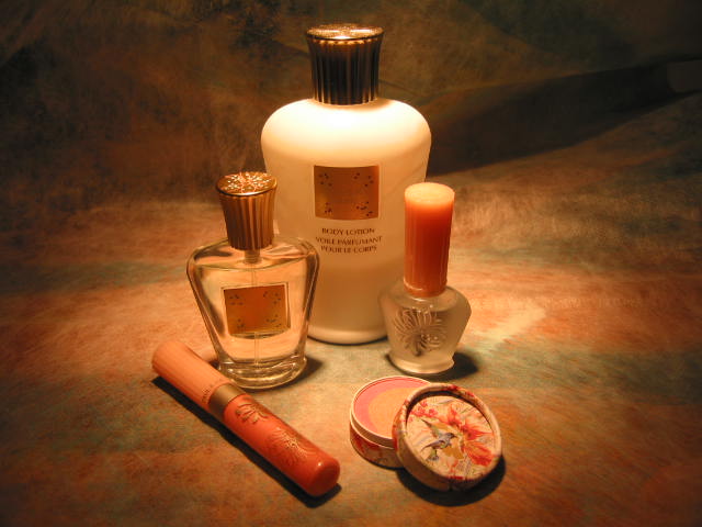
2. I love cute/elegant/princessy (depending on the brand) packaging. I know this is purely subjective. Brands like Pout and Benefit have more than merely functional packaging and they are known for cute and quirky images respectively, but I am never a fan. Not even Stila (sorry Stila fans)…I don’t like cartoon drawings on my makeup. On the other hand, brands like Ayura and Jill Stuart can do no wrong for me.

I don’t usually put my makeup items away in toiletry bags or drawers. I arrange them beautifully and display them happily on my dressing table and on the shelves. They are part of the room and part of the decor. I choose my makeup with the same aesthetic eye as I choose a table lamp or a coffee table.

The bottom line is, with many brands that have looks that appeal to me, when I need something (be it a lipstick or a foundation), I am usually able to find something that looks great, both on my face and in front of my eyes, and I will use it with more enthusiasm and joy.

And it just happens that most of these brands are Japanese.

3. A simple reason: most Japanese makeup items are scent-free.

Skincare-wise, I don’t have a preference. When I first started using skincare products, I chose them by reading the blurbs. If they sounded like something I wanted my skin to look like and if the price was within my budget, I would consider trying them. But over the years, I have learned to pay attention to the chemical aspects of skincare products. Now the first thing I look at when choosing skincare products is the ingredient list. I know what is good for my skin and what I should avoid.

In this case, the packaging is important in terms of preserving the antioxidants in, say, a moisturizer. A container with a pump dispenser is far better than a jar with a lid. (So of course we are not talking about aesthetics here.)

The thing with quite a few Japanese toners and moisturizers is that they tend to have alcohol to create that fresh feel after each use. But my sensitive skin can’t really tolerate that. (I don’t think alcohol should be in any skincare product anyway. It is potentially drying and irritating.) I do love some of the Shu Uemura products because they are alcohol-free and are so gentle. But currently most of my skincare products are from western brands. For example, my moisturizers are from Estee Lauder and Lancome, and recently I bought one from Nivea. If you happen to wonder what I use on a daily basis, read my post here.

I think many of us, especially the younger generation, are getting quite knowledgeable about what does and doesn’t work, but there are still some people who buy whatever the sales assistants say is good. I do try to encourage friends around me to learn more about ingredients in skincare products. After all, they go on our faces every single day…we might as well learn about them. I think a good place to start would be Paula Begoun’s website, as I am sure many of you know. Do some research and it will benefit you immensely!

Overall, Japanese makeup has the edge. Skincare-wise, I simply use what works for me. At the moment, there are more western products in my skincare routine, while several years ago, I used more Japanese products. So I wouldn’t say I have a clear preference. It depends on what suits my skin and what is more available at a given time and place.

So, what’s your take on this?

{ 39 comments }


(pictured: my Lunasol stash)


I am loving the look of Lunasol’s new collection! It is going toward a very soft look. All the colors look so gentle and wearable. It is about subtle and barely-there makeup.

My top pick is the lip palette, or Skin-Modeling Lips as it is properly called. This limited edition palette has four parts:

creamy-matte color (lip base)
natural color (lip color)
sheer gloss
jewel gloss

I’d like to have the one in EX04. I am a fan of blue-tone (but nearly totally sheer, of course) lipglosses. They make lips look really dewy and create a very natural and watery gleam.

This kit reminds me of another one by Ayura. It features a lip base, a lip liner, a highlight liner (for the two ridges of the upper lip, for extra perkiness), and a lip gloss. It is more of a lip-shaping kit that works in combination with your own lipsticks. I have it in 01 and I really like it.

The eye palettes also feature some soft colors. They are not as striking as what Lunasol had for last autumn (which has proven to be so successful that they top the favorite eye palette lists of Biteki and Frau magazines in Japan as voted by the readers), but they are great basics that look airy, breezy and beautiful. They also remind me of Jill Stuart’s latest eye palettes For example, Lunasol’s 04 looks very similar to Jill Stuart’s 02 Crystal Jade, and they both have the ubiquitous beige-tone palettes. I think, in this case, I’ll stick with Jill Stuart’s 04 Amethyst.

Both the four-color face powder palettes (Tone-Up Powder) look similar to Dior Detective from last autumn. It would be interesting to see how different Lunasol’s take on this will be.

The lip and nail colors will be great for the nude-color look.

As you can see, most of these products do remind me of some others. (Of course it is not unusual. New products are usually existing ones with a twist anyway.) But the texture and the pigmentation will vary (and the packaging, of course!) and I look forward to trying them out.

Apart from those above, you can also see Lunasol’s new foundation items here.

The color makeup items are out on January 19th, and the foundation items are out on February 23rd.

{ 0 comments }