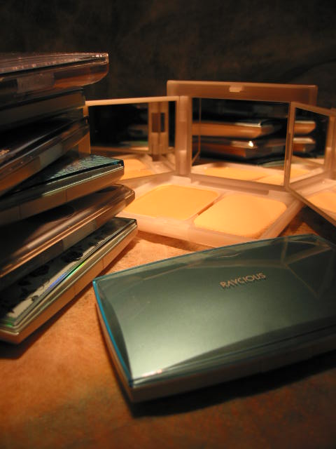
_Japanese Brand Profile

(pictured: Sony CP Makemania
Curvy Lip Silicone)

First of all, yes it’s Sony. They do cosmetics in Japan! (Or rather, they own a company in Japan that carries many budget and premium cosmetics lines. Makemania, which carries this Curvy Lip Silicone I have, is one of them.)

This lip gloss is claimed to have sold over 1 million copies in Japan and has been a huge sensation in some other Asian countries. It is nicknamed “Lip Attack” or “Lip Siege” (you get the idea).


It looks pretty ordinary, but it is one of the most lip-plumping lip glosses I have ever used. It is so good that I can’t even put too much on or I’ll end up having very fat lips, and it actually doesn’t feel too thick or sticky.

Also, one great design is the spatula applicator (see below). I always hate the sponge tip because it smudges off the lipstick and it is a hassle to clean. Now with the soft plastic spatula applicator, I can just wipe it with a tissue and it looks as clean as it can be. It also makes a smooth and even application! (Western brands please learn this!)

(pictured: the spatula applicator,
against the (very rare) bright summer sky in England)

Now that I have tried it, I can understand the hype about it all around Asia, especially when it only costs about $10 USD in Japan!

Edited on June 3, 2007: I’d like to point out that this is not the kind of lip-plumping lip gloss that gives you the tingling feeling and dilates the blood vessels in your lips. I personally don’t like that. For me the tingling feeling is a discomfort. The plumping effect of the Curvy lip Silicone lies in the spot-on texture, consistency, and the glassy and light-reflective effect.

Edited on July 18, 2007: Photos updated.

{ 24 comments }

(stunning ad from SUQQU’s Fall 2006 collection)
(from www.suqqu.com)
.

Back in September 2003, when SUQQU‘s first counter opened in Isetan Department Store (a world-class cosmetics heaven, and an ultimate battlefield for all brands) in Shinjuku, Tokyo, people were waiting outside the store for the doors to open. The revenue of its first day of sale broke the record of this upmarket department store for a debut brand (Voce Magazine, March 2007).

Why did so many people rush to buy SUQQU’s products even before they sampled them and why has it been successful since its debut? Apart from the quality of the products itself, I think there are two very crucial reasons.

First of all, in a youth-obsessed society (in a globally youth-obsessed era), where packaging is getting cuter and the colors are getting funkier, SUQQU resorts to the reverse strategy. It targets mature grown-ups. It appeals to women who are successful, classy, intelligent, and sophisticated. I believe that, by doing so, it also appeals to young women who look up to their more mature peers. It altogether creates a surprisingly wide market.

Another reason is their beautifully constructed theme for each season and the visual brilliance of their ad campaigns that convey the theme. Usually printed cosmetics ads feature the face of the model freshly made up against a muted background. Pretty straightforward, but dull at the same time. Not SUQQU’s ads. They always have a sense of message and story, and it certainly helps when the colors of each seasonal makeup collection have such a strong identity.

Last spring, it was a collection which couldn’t be more pink, with pink eyeshadows, pink lipsticks, and pink blushers. The ad featured beautiful full-bloomed flowers as the backdrop:

(ad for SUQQU’s spring 2006 collection)

(from www.suqqu.com)
.

Last fall, the collection featured primary colors used in ancient Japanese pottery. The ad (at top of the page) is stunning. But I think the upcoming spring 2007 collection is even more impressive. The theme is “goddess of the earth”. The eyeshadows are shades of blue and beige, paired with beige and brown lipsticks. It’s the sea versus the desert, bare earth versus deep ocean. The ad features a woman between the desert and the blue sky/ocean. She looks confident and in charge.

(SUQQU makeup leaflet for summer 2007)
.

Primary colors and shades of blue are not easy to pull off. But SUQQU’s message is “Wear them and be confident!” Packaged minimally with oriental sensitivity and sensuality, the colors inside are bursting with personality and attitude. All of these give SUQQU a very unique edge.

Later this month, I’ll come back to SUQQU again and review some of the makeup and skincare products. There are some fantastic products to be written about, including the smoothest eyeshadows I have ever tried.

Stay tuned!

Next: a lipgloss that has sold over one million copies in Japan.

{ 4 comments }

(pictured: part of my collection)


Meaning “moon and sun”, Lunasol is a very chic and gown-up line from Kanebo Group. In the last few years, the packaging has changed twice but has always maintained a low-key demure image. It used to have a skincare collection but it was discontinued.

I am glad that Lunasol has been quite popular in a couple of other Asian countries. The brand does exude quality inside and out, and the whole collection seems to have a quiet confidence about it in the sea of attention-grabbing merchandise in department stores.

The first two Lunasol items I bought were the lipstick and the powder case, and I bought them on my first trip to Tokyo when Lunasol was only available in Japan. I was then able to fit my own Kanebo foundation cake into the case. (I think all the foundation cakes from most Kanebo-owned lines should fit into one another’s cases.)

I don’t usually go for simple designs (I like glamourous and intricate designs, like Jill Stuart and Anna Sui), but there is something very elegant and sophisticated about Lunasol that really appeals to me. Even though I still prefer the silver and copper-beige square design when the line debuted, the current rich and glossy chocolate-brown look has a great sense of low-key glamour.

Their blusher is the only peach-tone blusher I have (in 03 Light Orange). (It seems to have been discontinued in Japan. See the rest of the colors here.) Most of the time, cool or neutral pink blushers work better for me. (Warm-tone blushers usually make me look too flushed.) But this one actually looks slightly more neutral once it has sat on my face for a while.

The blusher itself, the case, and the brush have to be purchased separately, but the quality of the brush is very good. It is exceptionally soft and has a good density of hair.

The lip gloss I have is in 04 Bright Pink. It is not really a shockingly bright pink. It is a very natural pink with delicate shimmer. (See the rest of the lip products here).

Their 2006 Fall Collection (especially the eyeshadow palettes) and 2006 Holiday sets have been extremely popular.

In the last couple of years, Lunasol has been consistently launching great seasonal collections. Look out for what’s new in the coming year!

{ 4 comments }

(Gemma Ward for Esprique Precious)
(image from www.interwoman.co.jp)

Even though many Japanese companies love having western superstars as their spokespeople, it is relatively rare for Japanese cosmetics companies to do so. Usually they use famous local movie or television actresses, and a couple other companies prefer relatively unknown western models.

However, Shiseido first broke the tradition by having Angelina Jolie to front the new budget cosmetics line Integrate earlier this year (see the television commercial on YouTube here). Now, Kose has international supermodel Gemma Ward to front their new makeup line Esprique Precious.

The line will debut with a limited edition set on December 1st, and the whole collection will hit the shops on December 16th in Japan.

The packaging is surprisingly similar to Kose’s other skincare and makeup line Beaute de Kose. Esprique Precious will have all the basics: lip sticks/glosses/liners, eye shadows/liners/mascaras, eyebrow pencils, blushers, and the face powder (similar to Guerlain’s Meteorites Powder). I am particularly interested in the blushers and the face powder. We can’t see the prices of the items on the website yet. I am sure they will appear later.

Do have a quick glance at part of the line.

Tomorrow: Lunasol, the concluding post to my Loving Japanese Brands series

{ 4 comments }

(pictured: part of my collection)


Lavshuca is the latest addition to my favorite brands. It was launched in February this year and has foundation and color makeup products. (The flash version of the website is worth a look. It does a great job of attracting potential customers.)

Price-wise, it is also the cheapest. It is a shelf-top (budget) brand rather than a counter-top (premium) brand, so it is in the same league as Maybelline and Bourjois. (A single-color eyeshadow costs 840 Japanese yens, which is about 7.2 USD.) It is launched by Kanebo Cosmetics, so quality-wise, it is on the same level as RMK and Lunasol.

As with all my other favorites, one major part of Lavshuca’s appeal is in its packaging. (Kanebo launched Lavshuca in a bid to lure the image-conscious teenage market in Japan.) It has that dreamy quality, with a lot of curves and filigree patterns.

I have got the loose powder in the 2006 Fall Collection. It has a little light-reflective particles to add luminosity (not greasiness) to the complexion. The single-color eyeshadow I have has a really great texture.

For me, Lavshuca (and Shiseido’s Majolica Majorca) are the only two shelf-top brands that feature both top quality products and great packaging. No western budget brand comes even close. It would have no problem “looking expensive” if it had its own counter in a department store. Maybe this is part of the reason it has been extremely popular with teenagers and young 20-somethings in Japan. Other nearby countries in East Asia have already caught on the trend and many people there want a piece of Lavshuca as well.

As long as it keeps the dreaminess, the fun, and the coolness of the brand, I think Lavshuca will continue to be very popular.

{ 6 comments }

(pictured: part of my collection)


Sofina, part of the Kao Group, is a major cosmetics brand (along with Shiseido, Kanebo, and Kose). It has an efficient and no-nonsense concept of skincare and makeup with a sense of fun and enjoyment. It mostly appeals to the 20-something generation.

One of the two Sofina’s foundation lines, Raycious, is probably more popular than the skincare and the color makeup lines. The debut of the 1st-generation Raycious powder foundation in 2000 was a sensation. It was said to have sold 1 million in its first year in Japan.

The innovation of Raycious lies in the ultra-fine luminous pale-blue particles (which the blue packaging represents). It counteracts the dark orange undertone (which makes skin look dull and lifeless) and keeps the face bright (not shiny) and fresh-looking throughout the day. The color of the foundation does not fade or turn dull when the face gets oily.

When I tried it for the first time, I was amazed. All the advertising claims were lived up to. No wonder it sold so well. The color does not darken over time, unlike what usually happens with a lot of other foundations. And the foundation stays fresh throughout the day and my face actually looks more luminous (not greasy!) by the end of the day.

Each year the packaging and the formulation of the foundation change, so we’re in the 7th-generation in 2006. But the fine blue-based particles have always been the main feature of Raycious. This year, the new formulation is all about defining the facial contour, and the foundation case became as much of a talking point as the foundation itself when it features a three-way mirror (for seeing exactly how the foundation defines the contour of our faces from multiple angles).

Aube, Sofina’s color makeup collection, offers all the good basics for daily makeup. The packaging changes entirely every two years or so. New products replace existing ones season after season and we end up with a completely new line every two years, in line with the revamped packaging. The Spring 2007 Collection is mentioned in a previous post.

The daytime moisturizers with proper sunscreen ingredients are the most popular items in the skincare line. They are fresh and still great as a makeup base.

Packaging-wise, Sofina is the most down-to-earth one among all my favorite brands, but it consistently offers great and innovative products. I will always be its loyal customers.

{ 18 comments }

Japanese cosmetics company websites almost always feature their latest products weeks before they hit the shopd, which is to create a buzz and to have the fans drooling for weeks (and racing toward the shops on the launch day). (European brands please learn!!)

Kanebo T’Estimo is usually one of the first brands in Japan to launch the seasonal collection, and you can already see the whole collection on the official website, with all the other bits up on December 1st. The new collection will appear in shops as early as December 16th.

It seems T’Estimo will be going to back to tone-on-tone with their eyeshadow palettes. The blues and the greens should be soft and wearable (typical of Japanese cosmetics), and the browns should be great from day to night.

Tomorrow: YSL (the last of my three European favorites).

{ 0 comments }

(pictured: part of my collection)


Like Anna Sui and Paul & Joe, Jill Stuart is a non-Japanese fashion label that launched the beauty line in Japan, and, just like the former two, the cosmetics line was a sensation in Japan.

It was launched on August 31 last year with a full range of products (for eyes, cheeks, lips, nails,…) Later on, there was a full foundation line. The star product is the loose powder blusher. The shape of the container is not something that fits comfortably in any makeup bag, but this does not stop people from wanting to own it and put it on their dressing tables. It looks fancy and feminine.The loose-powder form of the blusher is obviously quite a novelty, too.

October 6 saw the launch of the Jill Stuart skincare line, with products mostly catered to the Japanese market.

I was simply wondering how many people in the US knew about Jill Stuart cosmetics, so I posted a question on the discussion board at MakeupAlley about this. Only two people replied and they had never heard of it. That was what I thought would be the case.

Out of the whole beauty line, only the fragrances are available in the US so far.

Part of my Jill Stuart collection includes the 2005 Christmas Collection, with a face highlighter and a mini lip gloss. The container of the highlighter (pictured left) is basically the same as that of the loose powder blusher. For me, I don’t think a pot of blusher can look any cuter than this.

So far, the whole Jill Stuart cosmetics collection is still only exclusive to Japan. I have heard some cosmetics fans in Asia saying that it is going to be introduced to some other parts of Asia. It is quite possible, since there are people from Hong Kong and Taiwan buying Jill Stuart products in Japan. They bring them back and sell them in their boutiques or on-line, and the demand is high. I think Jill Stuart will definitely have a market in these two places at least.

I don’t expect to see Jill Stuart anytime soon in the UK. But as long as it is going strong in Japan, I’ll make my way there whenever I can…

{ 4 comments }

Even though Sophie Albou, who founded Paul & Joe, is a French designer, Paul & Joe cosmetics is developed, made and launched in Japan. It is one of the more widely available brands of my Japanese favorites. (Check here for the Japanese website, which has slightly more content.)

The soft and understated pale pink color glides through most of the makeup products and each season features specially designed Paul & Joe prints on the limited edition eyeshaows and lipsticks. The elegant and slightly retro image is perfect for the boudoir look, and I think their hummingbird collection for this Christmas is the best limited edition collection to date in terms of both packaging and color selection. (It is strangely not featured on the website but is available in the UK at least, as far as I know.)

Paul & Joe first appeared in the UK in Harvey Nichols London, where I saw the full range for the first time (after looking at all those products on Japanese magazines for quite some time). I just had to get something and I left with a lip gloss. Paul & Joe moved out of Harvey Nichols a couple of years later and now has counters in Fenwick and Harrods. (Check here for more retail points.)

I usually go to the counter in Fenwick. The sales assistants always seem to recognize me and are very friendly and helpful. Quite generous with samples, too.

My favorites are lip gloss in 04 (glittery orange pink), nail treatment oil, hand cream, Blanc eau de toilette (mild, sedate, and elegant), and Blanc body lotion.

The primers and foundations are the more talked about items, although I have not yet tried them.

Their products are regularly featured in magazines in the UK. It seems that they have been expanding their market all over the world. Hopefully it will stay around (especially in the UK!) for a long time and continue to be all feminine and gorgeous.

{ 2 comments }

(pictured: part of my collection)


Even though Anna Sui is a Taiwanese-American designer whose career took off in America, her cosmetics range is developed and made in Japan (by Albion) and is essentially a Japanese brand.
I adore Anna Sui because it is fun, playful, gorgeous, and mysterious.

I remember
reading some comments about Anna Sui cosmetics on the Internet when it was launched in America many years ago. Someone said that the Gothic-style packaging was bizarre (well, not in this season!) and she wondered where the market was going to be.

She was so wrong. One thing she probably didn’t know was how hugely popular Anna Sui had already been in Asia. The style of packaging was actually just right for the Japanese market: it was cute, girlie, fancy, and dreamy. (It is not the only style that sells in Japan, but it does attract everyone that wants everything to look ultra-cute.) In the image-conscious Japanese society, packaging matters and packaging sells, especially when Japan has a hugely competitive beauty market where good (and right) packaging stands out on magazine pages and grabs attention. When the first Anna Sui counter opened in Taiwan, it sold about 30,000 USD worth of products on the first day of business alone. Now, it is still going very strong in Asia.

It does target heavily on the younger consumers, who are the most relentless spenders. This might be part of Anna Sui’s success.

Of course, good packaging is not enough if the content doesn’t deliver. Anna sui has many strong products, such as loose powder, eyeliners, and lipsticks. My personal favorites are the powder blusher and cream-stick blusher (which was discontinued). My powder blusher color is 400. Its tester looked shockingly red when I was trying to decide which color to buy, but it actually goes on matte, sheer, and surprisingly natural. It can be built into a more intense finish as well. The brush in the compact is nice and soft, compared with so many others.

This autumn, the packaging of the foundation range has gone back to classic black, as it first was. I do miss the gold packaging because all the lovely filigree patterns get to stand out much more.

Anna Sui falls a bit short on skincare. It is not particularly known for its skincare range, and it just happens that I haven’t come across anything that works for me.

The last time I saw Anna Sui cosmetics in the UK was several years ago. The self-help shelf in Selfridges London looked forsaken and it didn’t have the full range. Then the shelf was gone and some of the products strangely appeared at the Hard Candy counter in the nearby Debenhams for a few months before they completely disappeared (I think) in the UK. (The fragrances are still widely available though.) It was a shame…if only I could also see all those gorgeous and sensual loose powder cases in every department store here……

{ 10 comments }