_Japanese Brand Profile

(Shiseido Maquillage Clean Contrast Eyes 2 in SV844)

I haven’t really been very interested in Maquillage since it was launched in fall 2005. But sometimes, it only takes one item to start my interest in a makeup line, and you are looking at it now.

Maquillage replaced PN (the color makeup line) and Proudia (the base makeup line) and was what Shiseido called a “Super Brand”. The expectation at the time was extremely high, since PN, in particular, was very successful at bringing young people to Shiseido and rescuing the brand’s then aging image. Over the last couple of years, Maquillage, with a more mature image, has proven to be delivering the sales figures.

For those of you that might not be familiar with the multi-layered branding concept in Japanese cosmetics, Maquillage is not a fully fledged brand and is simply the name of Shiseido’s main color/base makeup line. It does not have its own counters and is sold at Shiseido counters in Japan and some other Asian countries (where you will find many other lines like Elixir Superior (skincare/base makeup), UVWhite (whitening), Anessa (suncare), Revital (anti-aging), and Beauty Voltage (youth skincare)).

Back to Maquillage. Since I have been very interested in lilac for the past year or so, I am often excited to see lilac being featured as the main eyeshadow color for a seasonal collection. For spring 2008, this look (modeled by Ebihara Yuri, one of the four brand ambassadors for Maquillage) really grabbed my attention.

(image from www.shiseido.co.jp)


(from www.shiseido.co.jp
via xuzer at Dailymoiton)
After checking some more images of this palette on-line and on magazines, I decided to try it.

Initially, being (a bit overly) excited to try a lilac that was much cooler than most of the other lilacs I had, I used it as the main shade on my eyelids and I used the silvery grey around my lash line. It didn’t work well. Worn alone, the lilac is almost too pale for my eye area and the whole look is not optimally flattering.

When I tried the palette for the second time, I wore the silvery grey as the main color with most of the lilac showing through from underneath and around the silvery grey. This time, it worked a lot better.

A couple of days ago, I happened to find the following application steps on the Shiseido website. They show more or less how I used the palette for the second time. (They are similar to those on the back of the outer packaging of the palette, but the images below give a clearer idea.)

(image from www.shiseido.co.jp)

My own shade descriptions:
1. sheer white with mainly pale multi-color shimmer and relatively little pigment
2. pale blue-ish lilac with very fine and subtle shimmer and an overall satiny finish
3. silvery grey with a semi-metallic shimmery finish and a very slight warm copper undertone
4. dark matte charcoal with very sparse shimmer

With some eye palettes from Japanese brands, the second darkest shade is usually meant to be worn under the crease. But I think one of the best ways to use this palette is to follow the steps above and use the second darkest shade (silvery grey) both under and around the crease and over most of the lilac applied beforehand. (If you don’t have a crease, use the silvery grey as the main shadowing shade over the lilac, which is applied on a slightly broader area on the lids.)

The key is to layer the two shades. Since the silvery grey has a touch of sheerness, the lilac is able to show through and the two colors together create a lovely and subtle depth for the eyes.

Since many eye palettes in Japanese brands are named after the main shade, I was later able to understand why this is a (well-justified) SV (Silver) palette and not a VI (violet), which I did wonder initially. (Note: Kanebo brands would use PU (purple) instead of VI.)

The practical strengths are there as well. The powder is smooth and goes on easily, and the colors are long-lasting.

Essentially, this is a silvery-grey palette with lilac as the accent color. The concept is different from that of my other lilac palettes with gradations of lilacs. For me as a lilac lover, this alone makes the palette worth purchasing. (But I do have to control my fondness for lilac and try not to over-layer it!)

The “silver-greyish lilac” look it creates is subtle and natural, as you see in the ads. It is very good for daily wear. If you want a more dramatic look, layering the silvery grey and putting more emphasis on the dark charcoal will easily give you a smoky effect.

(By the way, in the ad, Ebihara Yuri is also using the new Gel Liner in SV854.)

I did spend quite a few weeks deciding whether to buy this palette or not. But I am very glad I did!

My other two lilac palettes for spring 2008:

Coffret D’Or 3D Lighting Eyes in 04

Lunasol Sheer Contrast Eyes in Lavender Coral

Other related posts:

Must-Try Look for Spring 2008

Spring 2008 Makeup Trend Report

{ 4 comments }

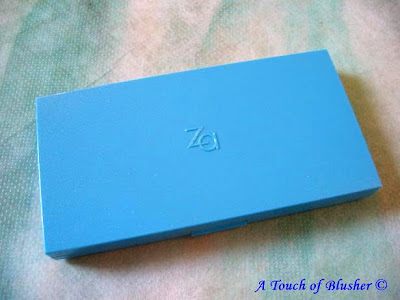
(Shiseido ZA Two-Way Foundation)
This favorite foundation of mine got a very brief mention in my post on my foundation routine almost precisely a year ago (the one in the cherry-pink case). After I did a couple of Foundation Face-Offs (SUQQU vs. Chanel and Lunasol vs. Coffret D’Or), I thought I should highlight my favorite foundation for the past few years.

Launched in 1997, ZA is a drugstore brand from Shiseido that is targeted at those in the mid-20’s. What is interesting about ZA is that it is a Shiseido line that is not sold in Japan. According to ZA’s website, it is available in Singapore, Hong Kong, Taiwan, Malaysia, Thailand, China, Indonesia, and Hawaii.

(ZA Two-Way Foundation)
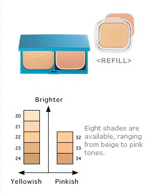
(I wear #22.)
(image from www.za-ny.com)

Even though Sofina’s Raycious is also one of my favorite foundation lines, its annual powder foundation releases over the past few years seem to be getting paler and a lot more luminous. (I prefer a satiny matte finish.) Despite their very good sebum-control efficacy, the overly luminous finish doesn’t really suit me. This is where ZA comes in (while I use Raycious foundations mainly for highlighting and precision concealing).

For me, a good foundation should even out my skin-tone (particularly the mild redness), offer a medium coverage, create a matte finish, control shine, and minimize the look of pores. ZA’s Two-Way Foundation does all of these relatively well.

Basics

SPF 20, PA ++, 8 shades (see above)

Finish

The finish is predominantly matte with a very subtle and natural luminosity.

Texture

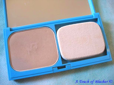
The texture is more on the dry side (which is good for sebum control). Among major Japanese cosmetics lines that release different powder foundations for spring/summer and fall/winter, this foundation’s texture is more like that of a spring/summer release.

Coverage

The coverage is around medium, and it covers mild redness and minor imperfections quite well. (I wear #22, a light-to-medium shade with a subtle yellow undertone. It evens out my mild redness effectively and gives a very natural look.)

Pore Coverage

It offers relatively good and pleasantly long-lasting pore coverage.

Shine Control

The shine-control ability is fairly good. The slightly drier texture makes the powder absorb sebum well, and the absence of shimmery particles means that the shine does not look more pronounced than it already does. (But it is worth mentioning that Coffret D’Or’s new Beauty Lasting Pack UV has an even better shine control ability.)

Lasting Power

It has a very good lasting power, which manifests in two ways. Firstly, what happens with some powder foundations I have tried is that, after I blot out the shine for several times during the day, the foundation starts to look patchy and cakey. But I have rarely experienced this with ZA. Also, the shade of the foundation darkens very minimally and only after a very long day. Sometimes I have to have my makeup on for more than 12 hours and this foundation still looks pretty good right before I take my makeup off.

Overall, this foundation really suits me. Even though there are a few other powder foundations I’ve tried that perform better in one or two categories above, this is by far one of the most well-rounded foundations that I have used so far in terms of my personal foundation-wearing preferences.

Unfortunately, for those of you that might be interested in ZA but don’t live in the regions mentioned above, I have not yet come across a website that carries ZA and delivers internationally. But I will keep you updated if I have more information.

Updated on April 2nd, 2008:

– Two readers have told me that ZA is no longer available in Hawaii.

– A reader has noticed that some ZA items are sold on-line. Please refer to the comment section for the link.

Thank you all for the alerts!

Related Posts:

Paul & Joe Foundation Primer N

Raycious Pressed Powder

Lavshcua Loose Powder

(For me, all of these work well with ZA Two-Way Foundation.)

Other items in my “Can’t Live Without” series:

Dove Body Silk

RMK Cleansing Oil N

{ 46 comments }

(a tearful diva)
(image from www.kao.co.jp/est)

A reader once asked me why, regardless of the generally consistent quality, certain Japanese makeup lines (under the same company) are more expensive than others. To summarize my answer for her, apart from the fact that price-points and target consumer groups define each other, more prestigious makeup lines tend to have a fuller philosophy behind their creations.

One prime example is Sofina EST.

Sofina‘s EST is not new. It has been a skincare line under Kao’s Sofina for many years, and it is Sofina’s most expensive line. In fall 2007, EST launched a full color makeup line, following the earlier debut of the base makeup range. (While, obviously, the brand name reminds people of the superlative suffix “-est”, Sofina also advocates that it is an acronym for “Essence of Sofina Technology”.)

The over-arching concept of EST’s color makeup is Emotional Beauty. As our faces are always displaying various feelings and emotions, EST attempts to use colors and finishes to enhance our day-to-day expressions of emotions. So, our beaming smiles look even more dazzling, our focused determination is even more infectious, and our sorrow melts the hardest of hearts.

(image from www.kao.co.jp/est)


I love EST’s recent ad images. They are beautifully and subtly compelling, with colors that enhance the facial features rather than overtake them. To embody the essence of the line, the model (April) displays a much wider range of emotions than what we usually see in makeup advertisements. The image on the top of this post is by far my favorite. As for the two below, I call them “despair & hope”:

(image from www.kao.co.jp/est)

(image from www.kao.co.jp/est)

However, all this ethos will be hollow if it can’t translate to product designs. So how does EST carry out their promise?

One item that defines the line is Emotional Aura Pact. Essentially, this is a highlighter for the eye area. It includes four subtly different shades of various finishes and opaqueness, and each of them is used on a specific part of the eye area.

(Emotional Aura Pack)
(image from www.kao.co.jp/est)


Apart from the eye area, this multi-purpose item can also be used around the lips to sculpt your pout. So, when you feel surprised, happy, curious, excited, inspired, or moved, this item is designed to capture your million faces and help them make a lasting impression.

Also, so far, I have come across good comments on Emotional Aura Eyes, the eye palette range:

(Emotional Aura Eyes palettes)
(image from www.kao.co.jp/est)


After the huge success of Kanebo’s Lunasol in the last couple of years, Kosé’s Magie Deco and Sofina’s EST were two of the major makeup launches in late 2007 that posed as rivals. Similarly priced and packaged with a sophisticated flair, they appeal to similar demographics. With a strong and distinctive concept behind it, Sofina EST’s development and evolution will be immensely interesting to chart and will serve as an indication of the future of Japanese cosmetics.

[Even though Sofina is available in Japan and several other countries in Asia, the EST line is currently only available in Japan as far as I know. The EST website is for information only and does not offer on-line ordering.]

Related Posts:

Loving Japanese Brands – Lunasol
(my current favorite Japanese brand)

Brand Profile: SUQQU
(a reverse strategy that works)

Coffret D’Or 3D Lighting Eyes
(replacing the beloved T’Estimo)

{ 13 comments }

(Mamew brand logo)
(image from www.mamew.jp)

It was estimated several years ago that there were between 3000 and 4000 cosmetics companies in Japan (from Textbook on Beauty, by Kaoru Saito). What we see in major Japanese cosmetics magazines is only a very small selection of them, and it is always interesting to see a new brand on the magazine pages.

Launched in October 2007, Mamew is a fairly new brand but it has been featured in major Japanese cosmetics magazines like Biteki and Voce as well as top fashion magazines like Vogue Nippon.


(the very minimally packaged Mamew Lineup)
(image from www.mamew.jp)

What attracted the attention of these magazines are Mamew’s Mascara Kits (two versions: Volume Curl and Long Lash).

(Mamew Mascara Kit)
(image from www.mamew.co.jp)

The mascara liquid and the brush are packaged separately, and each application involves putting the mascara onto the brush (just like putting toothpaste on a toothbrush, I suppose).

(image from www.mamew.co.jp)

You might think this is a lot of trouble, but here are the unique strengths of this product (from the Mamew website):

1. You can have more control of how much pigment goes onto the brush.

2. You can curl the lashes and keep the curl more effectively with the blush made with dense natural hair.

3. You can benefit from a fresh application every time by cleansing the brush after each use.

4. You can enjoy an easier application with the slim brush handle.

Apart from these, I think the unused mascara will probably remain moist longer. Also, this seems to be an updated version of the most traditional mascaras with a brush picking up the black pigment.

Judging by the increasing level of press interest, Mamew’s Mascara Kit has a potential to be a cult beauty item in Japan.

(Mamew is currently sold in Japan only, and the website’s on-line ordering service opens to residents in Japan.)

Related Posts:

“Loving Japanese Brands” Series
(my sensational seven)

Lash Out! – by Laura Mercier
(featuring mascaras from Dior, YSL, and Max Factor)

You Mean That’s NOT Real?

(What do you think?)

{ 10 comments }

(Kanebo CHICCA counter design)
(image from www.nikkei.co.jp)

(the classy detail of the packaging)
(image from www.chicca.jp)


On March 5, Kanebo will launch a new brand, CHICCA (pronounced “kikka”), which will have its own counters in department stores in Japan.

The brand image will be minimalistic and sophisticated.

Targeted at a more mature clientèle, CHICCA will be one of the most high-end brands under the Kanebo Company. In the makeup line, a lipstick will retail at around 50 USD and the pressed powder will retail at around 98 USD in Japan.

(CHICCA’s debut base and color makeup lineup)
(image from www.chicca.jp)

(CHICCA’s debut skincare lineup)
(image from www.nikkei.co.jp)

(part of the color makeup lineup)
(image from www.chicca.jp)

Following the debut of Coffret D’Or last December, this will be another important move from Kanebo, which was not doing very well financially and was purchased by Kao in early 2006. It would be interesting to see how CHICCA competes with other top-end brands in the future.

Updated on January 28, 2008:

CHICCA’s official website has been launched.

Photos of the details of the compact design and part of the color makeup lineup have been added above.

The brand is gradually appealing to me more and more. The Enthralling Powder Eye Shadow (particularly the duo in #02, beautifully named Chiffon Lavender Dress) and Flush Blush (a cream blusher) are just two of the items that have caught my eye.

(CHICCA Enthralling Powder Eye Shadow
and Flush Blush)
(images from www.chicca.jp)

Related Posts:

SUQQU: Sensuality with an Attitude
(another major high-end brand in Japan)

All About Japanese Cosmetics
(Can’t have enough of them…)

Loving Japanese Brands

(Read about my 7 favorite Japanese brands.)

{ 2 comments }

(image from www.nikkei.co.jp)

Kanebo’s Coffret D’Or will be releasing a new line of lip colors as part of the spring 2008 collection on January 16, 2008.

The dual-purpose lip colors include a slim lipstick that doubles as a subtle lip liner to define the lip shape as well as a liquid lip color to add shine and dimension to the lips.

If you like your makeup items to be multi-purposed and ultra-compact, then these might be worth looking into.

(image from www.nikkei.co.jp)

Kanebo’s Coffret D’Or is replacing the color makeup line T’Estimo and the base makeup line Revue. The brand image is elegant and understated but perhaps not as eye-popping as some would hope. But it is still very early days and it would be very interesting to see how the brand evolves.

(part of the Coffret D’Or lineup)
(image from www.kanebo-cosmetics.jp/coffretdor)

A couple of years ago, when Shiseido’s Maquillage replaced the very successful PN (the color makeup line that injected an air of youth into Shiseido’s then aging brand image) and Proudia (the base makeup line), it was believed that many PN fans had grown up and wanted something more mature and sophisticated. As the drugstore line “ff” was discontinued at the same time, it was also suspected that Shiseido wanted to experiment with the concept of “Super Brand” to better define Shiseido’s image, instead of too many lines with various price and retail points.

Kanebo is apparently doing something similar, as Coffret D’Or’s image at the moment is much more sedate and grown-up than T’Estimo’s. It actually bears a slight resemblance to the beautifully packaged Lunasol (also by Kanebo), although I think Lunasol still has a better edge.

I have started to wonder if other major brands like Kose and Sofina will follow this trend…

Related Posts:

Lunasol Spring 2008 collection

(Loving the eyeshadows…)

T’Estimo Frame Impact Eyes Palette
(So long, T’Estimo!)

{ 9 comments }

(Romantic Illuminate:
Magie Deco Holiday 2007 Collection)
(image from www.cosmedecorte.com/magiedeco/)

Kosé’s top-end line, Cosme Decorte, released a new makeup line in August called Magie Deco. Price-wise, it is cheaper than Cosme Decorte’s existing makeup collections but it is still a high-end line.

Naturally, these are Magie Deco’s first limited-edition seasonal items, and they are certainly keen to make an impression.

The two items, Shadow Brilliance and Face Powder, are sold as a set. As with many other holiday items for Japanese brands, they feature wearable and shimmery shades, great for the party season. (I think the Face Powder will be a straightforward sheer face powder with some shimmer.)

I really like the prints on one of the eyeshadows and on the gold lid of the Face Powder case. Feminine, flowy, and glamorous.

Magie Deco’s sophisticated brand image has been grabbing more and more of my attention. This is certainly a line I will pay attention to in the coming seasons and it will be very interesting to see how it develops.

Related posts:

Magie Deco Loose Powder
(one of the shortlisted items on my loose powder list)

Holiday 2007 Collection Galore
(photos and more photos…)

Holiday 2007 Collection: First Thoughts
(after I saw some of the items in the shops)

{ 2 comments }

I can’t take credit for this description of Kate, Kanebo‘s consistently successful drugstore line.

One reader, Tammy, left a comment under one of my posts on Lavshuca and asked about Kate. She described Kate as “Lavshuca’s edgier, darker sister“. (Both are Kanebo’s “daughters”.)

She couldn’t have put it any better!

But so far I have never bought anything from Kate. (I almost did for several times though.) Somehow the brand does not appeal to me. But, am I not edgy? Am I not dark enough for Kate??

Well, looking at my avatar….

.

(Well hello!)

…ummm……maybe not. (I do blush too easily!!)

Kate definitely has an edgier image (its slogan “No More Rules” sums it up), while Lavshuca is all very dreamy (yep that’s me). But Kate is also one of the most established and best-selling drugstore brands in Japan. It has a strong brand identity and has survived a lot of competition (against the new wave of drugstore brands such as Integrate, Kiss, Makemania and Love Clover).

You can see some of Kate’s TV commercials on YouTube to see how Kanebo is branding Kate.

Aside from the image, some of Kate’s popular items include:

Dual Carat eyeshadow duos
Deep Eyes N eyeshadow palettes
Line Spicy eyeshadow palettes
Glam Trick Eyes eyeshadow palettes
Super Sharp Liner eyeliners

When it comes to continuously releasing attention-grabbing items, I also have to hand it to Kate. The wide array of eyeshadow palettes and the recent cream eyeliner and loose eyeshadow have indeed given Kate that little extra (and almost semi-professional) edge. (I guess this is what I mean by product designs under one of my Anna Sui posts.)

So, have you tried anything from Kate? And what’s your favorite? Let me know!

I can be convinced!

.

Updated on December 31st, 2012:

Finally I purchased my first ever Kate item, Gradical Eyes A in GD-1!

{ 22 comments }

Shiseido’s Integrate Gracy will be one of the latest drugstore lines in Japan. (The logo is instantly recognizable as the sister brand of Integrate.)

Launched in Japan on August 21st, Integrate Gracy is targeted mainly at consumers in their 50’s, with understated packaging and timeless, elegant, and wearable colors. Also, all the products are fragrance-free, which can be a huge plus for people across all ages.

Integrate Gracy is not the first drugstore brand in Japan to specifically appeal to a more mature clientèle. Kanebo’s Evita (skincare and foundation) and Media (foundation and color makeup) are two examples. Now it’s Shiseido’s turn to add a new player.

The packaging is predominantly black and the overall look reminds me of Media and another of Shiseido’s drugstore lines, Selfit. I actually slightly prefer Integrate Gracy’s packaging to Integrate’s, which I think is painfully plain. (The case of Integrate Gracy’s loose powder looks simple and elegant.)

The line-up is vast and is actually larger than Integrate (launched in August 2006, targeting consumers in their 20’s and 30’s). It features a full range of foundation products, which Integrate does not have at the moment. It includes cream/liquid/powder foundation, primers, concealer, and loose/pressed powder. I think it is quite exciting.

The color makeup includes lipsticks, lip liners, blushers, eyeshadows, eyeliners, brow pencils, mascaras, and nail colors.

The target audience is very specific. But good prices and good quality are definitely for everyone!!

Source: Nikki Net

{ 0 comments }

(pictured: my Majolica Majorca foundation and blushers)

For me, there are two Japanese brands that combine ultra-princessy packaging and superb pocket-friendliness: (Kanebo’s) Lavshuca and (Shiseido’s) Majolica Majorca.

I haven’t really talked about Majolica Majorca very much because Lavshuca has really edged Majolica Majorca out for me in the last couple of seasons.


I do remember how excited I was when it was first launched in July 2003, which was way before some of my current favorites (like Lavshuca and Jill Stuart) took to the stage. At the time, packaging for Japanese drugstore lines was never about being maximally appealing…until Shiseido launched Majolica Majorca, which targeted consumers in their late teens and early twenties. (There were always lines with cute packaging, but they were never packaged to the point of being invincibly dreamy.)


Gold is the predominant color for most of the casings, with filigree patterns, emblems, words written in fancy styles, and other decorative details. It has a royal and antiquey feel, and it was all very cute and princessy.

Their liquid eyeliners and mascaras have always been very popular. As for me, I have got two of their blushers and a powder foundation.


Both blushers are medium to sheer. PK333 is a cool pink (similar to Lavshuca Cheek Color PK-1) and OR211 is a light orange. I prefer PK333 because OR211 is a bit too warm for me.

The two-way powder foundation (Skin Remake Compact) is quite different from the ZA two-way foundation (also made by Shiseido) that I have been using for years. Relatively, Majolica Majorca’s powder foundation has a more moist feel, has a slightly better coverage, but controls shine much less effectively. (Because it controls shine rather poorly, I only wear it when the weather is very cold.) But if your skin-type is combination or slightly dry, this might be a good choice for you as it does give a smooth and almost satiny finish.

Recently, Majolica Majorca’s packaging has not been appealing to me. I think it is because brands like Lavshuca and Jill Stuart are really pushing it in this area. Also, for me, the recent products are just a little less than exciting.

But I still want Majolica Majorca to wow me again!

I’d be interested to know your view of Majolica Majorca and your favorite Majolica Majorca products.

{ 34 comments }