– YSL Shimmer Rush Palette Collector All-Over Makeup Palette (for eyes, cheeks & lips)
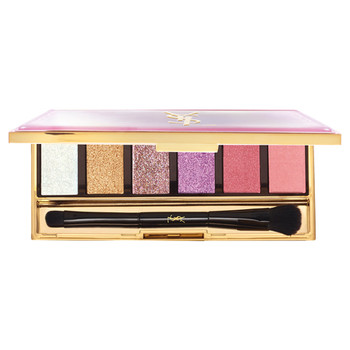
(image from www.cosme.net)
{ 0 comments }
Makeup, Skincare, Fragrance and a Bit of Fashion
– YSL Shimmer Rush Palette Collector All-Over Makeup Palette (for eyes, cheeks & lips)
(image from www.cosme.net)
{ 0 comments }
(continued from Part 1 & Part 2)
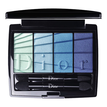
3rd: Dior
(image from www.dior.com)
Collection highlights:
{ 0 comments }
(continued from Part 1 & Part 2)
3rd: THREE
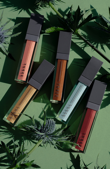
(image from www.threecosmetics.com)
Collection highlights:
{ 0 comments }
(image from www.cosme.net)
Matte lip colors have been on-trend for some time, but, in fall 2018, many major beauty brands are releasing new lip color ranges that feature either a matte or a semi-matte finish.
{ 0 comments }
(continued from Part 1 & Part 2)
3rd: Chanel
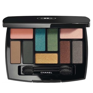
(image from www.chanel.com)
Collection highlights:
{ 4 comments }
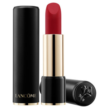
(continued from Part 1 & Part 2)
3rd: Lancôme

(image from www.fashion-press.net)
Lancôme collaborated with Sonia Rykiel for its fall 2016 makeup collection. The Sonia Rykiel Draws Paris for Lancôme collection features the designer’s iconic multi-colored stripes, which can be seen on the packaging of La Palette Saint Germain, Cushion Blush Subtil and Parisian Lip Le Crayon.
Sadly, Sonia Rykiel passed away on August 25th. I will always remember her sense of style (and her hairstyle).
{ 0 comments }
(images & info from www.fashion-press.net)
Here is a look at Lancôme‘s fall 2016 makeup collection, which is designed in collaboration with French fashion brand Sonia Rykiel. The Sonia Rykiel Draws Paris for Lancôme collection includes:
{ 0 comments }
10th: Paul & Joe
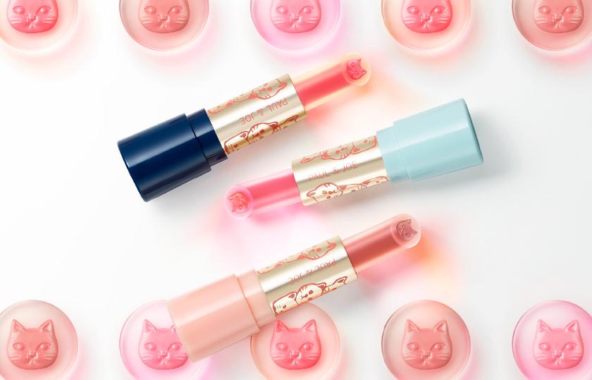
(image from www.paul-joe-beaute.com)
Paul & Joe’s summer 2016 Come Sail Away makeup collection features three limited-edition shades of Lipstick L and two limited-edition designs of Lipstick Case A. The collection combines nautical elements with the brand’s recurring cat theme.
{ 0 comments }

Jill Stuart Story of Fragrances Collection for 2025 & 2026 (image from www.cosme.net)