(continued from Part 1)
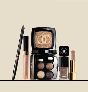
6. Paul & Joe

(image from www.paul-joe-beaute.com)


I think, for many people, the highlight of Paul & Joe’s spring 2010 collection is the Disney Character Collection, which features the Alice in Wonderland characters. For me, I also like the new eyeshadow singles (Select Eye Colors). A while ago, I was told by a Paul & Joe sales assistant that they might not be launched in the UK. But, fortunately, I recently saw them in Harrods. All the 25 shades are available here.

5. Maquillage

(image from www.shiseido.co.jp/mq)


There are five Eyes Creator (3D) palettes in Maquillage‘s spring 2010 collection. All of them feature light-to-medium colors, which look very wearable. I particularly like PK766 (with a hint of peach) and BR765 (with a hint of gold). The new shades of Eye Color N (Powder) include GD, BE, and BR shades as well.

4. Est

(image from www.kao.co.jp/est)


I still haven’t tried items from Est, but I nearly decided to go for a couple of items on several occasions. In the spring 2010 collection, I like the look of the Emotional Multiple Eyes palettes in 09 and 11. 09 reminds me of Magie Deco’s Shadow Brilliance II in Foxy Lady, while 11, with lilac, pink, and yellow gold, reminds me of Lunasol’s Sheer Contrast Eyes in Lavender Coral.

The countdown concludes in Part 3.

Related posts (on summer 2010 collections):

Paul & Joe

Aube Couture

Jill Stuart


{ 0 comments }

In my post on the makeup trend of spring 2010, I mentioned that quite a few orange-toned shades seemed to be appearing among Japanese cosmetics. Today, I am looking at a good example of this trend, Spring Modern Eyes in 03 Orangy Brown from RMK’s spring 2010 collection.

Top left: well-pigmented mildly metallic warm brown with a burgundy undertone
Bottom: moderately-pigmented shimmery light warm beige
Middle: lightly-pigmented mildly shimmery off-white
Right: sheer subtly shimmery soft peachy orange

The orange looks vibrant in the pan, but it is sheer and subtle when applied.

All the colors go on very smoothly, especially the light beige and the dark brown. The staying power of all the colors is good.

According to the application instruction enclosed with the palette, firstly, the light beige is applied on the eyelids. Then, the dark brown is used to line the eyes and the off-white is applied on the brow bones. Finally, the light orange is layered on top of the other three shades.

Based on this application, the effect is soft and warm. Even though the light beige and the orange are on the sheer side, they are not so sheer that they would just show up as shimmer.

I personally really like the light beige, which is a very good daytime color. It has the right (softly warm) tone for my slightly warm complexion and it adds subtle depth to the eyes. The multi-color shimmer also enhances the dimension of the eyes.

The orange imparts a touch of bounciness to the eye areas. It can be layered for slightly more intensity, but it doesn’t look gaudy or overly vibrant. It can also be used in the inner corners of the eyes or as a lower-eye liner for a very different look. I have not tried any shade similar to it before and I do find it to be quite wearable.

This palette is an interesting reinterpretation of warm neutrals. If the orange in this palette were a medium-to-dark beige, the palette would be relatively more ordinary. The orange certainly adds a bit of novelty and an element of surprise and discovery to the palette. It makes this palette worthy of a look even if you already have a few neutral palettes.

(The product featured in this review is provided by RMK.)

Related posts on RMK:

Summer 2010 Collection

Ingenious Powder Eyes

Powder Foundation EX

{ 6 comments }

Maison Martin Margiela was established in 1988 by Belgian designer Martin Margiela. Conveying a feel of simplicity, neutrality and pragmatism, the brand features collections for women and men as well as eyewear, fine jewelry and other accessories. Earlier this year, the brand launched Untitled (eau de parfum), its first fragrance.

Top notes: galbanum essence, box green, bitter orange blossom absolute
Middle notes: lentiscus resinoid, jasmine, galbanum resinoid
Base notes: musk, cedar, incense resinoid

There is something deeply alluring about this scent. As someone that generally likes fresh fruity florals, I surprised myself by being drawn to this dry, bitter, smoky, and woody green scent. It has a sharp, dry, and citrusy start and then it warms up with the smoky and woody notes. The notes of bitter orange blossom and incense seem particularly pronounced on me.

The fragrance radiates a comforting sensation not because it is soft, sweet, or smooth but because it feels solid, secure and dependable. Also, its angular, assertive, and uncompromising traits give the scent a well-rounded character.

I also like the coherent design details of the bottle. The string that secures the stopper, the white (the label’s key color) paint that surrounds the bottle, and the typewriter prints of the names of the fragrance and of the fashion house all create a feel of a work of an artist. It reflects the nature of the brand, which is rooted in experimentation and craftsmanship.

Untitled is not about creating a wide mass appeal. It is about sculpturing a distinctive character, one that is poetic, instinctive, and sophisticated. For me, it is quite a revelation.

In the UK, Untitled by Maison Martin Margiela is available exclusively at Selfridges. It is available in 30ml, 50ml, and 75ml.

(The product featured in this article is provided by Maison Martin Margiela.)

Related posts:

My Fragrance Favorites

Tiempe Passate by Antonia’s Flowers

Brooklyn by Bond No. 9

{ 2 comments }

Here we go, in reverse order:

10. Kate

(image from www.nikkei.co.jp)

(Diamond Cut Eyes in BR-3)
(image from www.kanebo-cosmetics.co.jp)

Kate is far from a regular on my seasonal top ten lists, but the line’s Gradical Eyes A series, with five tone-on-tone shades in each palette, has some soft-neutral options that appeal to me. (Also new for spring 2010 is Diamond Cut Eyes in BR-3, which is the kind of light-to-medium neutral palette that I would consider trying.)

9. SUQQU

(image fromwww.suqqu.com )

One of the things SUQQU is known for is its range of neutral-toned eye palettes. For spring 2010, the new additions are in the form of the limited-edition Noble Nuance Eyeshadow palettes. On the other hand, the star item of the collection is the multi-toned Noble Nuance Face Color.

8. YSL

(image from www.ysl.com)

(image from www.ysl.com)

Many major western brands, such as Chanel and Dior, have released relatively muted shades for spring 2010. This makes YSL‘s spring 2010 makeup collection stand out from the crowd. There are still wearable pinks and browns, but there are also more vibrant shades such as turquoise and deep violet. Lilac makes an appearance in the new Ombre 5 Lumières palette and the new La Laque nail color.

7. Elégance


(image from www.elegance-cosmetics.com)

The spring 2010 makeup collection from Elégance is also quite colorful. There are some interesting color combinations in the three new variations of the Phantom Eyes palettes (cool turquoise and warm pale pink, bright pink and mint green, and yellow and lilac). Eight shades of Eye Crayon also join the brand’s makeup lineup.

(The countdown continues in Part 2 and Part 3.)

Related posts:


Spring 2009 Makeup Top 10 Part 1, Part 2, and Part 3

{ 2 comments }

From today and throughout the next few weeks, I will be looking at a different fragrance each Friday. The series begins with Sheer Stella 2010.

Stella by Stella McCartney is one of my favorite fragrances. Since 2004, a limited-edition Sheer Stella Eau de Toilette has been released each summer. The notes of these Sheer Stella editions are more or less the same, and each edition features a different packaging. I came across the 2010 edition in my local Boots earlier this month, and, again, I decided to get it with no hesitation.

Most editions of Sheer Stella feature citrusy/fruity top notes. The 2010 version does too, but I find that its fruity top notes are subtler than those of many other editions. It features notes of organic rose and amber, and, overall, Sheer Stella 2010 seems rosier and more mellow than most other editions.

The bottle is designed by Philip Jones, a British painter and sculptor. I like the soft and quiet elegance of the design. It also reminds me of Chinese ink landscape painting.

As lighter versions of Stella, most editions of Sheer Stella are relatively long-lasting. I tend to wear Sheer Stella in spring and summer and Stella (and Stella Rose Absolute, the deepest of all the Stella McCartney fragrances) in fall and winter.

I hope that we will have a warm summer this year in the UK. It is always nice to enjoy Sheer Stella on a lovely summer day…

(The fragrance is my own purchase. The press information is courtesy of Stella McCartney via The Perfume Shop.)

Related posts:

StellaNude

Sheer Stella 2008 & 2009

Sheer Stella 2004 – 2007
(The bottle designs of the 2005 and 2007 editions are still my favorites.)

{ 0 comments }

(Chanel’s spring 2010 makeup collection)
(image from www.iswii.net)

I nearly decided not to post a round-up of the makeup trends of spring 2010 because, unlike some of the previous seasons, there are not many clear makeup trends for spring 2010.

Nonetheless, one noticeable trend for this season is the continuation of medium-to-warm neutrals from previous seasons. They are relatively easy to wear and they suit many types of complexions. They also suit most occasions and you can wear them later on in summer and in the rest of the year. Chanel and Estée Lauder are two of the brands that have released these wearable neutrals for spring 2010.

(Estée Lauder Michael Kors
Eyeshadow Duo in Blonde Mink)
(image from www.esteelauder.co.uk)

Also, Kosé’s Visée released Glam Nude Eyes, in which all five variations are neutral-based, many of which are warm-toned.
(Visée Glam Nude Eyes)
(image from www.visee.jp)

One related trend that is worth mentioning is the appearance of orange-toned eyeshadow shades from Japanese lines. (All of the three lines mentioned below happen to be under Kanebo.)

Firs tly, apart from the usual neutral options such as BR-1, BR-2, and GD-1 in Kate‘s Gradical Eyes A, there is an OR-1, which is the kind of variation that is less often seen in Japanese cosmetics. I think it is an interesting reinterpretation of wearable warm neutrals.

(Kate Gradical Eyes A in OR-1)
(image from www.kanebo-cosmetics.co.jp)

(Kate Gradical Eyes A)
(image from www.iswii.net)

Coincidentally, the Spring Modern Eyes series from RMK (which is ultimately owned by Kanebo) includes the Orangy Brown variation.

(RMK Spring Modern Eyes in Orangy Brown)
(image from www.rmkrmk.com)

Coffret D’Or already released an orange-toned shade in Color Mixing Eyes’ Orange Brown Mix from summer 2009. The orange trend seems to continue into summer and fall, as it appears that the line’s late summer/ early fall 2010 collection will also feature an orange-toned shade in one of the new Beauty C Curve Eyes palettes.
(Coffret D’Or late summer/ early fall 2010 collection)
(image from www.nikkei.co.jp)

(I will be featuring Coffret D’Or’s Color Mixing Eyes in Orange Brown Mix and RMK’s Spring Modern Eyes in Orangy Brown later on.)

{ 2 comments }

(image from Liz Earle)

Liz Earle Naturally Active Skincare, founded in 1995 by Liz Earle and Kim Buckland, is recognized as one of UK’s leading skincare brands. The brand’s emphasis is on botanical ingredients and essential oils, and the products do not contain mineral oil. Today I am featuring Liz Earle’s Superbalm.

Superbalm is marketed as an emergency moisturizer that can be used anywhere, particularly on the lips, nails and cuticles, and elbows. The product has a solid balm consistency. However, occasionally, I have come across testers in department stores with a thick oily-cream consistency. This could possibly be due to the warm shelf lighting.

Some of the product’s main moisturizing ingredients are hazelnut oil, shea butter, rosehip seed oil, beeswax, avocado oil, neroli oil, lavender oil, and camomile oil. Rosehip oil has antioxidant properties, but neroli oil and lavender oil can be skin irritants for some people.

The product doesn’t appeal to me as a lip balm. Even though I don’t dislike the scent of the product, it is too strong for me on the lips. Also, I don’t find it as soothing as some of the other lip products I have used. But it works relatively well for me as a nail and cuticle moisturizer, as it is moisturizing without being greasy.

The product does not contain parabens.

If you are interested in trying the product, I would suggest making sure you like its herbal-medicinal scent (which does linger particularly if you use it as a lip balm) and making sure you are not sensitive to any of the fragrant essential oils in this product.

(The product featured in this article is provided by Liz Earle.)

Related posts:

Rose & Co. Apothecary Rose Petal Salve
(still my favorite lip balm)

Elizabeth Arden Eight Hour Cream
(great for nails and cuticles)

My Beauty Weakness: Cute Cuticle Oils

{ 0 comments }

(From left to right: Revlon Super Lustrous Lipglosses
in Lilac Pastelle, Pink Pop, and Coral Reef)

For Spring/Summer 2010, Revlon has released its first color makeup collection with Gucci Westman, the brand’s global artistic director. Today I am featuring three of the five new shades of Super Lustrous Lipgloss.

All these three shades are bright and well-pigmented, and they don’t contain any shimmer. They have a glossy vinyl finish that lasts well. A thin layer is enough to give the lips a gentle pop of color, and a second layer adds a considerable amount of shine and color and creates a liquid-lipstick look.

Coral Reef (right in photo), when applied light-handedly, is a relatively natural shade for my medium-to-warm complexion. But I personally slightly prefer Pink Pop (middle), which is quite versatile. One thin layer of it gives the lips an elegant rosy-pink look. With more layers, the color turns more vibrant and closer to a hot pink.

I thought I would like Lilac Pastelle (left) at least as much as I would like the other two, but it turns out to be a little too pale for my light-to-medium skin tone. (I might like it more if it were a lot sheerer.) I think it should suit those with a fair skin tone a lot better. It might also work for you if you like a relatively nude look for the lips.

The rest of the collection includes two other shades of Super Lustrous Lipgloss (in Peach Petal and Fire Cracker), two Nail Colours (in Minted and Lilac Pastelle), and one (limited-edition) ColorStay Eyeshadow Quad in Summer Suedes.

(The products featured in this review are provided by Revlon.)

Related posts:

Coffret D’Or Jewelcious Eyes in Purple Amethyst

Natural Makeup Recommendations (2 of 3): Cheeks & Lips

Dior Lady Dior in French Chic

{ 4 comments }

(images/info from www.cosme.net)

Sofina Aube Couture will release its early fall 2010 makeup collection in Japan on June 15th. The collection features:

– Designing Shine Eyes (above, 5 variations)

– Designing Stay Rouge (8 new shades)

– Designing Premium Rouge (8 new shades)

Related posts:

Aube Couture Summer 2010 Collection

Aube Couture Spring 2010 Collection

From My Treasure Chest (2) – Sofina Aube Rouge Dressious

{ 0 comments }

(images/info from www.cosme.net)

Anna Sui will release several bodycare and body makeup items in Japan on June 3rd. The items include:

– Instant Tatoo (above, three new variations)

– Body Protection G (SPF 30, PA++, with sparkles)

– Body Protection P (SPF 30, PA++, with gold-toned shimmer)

– Bodycare Kit (limited edition, with Body Shampoo (60ml), Conditioning Body Lotion (60ml), Body Scrub (80g), Mesh Body Sponge, Vanity Pouch)

In addition, a limited-edition Oil Control Paper Set will also be released on June 3rd. The set contains two packets, and each contains 80 sheets of oil control paper.

Related posts on Anna Sui:

Summer 2010 Makeup Collection

Spring 2010 Makeup Collection

2009 Hair & Bodycare Collection

{ 0 comments }