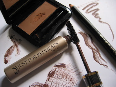
 (Pictured: Just for Redheads’ Brush a Brow,
Brow Stick, and Studio Mascara)Just for Redheads, as the name suggests, is a line specifically designed for those with red hair and fair skin. Makeup items such as black (or dark grey) mascaras, eyeliners, and eyebrow colors, can simply be too harsh-looking and dramatic for redheads. Warm and auburn hues, in this case, can better enhance the facial features without being overpowering.
If you share this concern, then these goodies might be what you are looking for.
Brush a Brow and Brow Stick (both in Ginger Auburn):
Brush a Brow is a velvety eyebrow powder that goes on smoothly and stays well, while Brow Stick is an eyebrow pencil that is softer than most others. It glides on very easily and creates natural and fluffy-looking brows (not that painted-on look).
The very warm brown tone is of course the main feature. It is that delicious milk-chocolate brown which softly enhances the brows.
Studio Mascara (in Ginger Henna):
What is great about this mascara is that no matter how much I layer it, it does not clump. Although it does not volumize the lashes like some others, it superbly defines, separates, and lengthens the lashes to create an effortlessly natural look.
Again, the warm brown tone is spot-on.
As I was trying on these colors, it appeared to me (who has dark hair and medium skin-tone) that they are not just flattering for people with red hair and fair skin. They are suitable for anyone that wants an ultra-natural warm look. I think what Just for Redheads has created are products that can give an understated and elegant radiance to your face.
The full Just for Redheads line also includes a complete range of makeup, foundation, skincare and haircare products.
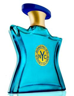
(Photo: from Bond No. 9)
Sometime last summer I was at Harvey Nichols in London and the sales assistant at Bond No. 9 stopped me and introduced me to their concept and some of their fragrances. I didn’t walk away with any but I was impressed with the distinctiveness of many of their creations.
This summer sees Bond No. 9 launch Coney Island, a quintessential summer fragrance. I love fragrances that are light and direct, and Coney Island is my kind of scent. I also love the striking deep aqua-blue glass bottle.
Appropriately marketed as a unisex fragrance, it reminds me a little bit of Giorgio Armani’s Acqua di Gio Pour Homme. Both have lime as a top note and burst with that citrusy energy, while Coney Island is slightly sweeter with caramel as a middle note and vanilla as a base note.
It is a great daytime pick-me-up fragrance and fantastic for a cool early summer evening. Fresh, fun, and totally unpretentious, it smells like fresh air, tropical ocean, and that glass of icy-cold lemonade at the beach. All in all, it is like the prefect summer.
Coney Island is launched on June 1st and online pre-ordering starts in mid-May (3.4 oz. at 180 USD and 1.7 oz. at 125 USD). It will be available at all four Bond No. 9 stores, selected branches of Saks Fifth Avenue, and Harvey Nichols, Harrods, Paris Gallery, Lane Crawford.
Top Notes: margarita mix, melon, guava
Middle Notes: cinnamon, chocolate, caramel
Base Notes: musk, vanilla, cedarwood, sandalwood
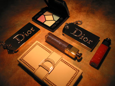 (Pictured: my own Dior stash)
Dior‘s summer 2007 collection is a feast of colors, and there is a wonderful balance between cool and warm tones. It is one of the best summer collections I have seen so far.
Dior Summer Play, lip color in a dice, is the sister to Dior Play, which was part of the Christmas collection back in 2005. This time, the dice has a bronzed and metallic exterior with a faux-leather string. One features a very sheer pink and the other has a slightly more opaque coral.
The two eye palettes are so gorgeous. 130 (Blue Croisette) includes a stunning selection of soft blue/lavender hues, while 440 (Sunset Cafe) has flattering shades of gold and brown.
I always want to see more interesting colors from DiorKiss lipglosses, and I have got my wish this season. The colors look fresh and remind me of tropical fruit. (I just bought the one in Mint Lemonade (#208) and I will review it later on.)
Blushers, bronzers, lipsticks, an eyeliner, and a mascara complete this very extensive collection, which creates a soft and sultry look with light pastel shades for both eyes and lips. The array of colors is a joy to behold, and you can get the whole summer look with this collection. Have fun trying everything on!
by PJ on Sunday, May 6, 2007
in _I Love Colors, -Ayura, -Bulgari, -Chanel, -Lancôme, all about Japanese cosmetics, bodycare, fragrance, makeup, stash focus
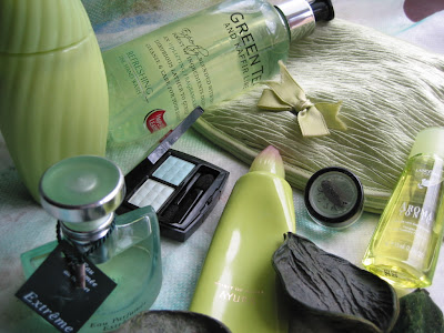
The weather is getting warm again, as the soft gentle green hue of new leaves is everywhere.
Bring that atmosphere into your boudoir…
——————————————————
Makeup:
Chanel: Irréelle Duo in River-Light
Von Natur: Eye Color in Chrysocolla
Fragrance:
Bulgari: Eau Parfumée au Thé Vert Extrême
Lancôme: Aroma Tonic
Bodycare:
Ayura: Spirit of Ayura hand cream
Ayura: Spirit of Ayura body lotion
Imperial Leather: Green Tea and Kaffir Lime handwash
.
More splashes of colors to come!
They are very straightforward, and, quite frankly, blatantly obvious. But are you doing all of them?
1. Wear sunscreen. Every day. All your life.
2. Sleep well (quality and quantity).
3. Eat well (balance and variety).
4. Exercise (intensity and regularity).
5. Don’t smoke.
6. Moisturize.
7. Take off your makeup as soon as you don’t need it on.
8. Learn to read the ingredient lists of skincare products.
9. Stay hydrated. (Don’t overdo alcohol, coffee, or tea.)
10. Control the stress. (Don’t let it control you.)
These all come from my own experiences. As you can see, there is nothing new here. No miracle product. No secret remedy. I always believe we don’t need to spend a lot of money to have great skin.
Also, you have probably noticed that many of them are not directly related to skincare. I think we all need to be constantly reminded that our lifestyle can affect our appearance as much as what we put on our skin.
Go through the list. What have you been doing already? What needs to be improved? Sometimes we get so obsessed with what to buy at drugstores that we forget that skincare is not just the matter of choosing the right cleanser or exfoliator……
Every little thing you do to improve your overall lifestyle, it will improve your wellbeing and you’ll look better!
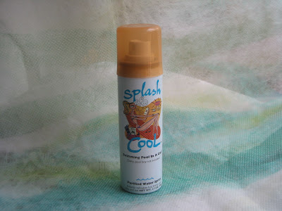 (pictured: Watersall’s Splash Cool)
If you are someone that carries a water spray everywhere you go, then you might be interested in the purified water atomizer by Watersall.
The mist is exceptionally fine, which gives a nice and relaxing sensation.
But do remember not to spray it and just let it dry. Your skin will become even dryer. Pat the skin dry and apply a body lotion to seal in the moisture.
For me, I find it particularly useful for changing or modifying my hairstyle. The mist is fine, light, and even, so it moists the hair without weighing it down, making it easy to re-style. I know a normal water pump-spray can basically do the trick, but this is several notches better…
I am sure you can probably find another (very idiosyncratic) way it can work for you…
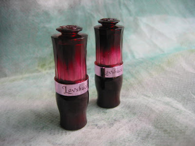
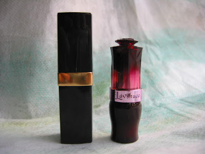
(the oh-so-pretty Lavshuca Jewelry Lips)
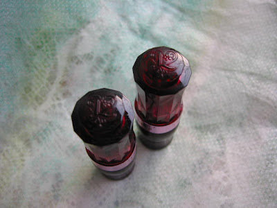
(engraved with the Lavshuca logo)
Lavshuca‘s Spring 2007 collection tops my list for the season, and these cutest little lipsticks are part of the reason. Lavshuca’s Jewelry Lips (approx. 10 USD) are exquisitely packaged. They also happen to be much more petite than most other lipsticks. Below, see how it is compared with a Chanel lipstick:
(They are nicknamed “Lavshuca Mini Lipsticks”.)
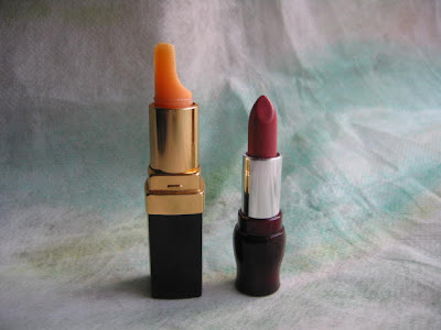
(And It is 1.8g of lipstick,
less than most others.)
The two I have, PK-1 and RS-1, are both very wearable. PK-1 is a sheer pink and RS-1 is a pinkish-plum with a little bit of shimmer.
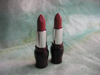
(from left: PK-1 and RS-1)
They are launched with 11 colors in February, and there will be another 11 colors to follow later on. So I assume they have been very popular!
(Read my Lavshuca brand review here.)
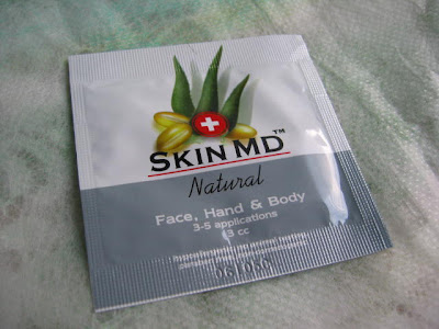
I received some samples of Skin MD Natural Shielding Lotion some time ago and have been using it for several weeks.
It is billed as a “shielding lotion”, which, according to their website, “keeps moisture-robbing irritants away from the skin while the proprietary ‘super’ humectants hydrate the skin throughout the day“. It can be used for face, hand, and body.
It is very light and non-greasy, and it absorbs well. Also, it doesn’t irritate my sensitive skin, which is great. (It doesn’t have alcohol, which is a huge plus for me.) Occasionally, when the weather was really cold, its texture and consistency was not rich enough and I would still put on a thin layer of my usual moisturizer.
So currently, when the weather can still get chilly (when the drying indoor heating is still needed), I use it as a serum before my usual moisturizer. I find that the product works the best for me like this in this time of year. I look forward to using it alone in summer and see how it goes.
As a hand lotion, it has been working nicely. It dries up to a satiny finish while keeping my hands moisturized. It is particularly great for daytime (no greasy fingers), while I would go for something slightly richer and more emollient right before bed.
If you have dry and sensitive skin and want to bring a bit of an enforcement to your existing skincare routine, I think this product is well worth some consideration.
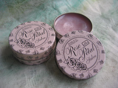
It is perhaps one of the best lip products I have ever used.
Back in 2004, I remember I was running out of lip balm towards the end of summer and I bought the Rose Petal Salve, Rose & Co. Apothecary‘s signature product, after reading about the Yorkshire-based shop’s launch in London’s Harvey Nichols.
At first, I was drawn to its elegant packaging and the very affordable price. (It wasn’t packaged like this then but it was equally nice.) After using it for a couple of nights, I realized I bought something really great.
It is very moisturizing but it doesn’t feel greasy or heavy. The lips look nicely moist and not oily. It also needs very little re-applying. The light rose scent smells divine but is never over-powering (I dislike lip products with any strong scent.)
It’s 5 pounds (about 10 US dollars) for 20 grams (the equivalent of around 5 stick lip balms). My previous one lasted about two years. Fantastic value!
It is also supposed to be multi-functional (as an eyebrow tamer and a cuticle cream), but I usually just use it as a lip balm and I only use it in the evening, as it doesn’t contain sunscreen.
Rose & Co. Apothecary products are available in the UK and Hong Kong.
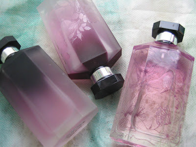
(pictured: from left to right —
Sheer Stella 2004, 2005, 2006)
Stella by Stella McCartney is one of my favorite fragrances. I just adore the feminine and sophisticated rose notes and the calming amber base note. Apart from Stella, since 2004, Stella McCartney releases a Sheer Stella each summer, which is a lighter take on the original scent.
I am happy to announce that my three Sheer Stella fragrances have just got a new sibling yesterday:
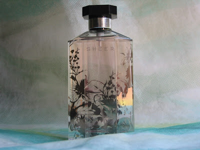
It features the consistently wonderful rose note with a lemony zest as do all the previous Sheer Stella fragrances. The bottle is pretty as always, this time also with exquisite prints like the last two years.
A closer look at each of the previous versions:
Sheer Stella 2004:
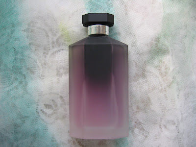
I bought this on-line after I bought and fell in love with Sheer Stella 2005. It features a simple frosted exterior. A very minimal and structured look.
Stella Sheer 2005:
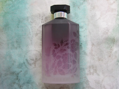
This is the first ever Stella McCartney fragrance I bought. I discovered this in her beautiful boutique in London. With floral patterns on frosted glass, the bottle looks so pretty and delicate, and I love the fresh and romantic scent. This kick-started my whole Stella collection.
Stella Sheer 2006:
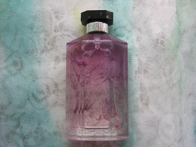
By the time this was out, I had already collected quite a few Stella fragrances and I simply couldn’t miss out on this one. The clear glass bottle features prints of flowers, hummingbirds, and butterflies.
To my rather amateur nose, all the Sheer Stella fragrances smell virtually identical, even though one website indicates that they feature different top notes (green mandarin orange for 2004, and Granny Smith apple for 2005). I still think they are more or less the same. (Maybe someone can help me here…)
But that’s absolutely fine, since I love the scent anyway and I love collecting the bottles.
Apart from these, I also have the original Stella, Stella Rose Absolute, Stella Pure Parfum (I didn’t actually pay for it…thanks to my Boots loyalty points), a limited-edition Stella candle, and some body products.
Ummm…I seem to have a bit too much of Stella! But I remain unexcited about 2006’s Stella in Two. They smell just as nice (all the same notes are there) but the packaging doesn’t do anything for me.
I like the freshness of Sheer Stella, and I love the sensitively somber touch of Rose Absolute. One is great for daytime and the other is surprisingly calming for bedtime (I tend to think any fragrance can be distracting for bedtime). I’ll come back to talk more about Stella McCartney’s fragrances later on.