After having great experiences with Shiseido Integrate‘s Pure Big Eyes in VI221 (which is one of my favorite purple-toned eyeshadow palettes), I couldn’t resist trying a neutral-toned palette from the range. I decided to go for BR337.
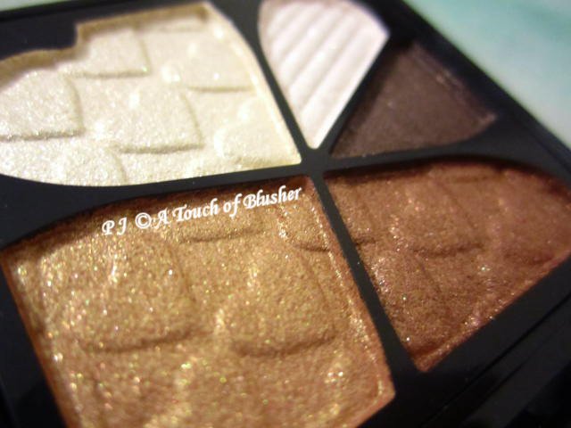
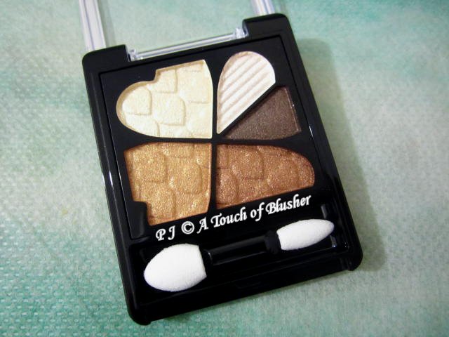
Shiseido Integrate Pure Big Eyes in BR337 (資生堂 インテグレート ピュアビッグアイズ BR337/ 資生堂 絕色魅癮 天使晶瞳眼影盒 BR337, ¥1500) was released in summer 2012. It contains an ivory, an off-white yellow, a light-to-medium bronze beige, a medium-to-dark auburn brown and a dark brown. All the shades have multi-hued light-reflective particles, and, on the whole, the lighter the shade, the more shimmery it is. They are all easy to apply and blend, and they all have a good staying power.
I find this palette to be quite versatile. You can use the (moderately pigmented) bronze beige as a light shadowing shade and the (well-pigmented) auburn brown as a dark shadowing shade, or you can use the bronze beige as the main shadowing shade and the auburn brown as a soft eyelining shade.
The off-white yellow can look rather shimmery as a base, and I tend to use it fairly light-handedly. The dark brown is well-pigmented and quite intensely dark, and it works well as an eyelining shade.
In my review of VI221, I mentioned that the off-white blue was too sparkly for me. As for BR337, I have tried using the very sparkly ivory (on the upper right of the palette) as a top coat on the middle parts of the upper eyelids. Used very sparingly, it doesn’t look overly sparkly and it adds extra dimension to the eyes. (There is no sparkle fallout.) The sparkly finish has a noticeable green tone, which creates a subtle contrast to the warm-neutral tones. I am not entirely sure whether I like the green tone itself or the contrast, but at least the green tone is not overly pronounced.
Just to be a little picky, I think the palette would work even better for me if the bronze beige were more gold-toned and less orange-toned. (It has both tones but it is more orange-toned.) However, I do like this palette. For me, the shades are very well-coordinated (except the ivory with its green-toned sparkles) and they create a beautiful gradation and a dimensional look. The palette’s warmth is particularly appealing to me, and its versatility is a good bonus.
Related posts:
Integrate Spring 2016 Makeup Collection
Stash Focus: Integrate Rainbow Grade Eyes in BE303
Stash Focus: Majolica Majorca Majolook (Illuminator) in BR788


{ 0 comments… add one now }