I still really like the current look of Shiseido Maquillage, and, over the last few years, I have reviewed Dramatic Rouge in RS329 Rose Rendezvous, Dramatic Mood Veil in PK200, Cheek Color (Clear) in PK222, Cheek Color (Clear) RD444 and Dramatic Mood Veil (Silky), all of which feature the same style of packaging. Today I will be sharing my thoughts on Dramatic Styling Eyes in OR303.
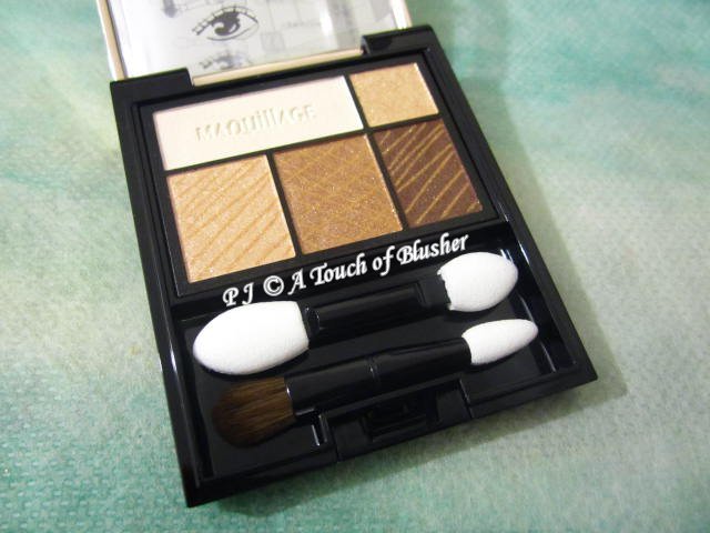
Shiseido Maquillage Dramatic Styling Eyes in OR303 (資生堂 マキアージュ ドラマティックスタイリングアイズ OR303/ 資生堂 心機星魅咖啡特調眼影 OR303 柑橘焦糖, ¥2800) was released in Japan in fall 2017 (when the Dramatic Styling Eyes range was launched with five variations). (Three additional variations (including one limited edition) were released for the holiday 2017 season.) The five shades in this palette are:
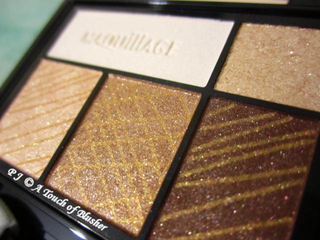
- cream white, lightly pigmented, softly glowy with a hint of shimmer
- light champagne gold (bottom left), lightly-to-moderately (towards moderately) pigmented, softly shimmery
- orange-toned bronze, moderately pigmented, softly shimmery
- dark brown, moderately-to-intensely (towards moderately) pigmented, velvety with a pearly glow
- pale champagne gold (top right), lightly pigmented, softly sparkly
All the five shades in this palette have multi-hued light-reflective particles. They are all easy to apply and blend. The cream white has a very good staying power, and the other four shades have an exceptionally good staying power.
The cream white is designed to be used as a base shade. I have to be fairly light-handed with it, as it can look unnaturally whitish if applied heavy-handedly. The light champagne gold is a natural-looking lightening shade that brightens the eye areas. It doesn’t look too yellow-toned or too orange-toned on me.
The orange-toned bronze is a competent shadowing shade and I like its softly shimmery finish. It coordinates well with the light champagne gold, but it is a little too orange-toned for me. As an eyelining shade, the dark brown is sufficiently dark but not particularly pigmented. A bit of layering is needed for a more intense look.
The pale champagne gold is designed to be applied on the middle parts of the upper eyelids and the inner one-thirds of the lower lash lines. It works well for me on the upper eyelids as it adds extra dimension to the eyes. (It doesn’t look too sparkly (when used relatively light-handedly) and its color tone coordinates well with the other shades in the palette.) However, for me, it can easily look too sparkly on the lower lash lines.
What impresses me the most about this palette is how long-lasting all the shades are. After a twelve-hour wear, they look almost freshly-applied as there is very little fading, creasing or traveling over time. I find that the two champagne golds, the orange-toned bronze and the dark brown are very slightly drier than many of the eyeshadows I have tried in recent years, but I do feel that they last longer than many of the (powder-based) eyeshadows that are very creamy and have a lot of slip (which can sometimes have more movement on my eyelids over time). (They are by no means chalky. They are just slightly less soft and creamy than many of the other eyeshadows I have recently come across, but they are certainly still easy to work with.)
Overall I do like this palette. The colors are very well-coordinated and they last very well on me. If the bronze were slightly less orange-toned and a little more gold-toned (or more khaki-toned), the palette as a whole would appeal to me even more. (Obviously the name of the variation (OR303) indicated the orange tone, but I didn’t think any of the other variations would suit me more.)
Related posts:
Maquillage Holiday 2018 Makeup Collection


{ 2 comments… read them below or add one }
I was curious about this shade and almost bought it (I got an orange-pink-blue from Holiday 2017 collection instead), I think I would enjoy this but I do have several warmer khaki palettes to go through (two from Lunasol two Majolica)so I will just skip it. I hope someday they will release a cooler lilac in this finish, so many reddish plum burgundy that make me look punched in the face.
Hi Mina,
I am pleased that you got the limited-edition OR321. I hope it is working well for you! :)
Gold-toned and khaki-toned neutrals tend to suit me more than orange-toned ones. I like bronze hues as well as long as they are not too orange-toned or too red-toned. Alas, the bronze in this palette is just a little bit too orange-toned for me……
A cool-toned lilac with the same finish as that of the orange-toned bronze sounds dreamy! :)
Thank you very much for posting your comment again! :)