Two weeks ago, I reviewed SUQQU‘s Designing Color Eyes in 128 Hiakari from the brand’s 2019 Holiday Makeup Kit A. Today I will be sharing my thoughts on Designing Color Eyes in 129 Tomoshibi from 2019 Holiday Makeup Kit B.
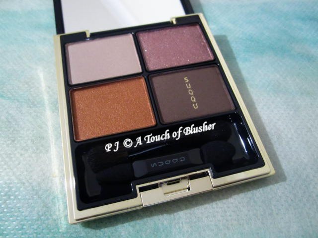
SUQQU Designing Color Eyes in 129 Tomoshibi (スック デザイニング カラー アイズ 129 燈火/ SUQQU 晶采立體眼彩盤 129 燈火, limited edition) was released in Japan for the holiday 2019 season. It is included in SUQQU 2019 Holiday Makeup Kit B (スック 2019 ホリデー メイクアップ キット B/ SUQQU 假日晶采彩粧組 B, limited edition, ¥10000 in Japan, £68 in the UK) and it is not available separately. The four shades in this palette are (anticlockwise from top left):
- light-to-medium gray, moderately pigmented, velvety matte
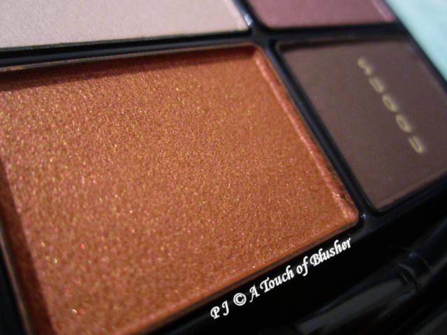
- medium-to-dark (towards medium) dusty orange, moderately-to-intensely pigmented, with pearly shimmer
- dark cool-toned brown, moderately-to-intensely pigmented, velvety matte
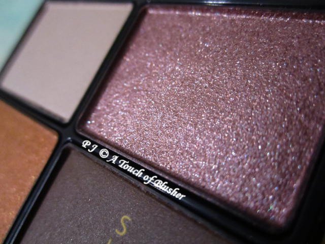
- medium-to-dark medium-to-warm dusty purple, moderately-to-intensely pigmented, softly shimmery
The orange and the purple have multi-hued light-reflective particles. (The gray and the brown also contain a very slight hint of shimmer, but it doesn’t look obvious on the eyes.) All the four shades are easy to apply and blend, and they all have a good staying power.
The gray can turn considerably darker than how it looks in the pan. It creates some depth and it works for me as a light-to-medium (towards medium) shadowing shade. It coordinates well with the purple but it is too cool-toned to go with the orange. A cool-toned beige would probably go reasonably well with both the orange and the purple.
Like red-toned shades, orange-toned shades are among the eyeshadow shades I have been experimenting with lately. The orange in this palette does appeal to me. It is darker than many of the other orange shades I have tried, and it works for me as a medium-to-dark (towards medium) shadowing shade. I like the depth and the richness of the shade.
I tend to go for medium-depth medium-toned purple shades (such as the ones in Lunasol’s Sheer Contrast Eyes in 02 Lavender Coral and Integrate’s Pure Big Eyes in VI221), and the purple in this palette is darker, warmer and more muted than the purple shades I usually go for. It appears almost brownish in some of the images I have come across on-line, but it is definitely a purple when swatched and when worn (even when layered on top of the orange and when viewed under warm-toned lightings). It is quite a dark shadowing shade for me, but I like its elegant low-key tone and softly shimmery finish.
I think it can work well with some of the tone-on-tone purple eyeshadow palettes I have, and I am particularly looking forward to wearing it with Aube Couture’s Designing Impression Eyes in 553 Purple and Coffret d’Or’s Beauty Face Shadow in 05 Lavender Purple. (I think it can be worn between the lighter and the darker shades in these palettes to add an extra layer of nuance to the gradation.)
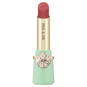
The orange and the purple work very well together to create an elegant and sensual look that is particularly suitable for fall and winter. The warm tone of the purple complements the deep warmth of the orange, and there is a soft gradation of depth from the orange to the darker purple. (For a lighter and more vibrant version of the look, I have tried pairing the peachy orange from Paul & Joe’s Eye Color CS in 102 Autumn Leaves and the purple from Coffret d’Or’s Full Smile Eyes in 04 Clear Purple. This combination works very well for me.)
The brown works very effectively for me as an eyelining shade. In terms of staying power, it (like the brown from Designing Color Eyes in 128 Hiakari from Kit A) works better for me than the charcoal black in Designing Color Eyes in 07 Hisuikou.
(Kit B also includes Glow Touch Eyes in 107 Yuragibikari (グロウ タッチ アイズ 107 揺光/ 晶采艷光眼彩蜜 107 揺光, 3.5g (mini size)), Flawless Lip Gloss in 109 Yoiakane (フロウレス リップ グロス 109 宵茜/ 晶采淨妍唇蜜 109 宵茜, 3g (mini size)) and Original Pouch B (オリジナル ポーチ B/ 假日晶采包 B). Glow Touch Eyes in 107 Yuragibikari is a moderately-pigmented medium-depth medium-to-warm dusty purple with a softly sparkly finish, and Flawless Lip Gloss in 109 Yoiakane is a semi-sheer plum with no shimmer (and is slightly sheerer than Flawless Lip Gloss in 108 Kokihi from Kit A).)
Overall I like this palette. I do need to keep the purple fairly close to my lash lines since it is quite a dark shadowing shade for me. Also, I need to be careful with the placement of the gray as gray-toned and taupe-toned shades don’t always look flattering on me. However, I really like the color tones of the orange and the purple as well as how these two colors work together.
Related posts:
SUQQU Spring 2020 Makeup Collection

{ 0 comments… add one now }